This week we are to compose a challenge reflecting our views on typography by selecting a poem and take in typographic considerations.
It’s a coincidence in which I have been working on a tshirt graphic on and off for a couple of weeks, MAN is it hard…there is always something that looks off and ever time I work on it is basically a 70% rework, a line here the space there…and I am still not done.

But anyway…This weeks challenge started by selecting a poem. Most poems I know are in Chinese…and I don’t really know much English poems. Being a great chance to go look at some though, I thought bout Roald Dahl and remembering him having slipped in small poetry in BFG and Charlie and the Chocolate Factory, but what had me go against that idea is that I want to do something less cartoon. So then I set my sights on Lou Reed. I’ve been a big The Velvet Underground fan, and always found Lou’s lyrics captivating. Eventually finding out he had a run as a poet in 1970 after he left as lead vocal of The Velvet Underground, but having read a couple I found them a lil’ scary with heavy hints of drugs and fetish, too hardcore.
So I went back to his lyrics as a vocal artist. Lou Reed has been considered one of the leaders of Glam Rock and Punk, and honestly most of his songs are still heavy in content. Lots of the content were hidden with extremely smart word play. For example the song Perfect Day off of Lou’s first solo album produced by David Bowie : Transformer, on the surface it’s about Lou having a day out with his ex-wife Bettye Kronstad, but having looked up different perspectives people have on the song, a once heroine addict declares that the lyrics totally expresses the feeling of addiction, how the drug could feel like a girlfriend in times of despair and how one could develop a relationship with it and feel fine for the day(please don’t do drugs), the song being feature in Trainspotting also further solidifying the perspective. How artists slip these kinda hidden messages in to these songs are scary and amazing at the same time.
I ended up doing All Tomorrow’s Parties from Lou’s Velvet days. Relatively tame, written about how a girl being addicted to partying. An experience i’ve had back in high school, keeping up with “costumes” for the next party, the one after that, and all future parties. All of these songs are unique perspectives of a certain period of time, a look in to the different ways of life, mentalities and observations.
My font design is aimed at portraying glam, not to over do the glam though to keep a high class, psychotic feeling of unrest; the toxic joy of addiction.
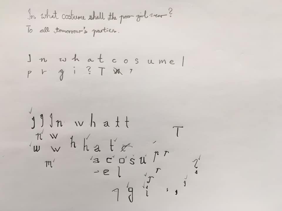

To me creating a type is establishing rules, and usually more rules would be considered and applied especially during the design of the first couple of letters. Sketching is COMPLETELY different than drawing them out in AI; what works on paper usually needs modifying once put in to software. Since only the fist line “In what costume shall the poor girl wear, in all tomorrow’s parties?” requires designing, I started with picking out all the letters needed for this sentence (as shown above) and this ables me to spell the word out later on. The design concept is what I call a semi-serif; I want a tiny tiny amount of decorative but not so much that would make the font look aged. So an element I stressed a lot on is the little curve or “kick” on the ascenders and the descenders. The little yellow boxes are in place to keep the angle of all endings aligned, enabling me to subtract after i’ve done expanding; the method is something I realised I needed to do while I was working along these letters. As in creating any font, a lot of elements get rather recycled, copying reflecting and pasting to compose letters with similarity, for example: the m is a child of the w, flipped upside down and making modifications.
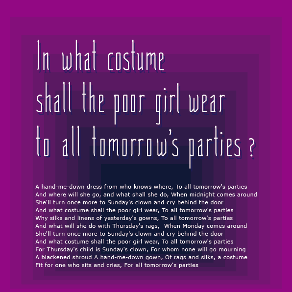
I ended up with a back ground graphic of something resembling a room born from the thought that all parties are held in rooms, and then the colour from lit outer rims descending in to what appears an endless dark suggesting the idea of “all tomorrow’s parties”, the next after the next after the next.
I would consider this end product as a first edition of Tomorrow’s Party Medium, the name I gave my font. As Adrianne has said in the lecture there is ALWAYS something to fix, and I guess that goes with all the typography work I have done so far.
ANDY was here
