
I started off the little adventure with my lovely fiancee around the North Point area, a place where all glimps of history is still exist like the 50s State Theater, 60s Wa Fung Mall, 70s Sun Beam Theater etc., but aside from these individual historic specticals the rest of it has caught up with development (not as much as areas like Wan Chai or Causeway Bay), there are not much a local guy like me could really identify with. Our general locations basically remain the same, but shops change with frequent examples of when certain 30 year old restautrants close due to sky rocketing rent, along with the business rich pieces of history gets checked off the list without means of supporting them or plans of passing on of knowledge or skill after these “legendary” owners are gone.
I promised myself not to stray off as much as I did during module 1, so back to our walk.
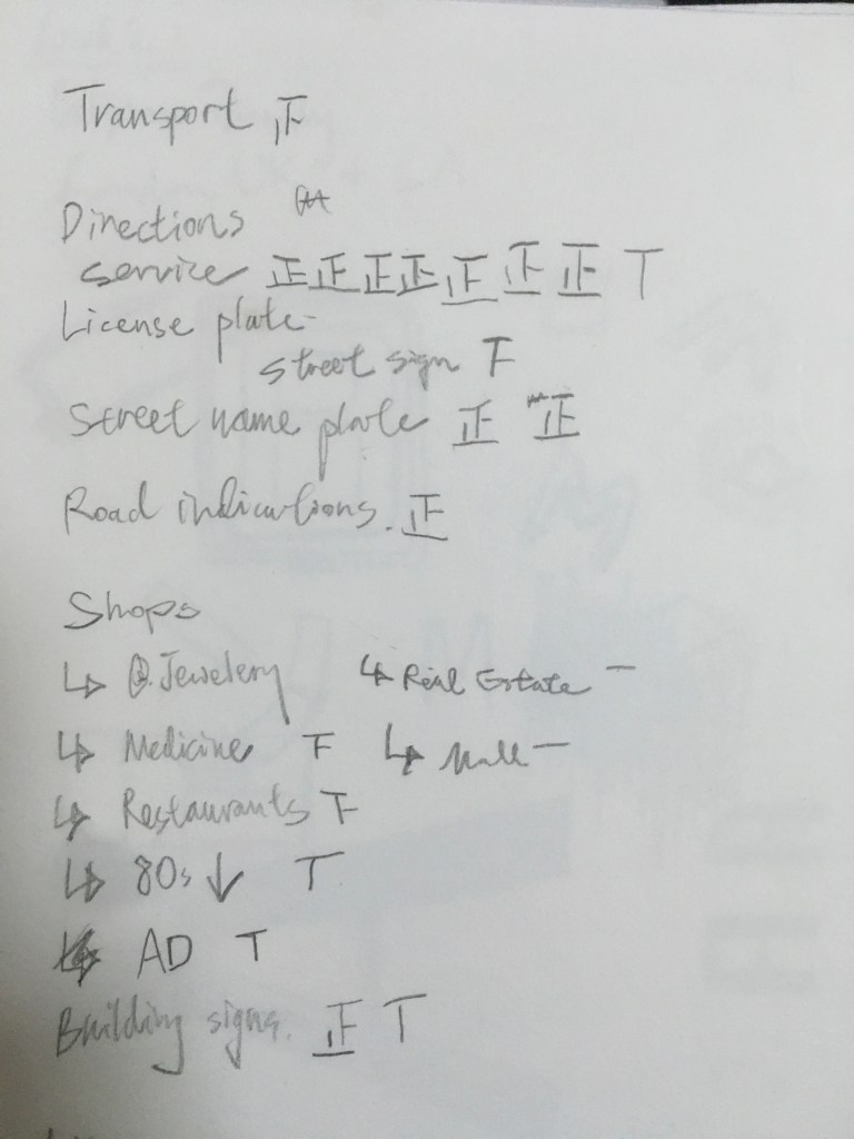
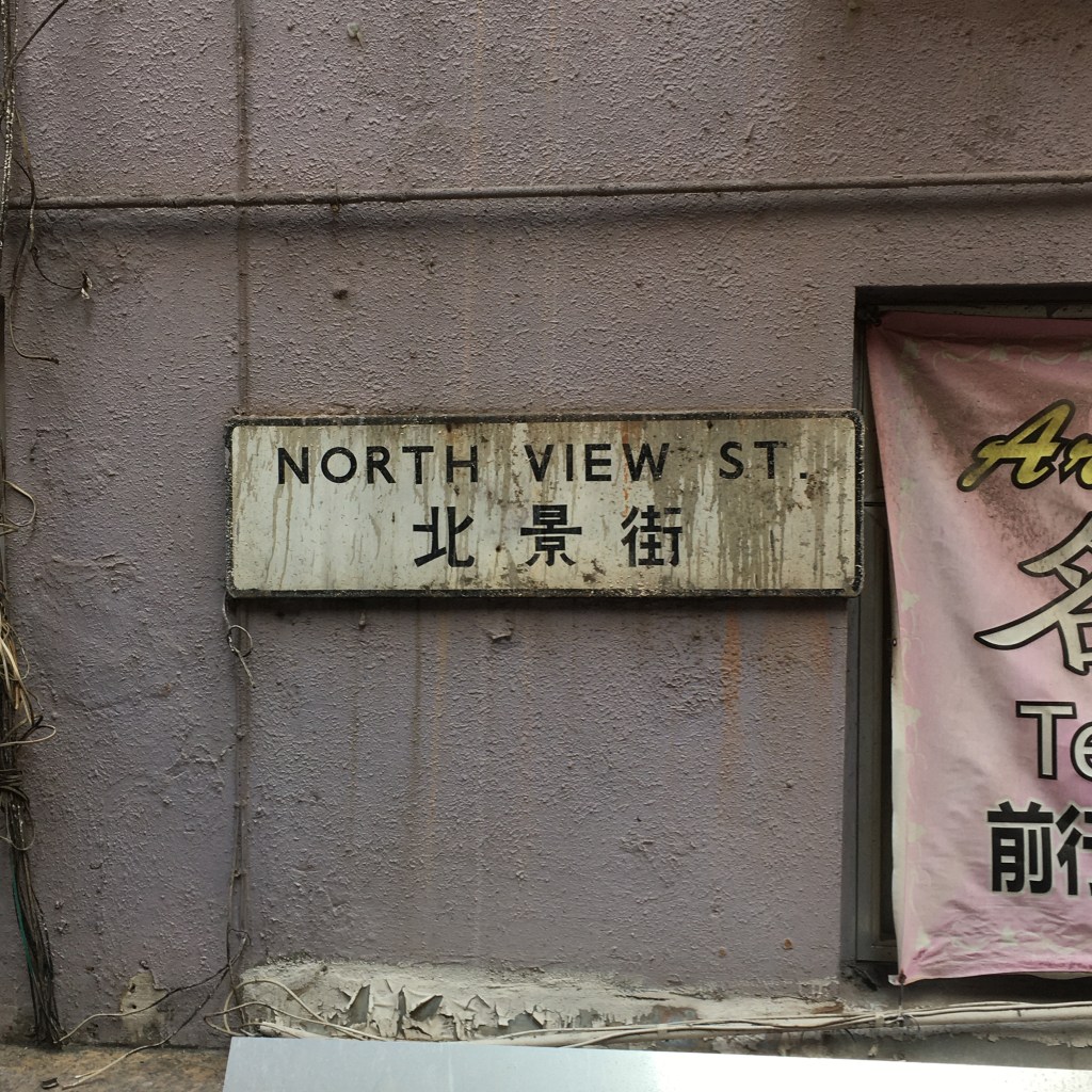
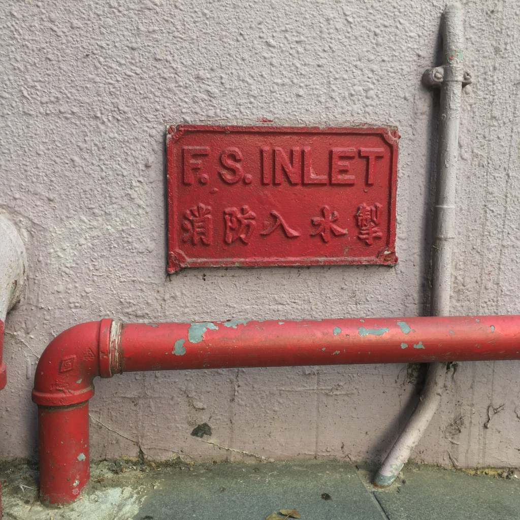
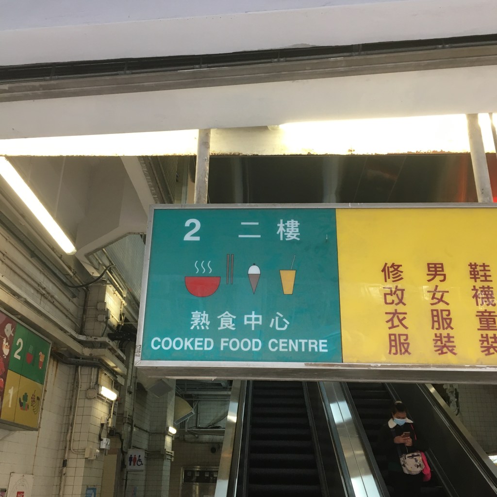
I compiled a list for my walk, and it was a result of a brainstorming for sources of local typography. The symbol you see is a 5 stroke chinese syllable we use to keep count. This way of documentation enables me to identify which is the most dominant form of typography in my area. The results were Direction and Services, such as manhole covers, instructions and warnings by utility departments and cable companies.
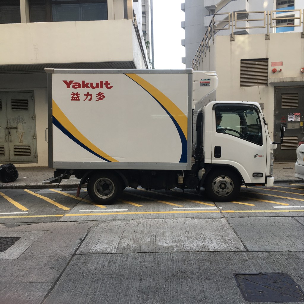
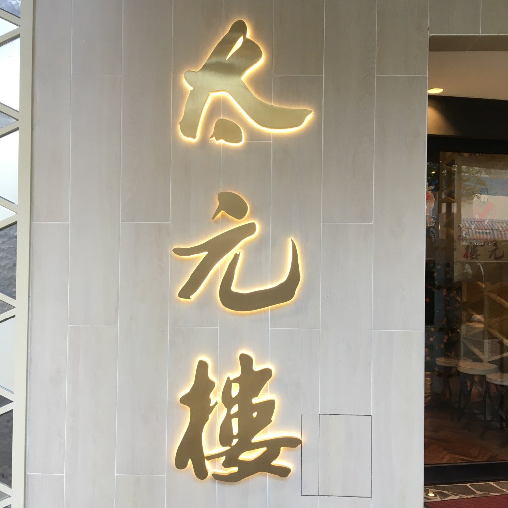
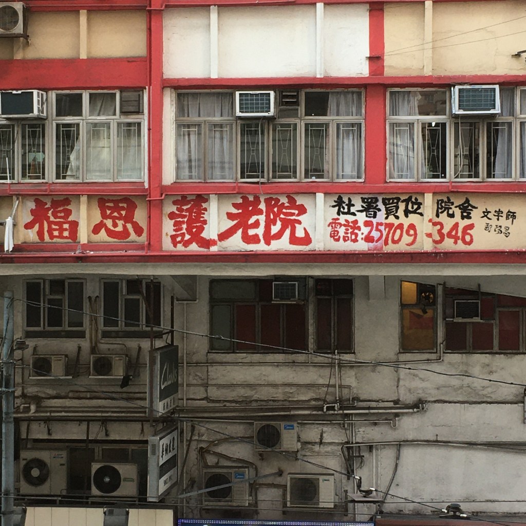
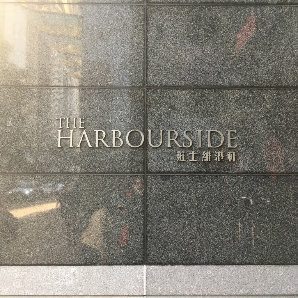
Yet Hong Kong’s street scape is a huge mix of much much more, and the following are some examples
I went up on padestrian bridges, down walk on the pavement and I would describe Hong Kong as a litter of typography, and it is in that chaos Hong Kong is voted as one of the most cyberpunk cities, an interesting way of saying old vs new I suppose.
For more details, feel free to download the below PDF for your viewing. More thoughts and notes are included, enjoy!
ANDY WAS HERE

I enjoyed this, Andy. “a litter of typography” is a great phrase!
LikeLike
thx there! I only noticed the comments section just now lol, you should come check it out some time!
LikeLike