Ill start by saying I think I have spent way more time than I was supposed to on this assignment, but that new knowledge gained and the result came out satisfactory, even with potential of this becoming a lasting project.
First as a graphic designer, I stressed a whole lot on the cover. With my writing based on Hong Kong mascots, I started off wanting my book to appear friendly,
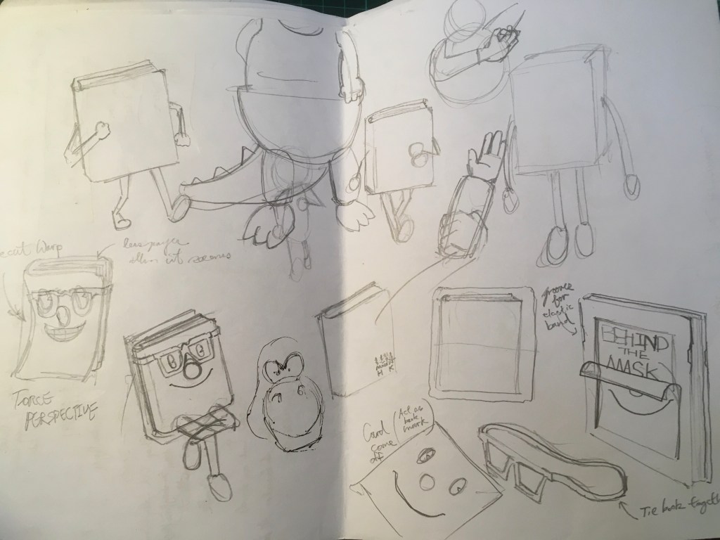


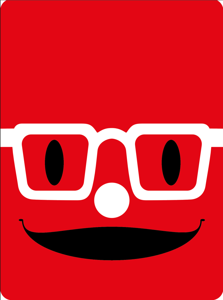
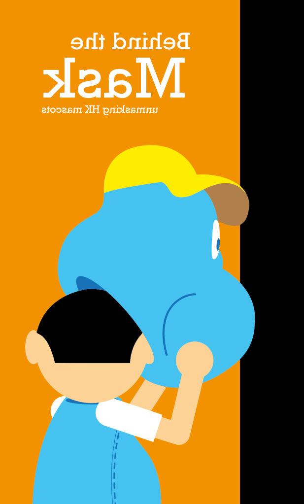
It went on for a bit, but something did not feel right…I don’t want to conclude this just by sticking arms and legs on the cover, and just going the “kawaii” route. So I went back to my title of “Behind the Mask”, and came up with a new illustration.

It started to ring better, and that I have taken cue from a 5 year mascot actor and personal friend “do not unmask while in mascot costume” and swung it out of the park. I started thinking that it is exactly what I am doing with my writing, and that in order for people to learn more about the path and details of mascots in HK, there is no avoiding of unmasking. I hope that readers will learn to appreciate the mascot culture by bringing more focus to the topic.
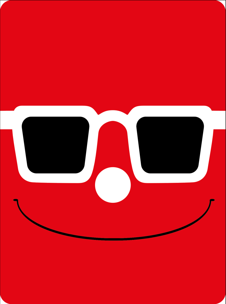
The orange in the background was chosen out of a very common impression between Hong Kong citizens and Government services : The orange is the recognizable color of the Public Health and Safety Department, for many years this color is commonly seen on street trash bins, and the color holds significance to HK.

At first, I wanted it to be a “coffee table book”, a big bulky book meant to be flipped through for leisure sake. It was met with quick feedback from my instructors, and aside from some minor altering to the writting suggested, there was another thing that froze me : composition was not based on a grid.
Ive always prouded myself in being a “cartoon man”, thats’ what I wanted to be and I take the opportunity to just cartoon my way outta projects as much as possible. Now that I am faced with editorial design and I will be honest: I am clueless.
I recieved an extenetion to my course due to family matters, and that I have received ample time to figure this out. I have tried using a grid before, but then everything turned out just didn’t seem right. After the many failed attempts of laying out a grid in AI, I finally landed on a solution that I am not super proud of ; but which I have learnt a great deal from doing:

I took an existing grid and started to use it, and that things finally started to make sense to me. The last time I ever used one was during college, and who knows what kinda wonders helped me pass that paticular assignment, but I did not get it up until now. I cheat with the grid here and there in order to maintain balance to all images and text on it, slowly as I got more pages done I finally saw the neat and order to my pages.
I was told at some point to change my title font from Rockwell to something else, that Sarif fonts might look a bit dated, but after much selection I still landed back on Rockwell. I want a museum quality to my book as if someone is at an exhibition on HK mascots and I find the font to hold a certain sense of wackiness which plays well with my cartoon related subject, it plays along with the reason why I have arranged everything with a sense of space in mind ; more negative whites in providing more attention to the subject on hand. So I have achieved an arrangement that is fun with an exhibit quality to it.
So, progress continued on until I reached mid-way and I froze AGAIN. Having ignored the fact that my piece of writing is only 3000 words long, it only just occured to me that I won’t have enough pages to compile a whole book!
Then 3rd module started and I am stuck. What life has taught me after I passed my 30s though is that : answers tend to pop-up when we move ahead and keep an eye out, so what happened was that during module 3 week 1, I stated a “mission” to help HK citizens see the value in good design. After that was said and done, I was out for a walk one night and then my query was answered after what must’ve been a week. To tackle the problem with HK peeps’ groundedness, the material must be short and most of all must be free of charge! It was an exact fit. The Hong Kong Handout is to be a monthly short read to take up readers a sweet 15-30 minutes to finish, informative on specific subjects and easy to obtain a copy, I do not want to create an app subsciption and to eliminate the distractions that nrighbouring apps and ding dongs might cause; just the reader and their booklet. The logo of HK Handout is a quick idea based on slot machines (3 Hs aligned), signifying the randomness of topics while you might just “hit the jackpot” and benefit by learning something interesting with every issue.
For each issue to be a different topic, id like to invite other friends in the creative industry to carry on writing for the other issues, there will be different cover designs and a selection of a main color. After all that is decided, Id like to further more my own issue and make it more interesting to look at, and a quick turn around and changing shapes landed me with a classic 90s optical illution very commonly seen on Mickey Mouse tshirts. Bring this “back view” optical illusion is a decision made to create a pop culture nestalgia.


For the very last pages, a preview of the next issues’ topic and also a page to credit the creator of the specific issue. This is to help (well my business) and the businesses of other guest writers, to get the word out there of what kinds of services which the person or company can provide, another effort to push the design industry here in HKC.
So let’s see (when im finally don’t have to work on 2 modules at once) if I could start translating these booklets in to Chinese and be handing them out for real! I am really happy to see this finished and is extremely pleased that I have finally picked up how to use a grid effectively.
ANDY WAS HERE
