Darkest Force is:
A company focused on logo work, graphic solutions and video editing. We are looking at younger business owners who would like to tie their operations with the flare of pop-culture and sub-culture, to aid “the scene” in hopes of changing the outlook of Hong Kong’s landscape.
Services:
1:
There is a lack understanding of how well done graphic design could benefit the variety of businesses here in HK, for example : local eateries, apparel, education, services, electronics, IT services, packaged product etc. In the years which Art Director Andy YH Lau has been in the graphic design biz, there is s realization that the general public thinks that design is no different than lil’ art and design projects done in grade school. So forms of material to educate the public is of importance.
Physical Outputs :
-The Hong Kong Handout (monthly printed material on a specific arts, design, cultural, local crafts topic).
-Online platform in educating and promoting design.
-Small team in producing blogs and videos on the topic of design.
2:
Before the actual design work is commenced, our team of advisors are here to provide pitches to owners looking to spice up their business. The usual conversation before reaching a contract to begin designing is a relatively long process:
-we find it to be best when our clients are involved, to have them understand their part of commitment and involvement
-to have clients fully understand how the process is like, what and when are initial ideas, development, the end product is to be expected.
-Most of all, the client is knowledgeable about what the end product will be, how it is to be used once finished, and that to assure that he or she will continue to receive support for a period of time once the design is delivered.
Projects in themselves are also able to serve point 1, in educating clients and to help them see the results and difference a well designed business or service could provide. This might
take longer than the average firm or studio, but we fully recognize the long-term importance of changing the impression of design towards the general public one at a time.
Physical Outputs:
Branding, logos, illustrations, packaging, info graphics, creative solutions.
Market Outlook and Potential:
The general marketing seen here in Hong Kong is experiencing a change in to a different era, it is witnessed that the content and pitch of commercials and ads are being handled by younger talent. Which signifies that the creative industry is:
1: Studio, firm owners are leaning more to a younger population.
2: The overall target audience of businesses pointing towards a younger population.
To appeal to this upcoming wave of more youthful and energetic content, branding and business operation, our firm shall stay at the very front in updating on what is trendy, the latest slangs and happenings in order to provide solutions that could serve the newly founded or elder businesses that would like to be rebranded.
Case Study 1:
The case of 3.9 by the Honey Collective is about to launch on July 4th, 2 young entrepreneurs that used to work in creative agencies that did not require too much guidance, they are exactly the clients we very much like to handle: young, open minded and full of potential.
Brief
3.9 was founded by 2 gentlemen who have pounced at the opportunity of an upcoming trend in CBD products (a biproduct of cannibas). Their idea is to infuse this supplement in to honey which works well with a variety of things such as : water, tea, cocktails, toast, bbq.
They were specific in what they wanted, and instantly agreed on a combo of greys and dark greys in creating a slightly scientific/hip logo and honey jar label. The thing that they lacked though was on pricing and the fact that they had to stick labels to jars by hand.
Solution
-Originally wanting to price the product at $220 HKD, $ 250 was suggested by us so that they would have a $30 buffer to pull discounts and promotions.
-The label has most of its content laid out horizontally, a strip of taglines and an actual colored line was added vertically in aid of their labeling work.
Case Study 2 (in progress):
Leung So Kee Umbrella Factory is a historical umbrella shop in Hong Kong which has frozen in time for decades. The business owner was an elderly gentleman without much interest in branding to begin with, but after viewing our proposal along with some suggested material, Mr. Leung has agreed to green light and to rebrand their business to appeal to a younger audience.
Pricing:
We have different business proposal plans for different clients, and usually depending on the decision to provide more counseling or not is the main difference to the pricing.
Pricing also varies depending on the request of different clients.
Case Study 1 : $5000 HKD for logo work, labels X 2 (only slight differences) and flyer.
Case Study 2 : $5000 HKD logo work, packaging, receipts and order forms.
with an additional $3000 HKD consultant fee + follow up for a month.
Darkest Force Roster
Design team – 1 Creative Director, 2 Graphic Designers, 1 Motion Graphic Artist
Consultant team – 2 Advisors + Proposal Pushers
Freelance – 1 Website Builder, 1 Copy Writer, 1 Accountant
Dark Matter Works (latest update)
After having registered Darkest Force with Hong Kong’s Business Registry, I started thinking that maybe Darkest Force as a name is not gonna work so well for it’s lack of seriousness and that the relations with design is too low.
After much consideration, I chose the name Dark Matter Works for dark matter’s similarity to graphic design, influencing a flow and pull in an “undetectable” way. So now, Dark Matter Works is a design firm under the Darkest Force brand.
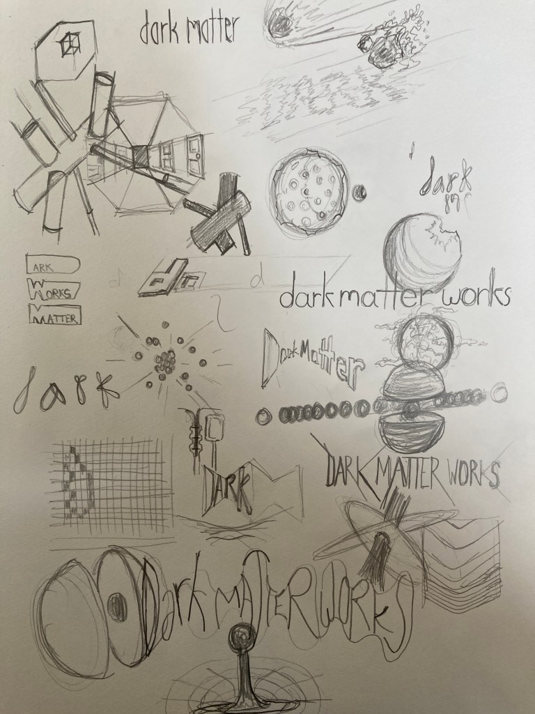
These are the sketches I did in coming up with a new logo, compared to the development of Darkest Force’s logo MANY years ago, I still want the sci-fi element to it, yet this time I do want it to appear more professional and have it appear more trust worthy.
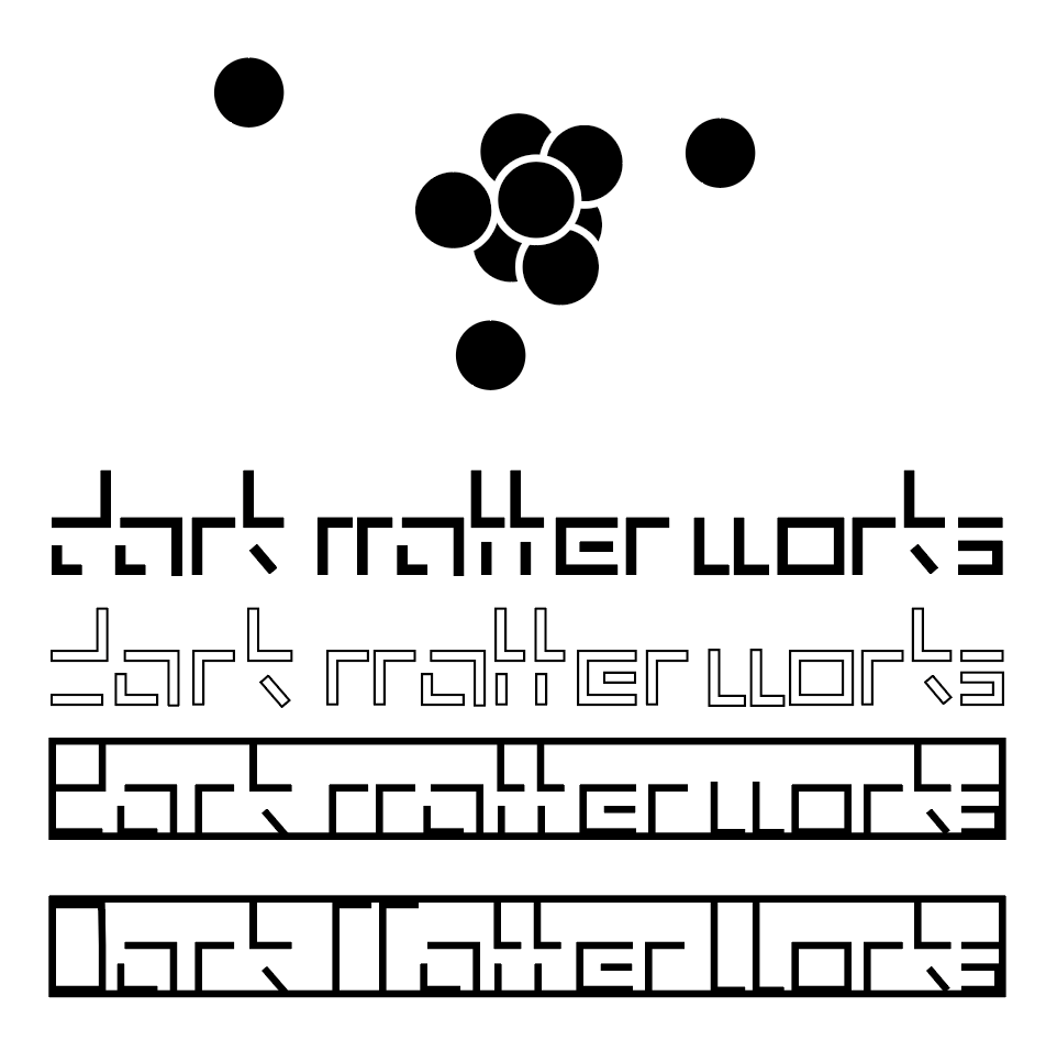
The final output is based on the typeface design above, having liked it but never having been a huge fan of “writing everything out obvious”, I decided to try and extract the first letters to build with, ending up with a logo I think fitting for my attitude, direction and what I want Dark Matter Works to represent.

The logo is a result of a plan to make a printer friendly business plan.In this document everything is mostly black and white in considerations of the COVID-19 pandemic. I came up with that idea having sat at home for months in total during the first and second out break here in Hong Kong, with a crappy printer at home, there isn’t much viewing quality documents, and I thought to myself that it might be the same for many of us.
This might be a one time plan, but the logo is the result I am looking for. The whole black and white considering crap printers could be a pretty sweet background story for the birth of this logo I suppose.
ANDY WAS HERE
