3000 Comic Strip, Mood Boards & Development
Now if I were to work on this comic strip on my own, I don’t think I would formally go through the process of research and moodboarding at all. Having just finished these mood boards though, I think it made everything a lot clearer and also extra considerations came with these moodboards to have this become more than a comic but a well developed, targeted piece of graphic work.
Struggles
When I was earning my degree here in HK, I have attempted to create a super hero character that people in Hong Kong could be proud of, and I will never forget this instructor I had named Gary. He was my instructor for essay writing, so I showed him my first draft when I had around 1000 words, and he told me : comics are not graphic design. He wanted me to rather back it up or change topic which he highly recommended. I did not want to back out.
After having hunted for more research content to back myself up, I came across a lecturer from the US named Arlen Shumer, author of Silver Age of Comics and at the time was touring around US on the topic of graphic design in comics. He was super kind and we spent 2 hours on the phone talking about research, history, typography and composition in comics, I thought I hit my jackpot and will be able to change Gary’s mind. But even with this strong backup he gave me a marginal pass on my essay and left these words in my feedback report : comics are not graphic design.
New Realization
Of course I was upset and all, and for the comic part I totally bombed that too…I think skill-wise I was not ready back then and I did not spend the time to find a good way to produce comic panels. BUT in the last module, I did a small Batman strip that actually restored all the confidence I need to attempt a comic again.
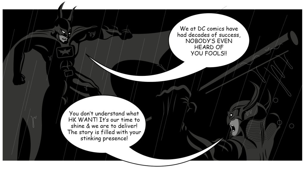
At first, I was worried the whole “comics are not graphic design” issue might surface again, but during the webinars I found my intentions for a self-initiated comic story not so far off from a video game. There is work to do in pin pointing all of my coming panels, character designs, settings in a meaningful direction, to bring the atmosphere to the intended audience (Hong Kong people) through graphic art, and ring the right bells with my story.
The Plan
The idea of 3000 has developed in to a project with commercial/ marketable intentions.
I have read many interviews by Japan manga artists like : Akira Toriyama (Dragon Ball), Eiichiro Oda (One Piece), Naoki Urasawa (20th Century Boys), most of them claiming to have achieved their master piece in a crummy apartment surviving on instant noodels, never expected huge success years later but worked purely fueled by passion. Financial success for them came in the form of TV/ anime adaptations, leading to related merchandises and toys flying off shelves. I have been greatly influenced by this methodology while growing up with Digimon by Bandai and 4WD Brothers by Tamiya.
Instead of “just working on a story”, I want to appeal to a younger Hong Kong population. So in the following is a walk through of my planned story along side mood boards to explain the complete idea I have in my mind.
I intend for the story to go on, but to balance my work load as a self-initiated project, my plan is to release and develope the comic slowly in short 12 panel strips at a comfortable bi-monthly pace.
1 : Ancient Super Cyclops & Their Curse
The story of 3000 has always been thought out to be based on kids rebeling against adults. Having came up with this simple story 8 years ago, the scenario sort of took place here in Hong Kong in 2019 when teenagers headed protests and later riots in expressing their negativity towards the government and “the people on top”.
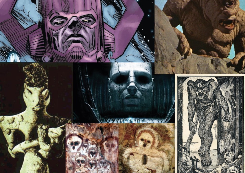
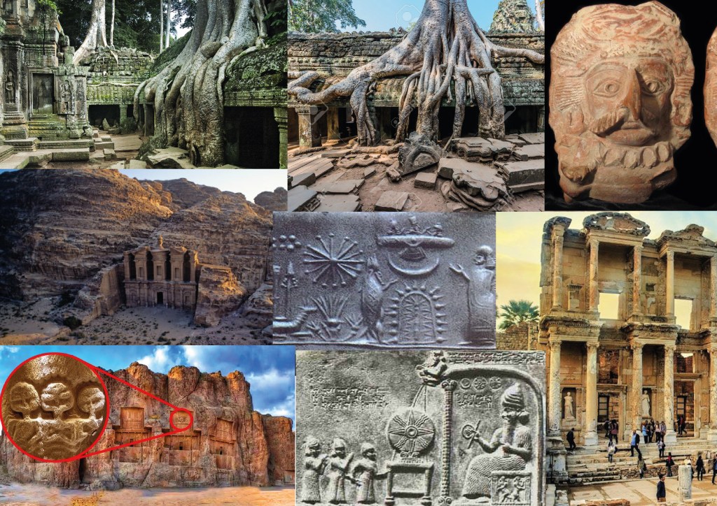
But in my comic, I want a more distant explaination to how young children (not teenagers) would have the strength and know-how to go berserk. So after years of podcasts on ancient civilizations and conspiracy theories I landed on one which made myself super happy with : The Annunaki or as some claim Cyclops Giants.
The super beings of these ancient civilizations millions of years ago were said to be super advanced and were responsible in kick starting human civilization, after humans got out of control and having struck an ancient nuclear war, these super beings went underground in to hiding.
In my story, all of the above happened with one twist : Before the “beings” went in to hiding they are to curse mankind by saying : “Evil will return in the form of a white powder and infest your children”. (please bear with me, after this connections are to be pulled with real word issues).
I settled on the beings to take the form of a race of Cyclops about a month ago, and that I wanted to include the mystic element in to my story to make things more interesting for people in Hong Kong. Escapism and fantasy is very popular in busy cities such as Hong Kong due to daily stress and mundane tasks at work, that is the reason why I wanted to slip a mystic higher power early on in my story to be able to add a further layer to a relatively “normal” storyline of : kids taking arms and rebel against adults.
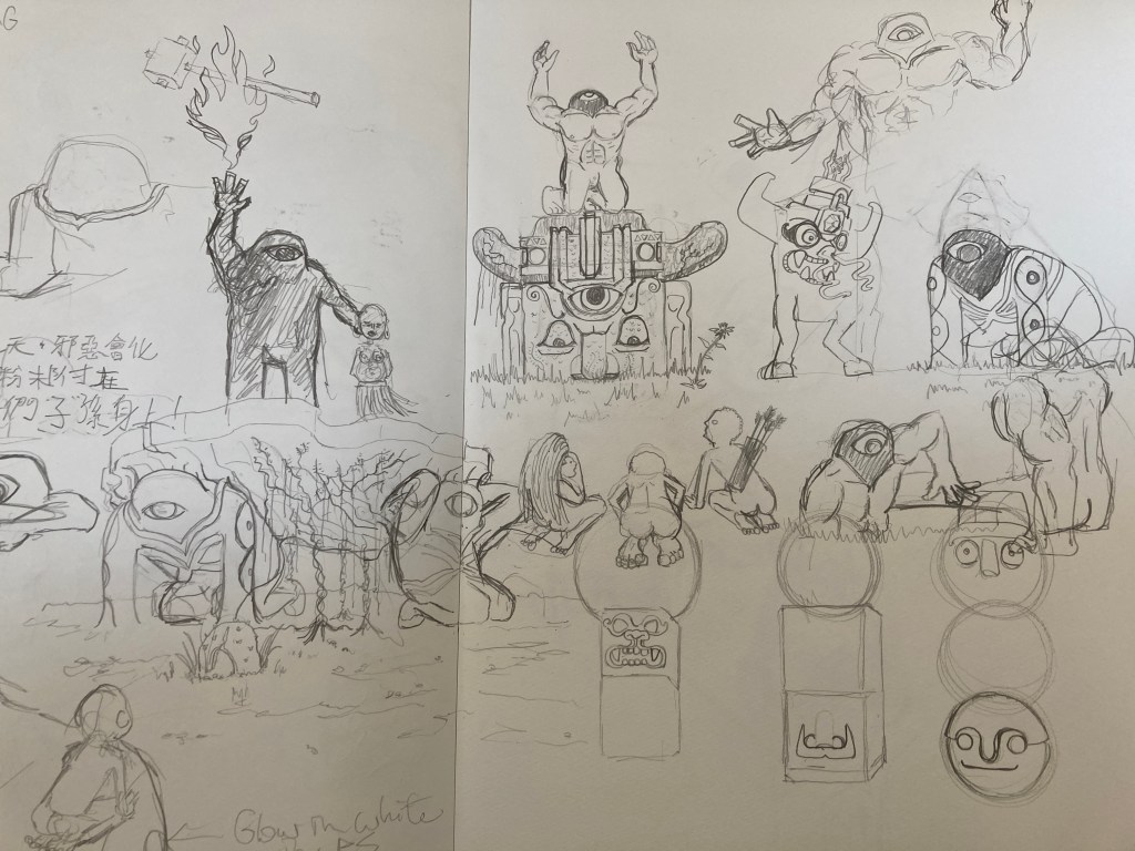
To be honest, I have only gotten to think of what is to go on for the 1st issue (around 12 panels), I am yet to think of when these beings are to reappear again; I am planting this seed on purpose for the future.
The Year 3000
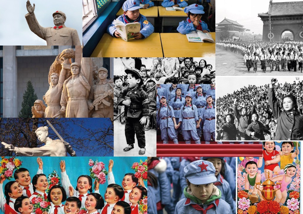
In a Utopian society (which appears to be Chinese), a class of children were seated in a class room, forcing the brightest of smiles while they are hard at completing a math exam. The following panel falls on to a boy in his neat uniform and combed back hair when the reader starts to realise that veins are popping on his forehead, sweat dripping and his smile starts to fade. HE SNAPS, and starts to stab the teacher with his pencil. Chaos, not only breaking within the classroom, but all over the city!
What is the cause of this? Back to reality, in 2008 there was a Chinese Milk Scandal that broke out in China when a baby milk formula was discovered to be responsible for kidney problems with infants and the company responsible having attempted to cover up their mistakes.
Now back to the story, the cause of the children rebeling is tied to the Milk Scandal, remember the white powder? Infant formula.
The choice of this is also led by my observation that children born these days are a lot smarter and that they grow to be freakishly tall, and in inquiring and bring up the issue amongst friends, the answer usually ends up back to milk formula. In Hong Kong, manufacturers pour millions in advertising infant milk formula, coining scientific terms like HMO, Aptamil and other fancy words like that; and since the China Milk Scandal, Mainland Chinese have been buying bulks of formula from Hong Kong, becoming one of the grudges HK people hold against the Mainland Chinese.
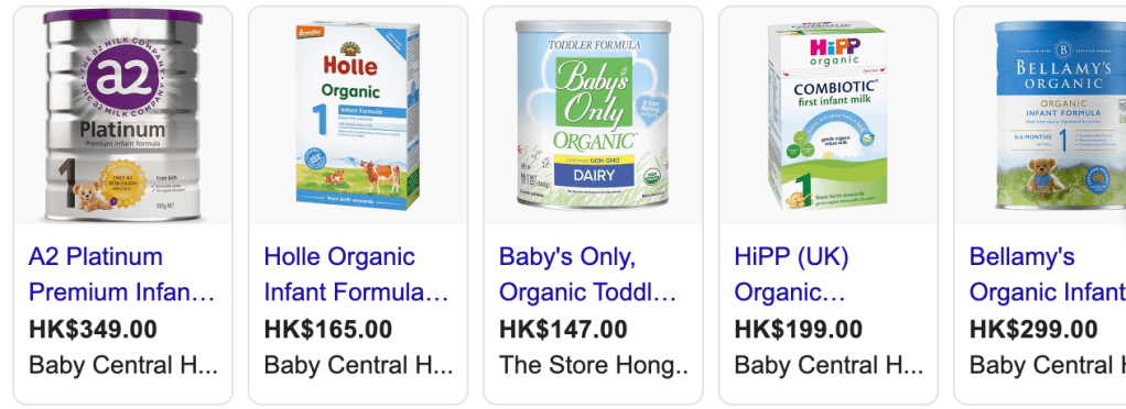
Personally, I think it’s unnatural to be boosting growth like this and there has always been talk about the side-effects milk formulas could bring. In a total fictional way, I am trying to include this issue in to the 3000 story.
On the other hand, the selection of the children appearing Communist Chinese is a tap in to the fear of some living in Hong Kong: The era of Chairman Mao’s Cultural Revolution from 1966-1976 was a significant period in time that made HKers fear the handover from Britich Colony back to Chinese rule.
The comic, is raising and highlighting happenings here in Hong Kong, serving the purpose of awareness with the use of story telling and graphics (comic). With decisions like this, I am attempting to bridge graphic design and comic as close together as possible.
Illustration Style
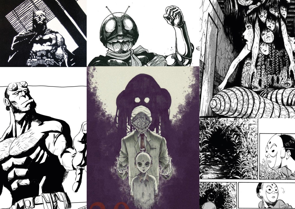
I want the comic to appear dark, giving the reader a sense of unease as one scans the panels. I selected panels from Kamen Rider (Shotaro Ishinomori), Hellboy (Mike Mignola), 20th Century Boys (Naoki Urasawa) and from Japan Horror Master : Junji Ito. They are all known for a solid high contrast, shadow and texture heavy drawings which is exactly what I am after, which I think is great for blood and gore yet pops and stands out in a modern way compared to the inside panels of more traditional artists like : Jack Kirby, Todd Mcfarlane and Alan Moore, which they take more advantage of color print.

On a side note, I want to illustrate in “black and white” and to print my issues on colored paper to stand out in a genre that has much competition, also to attract more attention to my relatively short issues of 12 panels, neatly packaged in to a black folder.
ANDY WAS HERE
