Pack’em Together, Cut & Paste
The 4 weeks is almost up! For the little time there is, we were not expected to have everything finished, but for me, I atleast wanted all my frames to read.
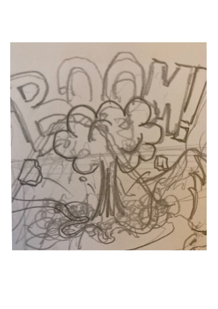
For me it is super important that even without the speech bubbles that one could understand the sequence just by looking at the pictures. So after having laid out what is to go on for every panel, I ended up with 18 including the cover art. So with my drawings scattered through different pages, I started taking pictures of them and essembled them in order by roughly masking them in Illustrator first, and it looks something like this…
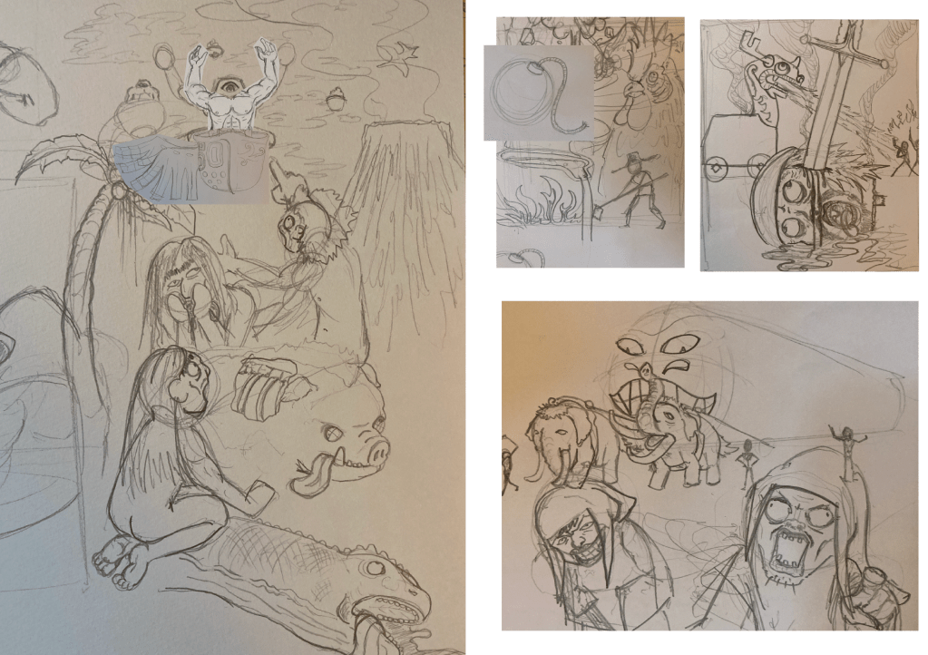
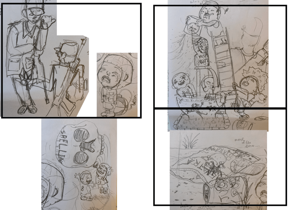
As seen in the examples, I tried my best to toy around with the camera tricks I picked up from my comicbook collection and camera angle tutorials on https://www.studiobinder.com/blog/ultimate-guide-to-camera-shots/ (I highly recommend this site for a quick guide to camera shots and tricks). I utilised insert shots, establishing shots, POVs and crowd shots…The extra tricks I think is a great improvement from what I did when I was younger and that the pages are just THAT more engaging to look at, I am finally on my way to achieve a comic I can be proud of.
Here’s a look at how I create my panels in Adobe Illustrator, the original process took around 45 minutes.
New Found Love For Calligraphy
Due to the massive amount of drawings before I ended up with a selection i’m satisfied with, I decided to finish the cover art to make my presentation date. During that period though, I ended up with 2 individuals freelance jobs which required me to dive in to some Chinese calligraphy.
In HK, we were required to practice a traditional style of calligraphy names Kai Shu, but after years of not having touched a calligraphy brush, the form I was aiming for was a more free form of calligraphy coined the Real Type by Master Au Yeung Cheung.
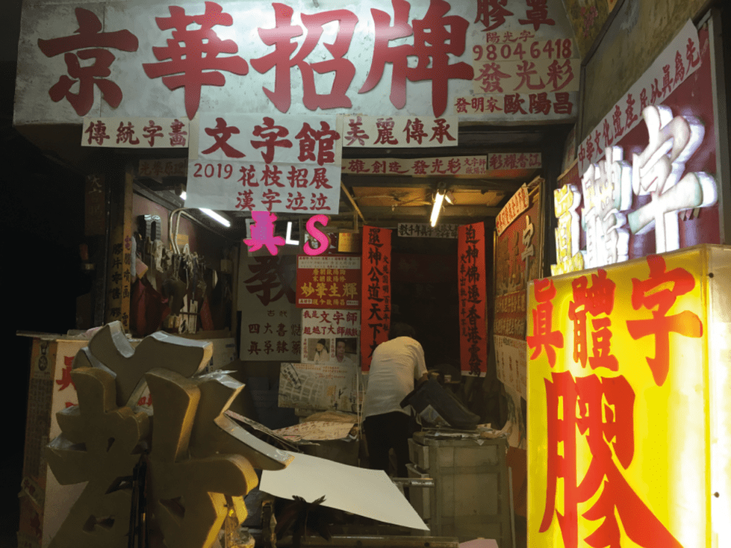
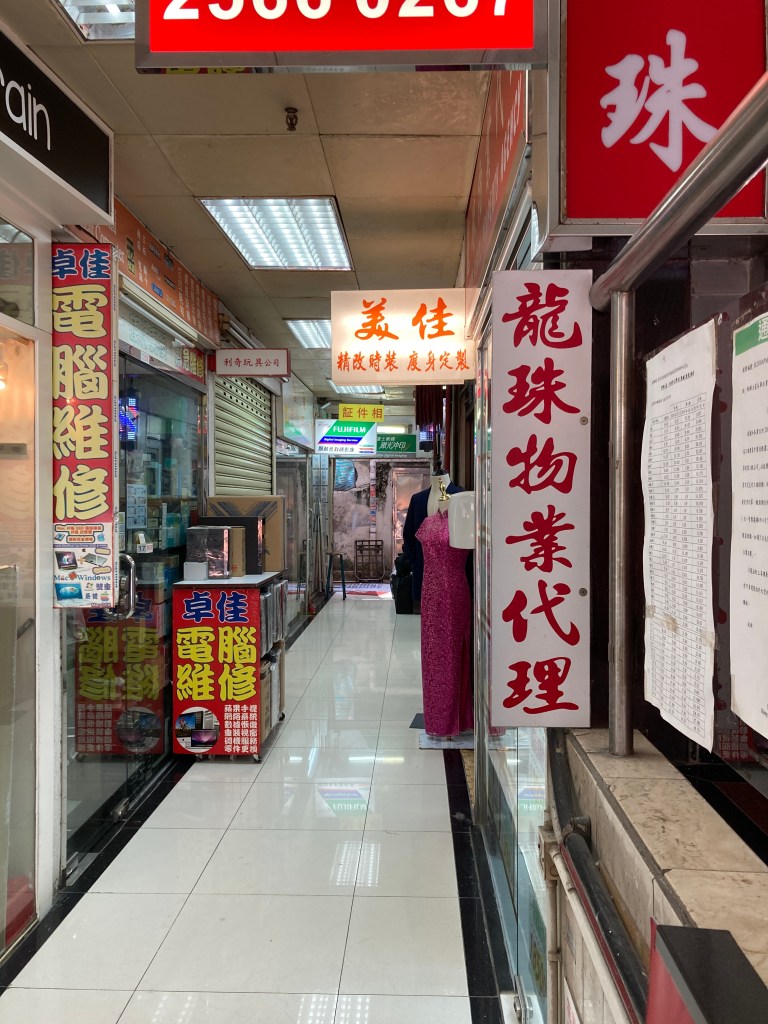
He is a true master at calligraphy and sign making, with an estimated 700 signs hanging all across Hong Kong island, but to be honest I have problems really talking to him. The couples times me and my fiancee met him he was around 70 years old, he never really seems to sleep much and that I would honestly say that he is suffering from some slight mental issues.
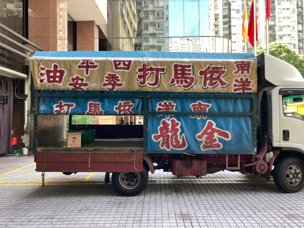
The first time we started chatting we had a sign made and took a 3 hour lesson (inteded only 1 orignally), by just writing over and over again on scraps of newspapers…he differs his style from the rest by emphesising on specific strokes such as: the very first strokes should always be on a 10 o’clock angle, the thicker tails should always look like a knife and the tips of vertical strokes should end like a chubby carrot. The amazing thing was after the 3 hours of practicing, we walked out to the many signs and billboards on Queen’s Road to find ourselves being able to pick out every writing and stroke, recognising a whole lot of signs done by Master Au and how they differ from the others.
Here comes “the problem”, we went back for visits but every single time we had to reintroduce ourselves again and Master Au would (with understanding and respect) repeat every single thing he has said before…
I’m really thankful for what he taught me and I do wish to take more lessons from him to further improve my calligraphy, but since everytime I see him ill basically have to go through hours of him repeating the same things and including the actual lesson it will take a good chunk of a day’s time…so ill leave that til I have more free time. But he showed me a standard uniquely his, and I am able to produce some type that is true to Real Type for my freelance work and the comicbook cover.
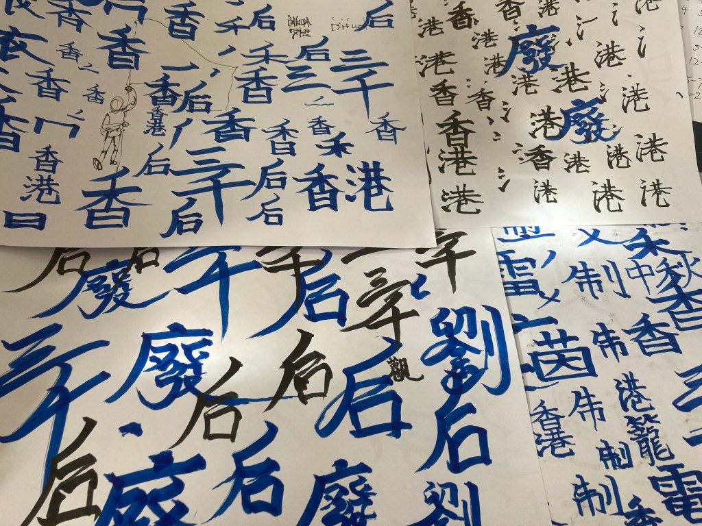
The tactic was simular to the comic drawings : pages and pages until I get one that I think fitting! With the essence of Real Type, I wanted the writing to look more wild which led me to take some influence from a Japanese calligraphy style called Wild Type and ended up with this,
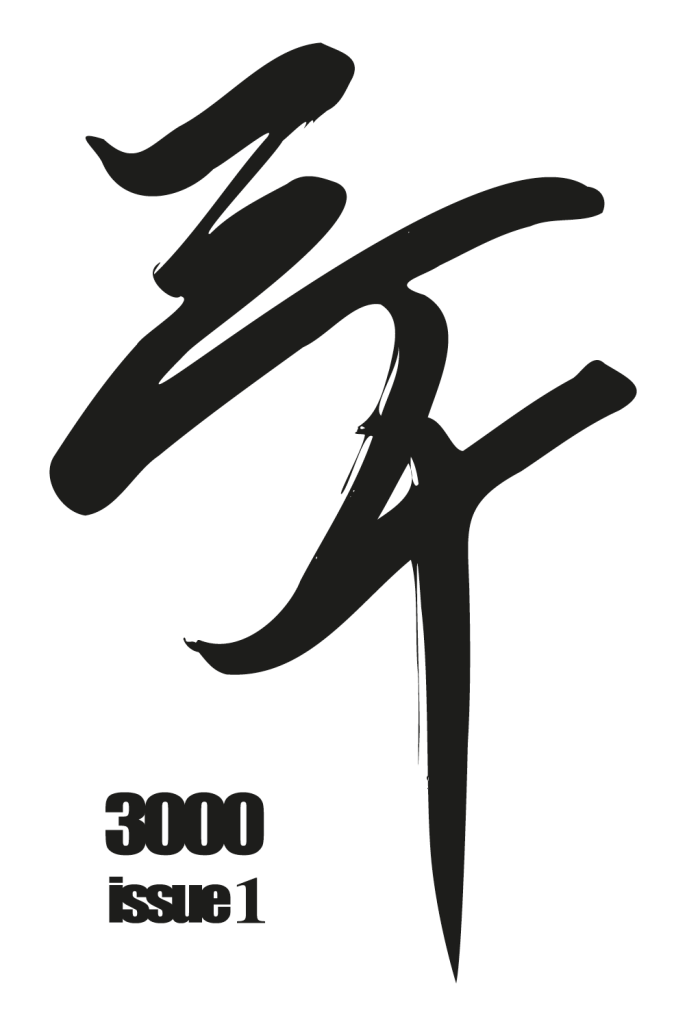
I popped the writing in to Illustrator and did adjust some points I think which could look better.
The syllables means 3000 (pronouced : Siam Cheen), which is the current title for my story cause it’s set to happen in the year 3000…for years now, I have always tried to think of a more fitting name for this story, but Siam Cheen just kinda got stuck, so I think I will leave it for now until i’m done the first issue. (but it’ll most likely stay the same, haha)
Cover Art
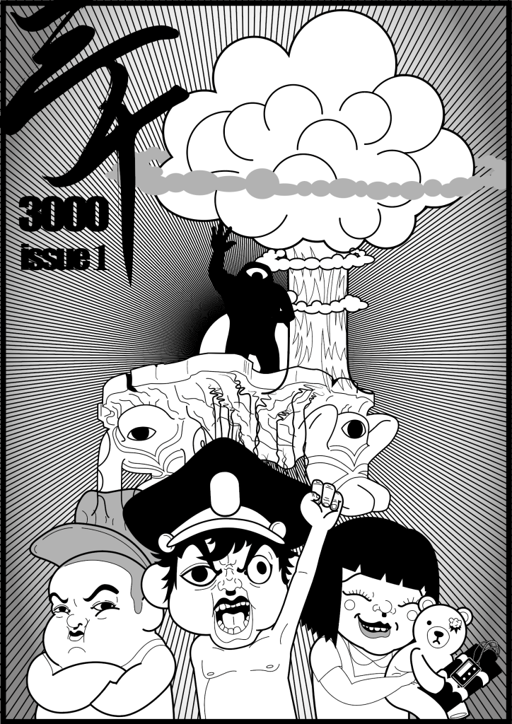
After the cover art was lined and shaded in Illustrator, I want my issues to differ greatly to the traditional binding, make my presentaion pop more and I thought a huge improvement could be done by experimenting with colored paper.
I then had the idea of slipping the pages in to a black paper folder, the color of every issue going forth will differ and in it will be a colored poster in hopes of raising the collectable value of eash issue.
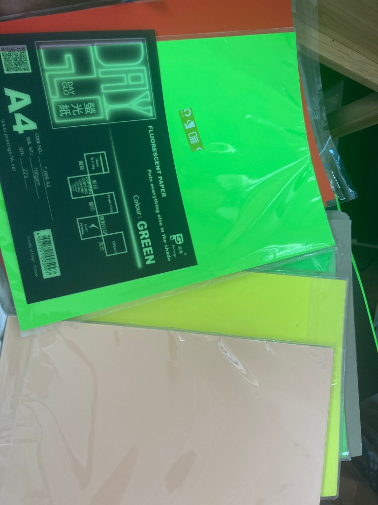
So my hunt for paper begun, nothing special at first, having came across primary colors and pastel colored paper, picturing in my mind that “eh, ill give em a go when I get home”. But then this magnificient neon glowing stack of paper just simply stood out on the shelf, in contrast with the others next to it, I knew exactly that is what I am looking for.
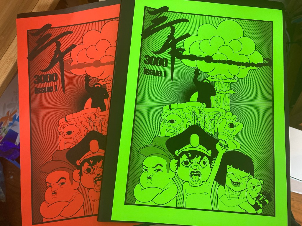
Although I think a bit more could go in to the illustration, the result almost brought a tear to my eye, although the panels are yet to be completed, this cover art came a LONG LONG way…it reminded me of the time when I was struggling with mental issues a good 10 years ago, and in contrast with the Photoshopped illutrations done back then I have really matured and that I think I am becoming the designer/illutrator I have always wanted to be. During the last module, Alec and Richard told our class something like “build your portfolio in the way you end up wanting to be.”, and that stuck with me since then. Now I think this single cover piece is as close as what I wanted to be.
As a self-initiated project, Id like to thank Richard for guiding me to take more graphic design considerations through out the process, without the advice I think it was really easy to have fallen in to the trap of “just doing drawings”, the extra research, dive in to camera angles and calligraphy has made the illustration come together with a lot more content and making this piece closer to a graphic design project. (he also told me to go on the streets to do live drawing…but I wasn’t able to squeeze the time, ill rememeber to do so in the future!)
ANDY WAS HERE
