FYP week22 : better start anew

It’s been around 2 months since the course has ended, and that on what seemed to be the closes I have ever been in reaching my dream of launching my own comic, characters and story, I have made a decision which I feel mature and fitting:

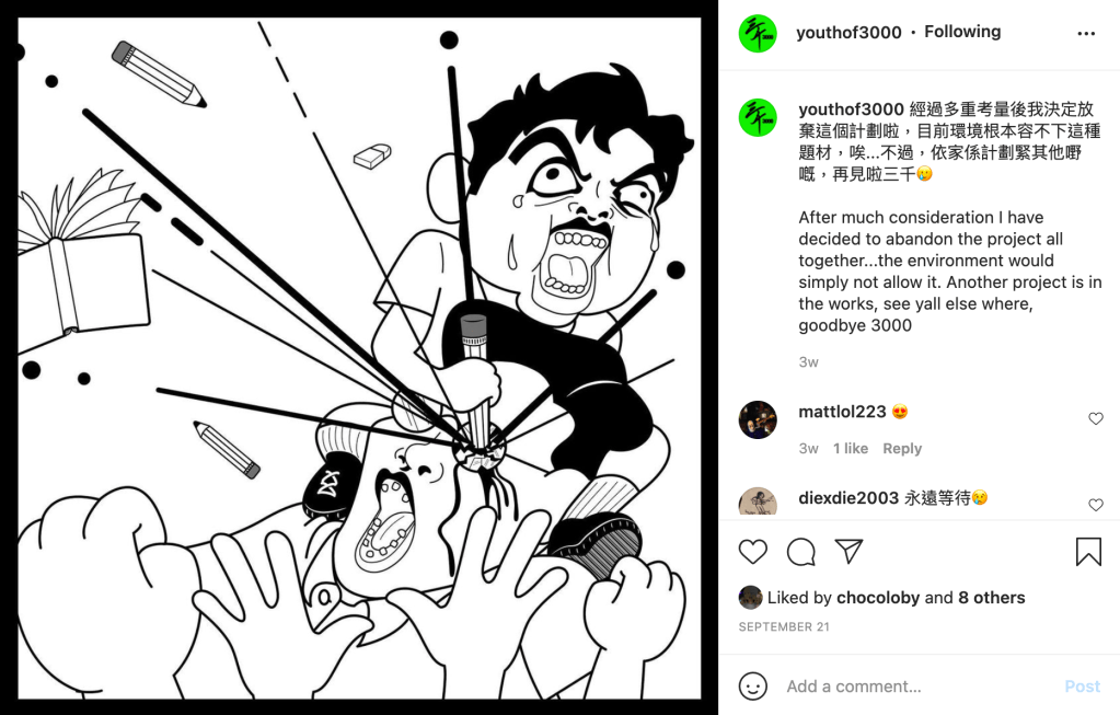
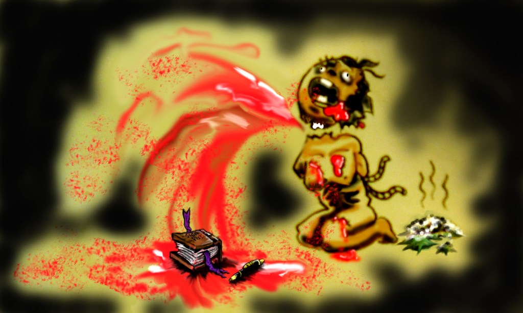
The initial plans for the story will not stand this test and if I have to change it drastically I don’t see the point in carrying on any longer. When I first had my idea I really wanted to express the kid in me who hated school, spill some adult guts and make this as controversial as I could possibly be.

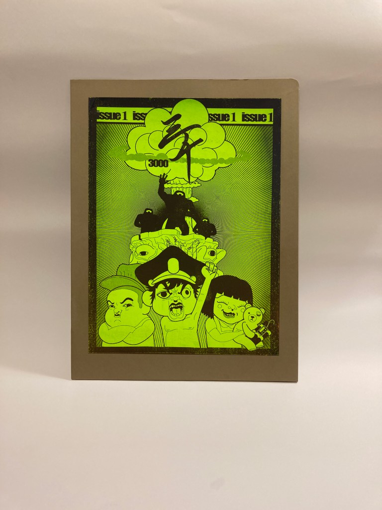
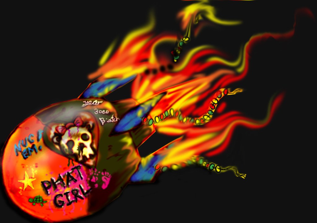
Now, 12 years later I have never imagined that a clamp down would be present at this very city. Although I do my efforts have been completely laid to rest, a great deal has been learnt in producing 3000. Shortly right afterwards though, I have came up with a series of ideas for me to start anew.

Monkey In the Middle Works

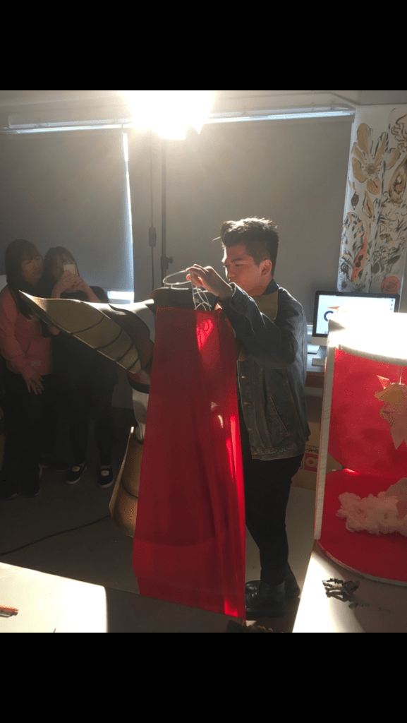
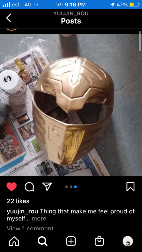
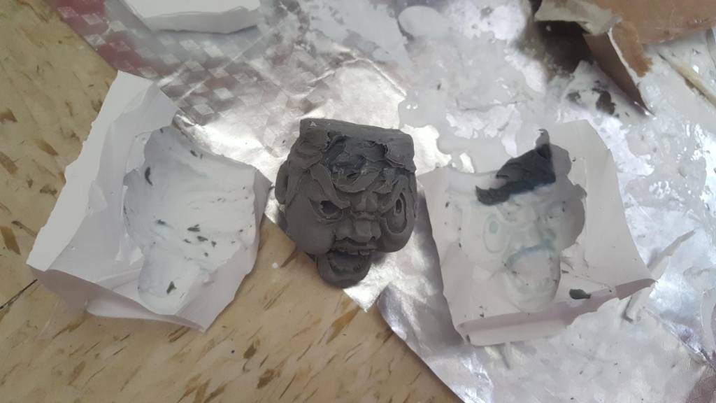
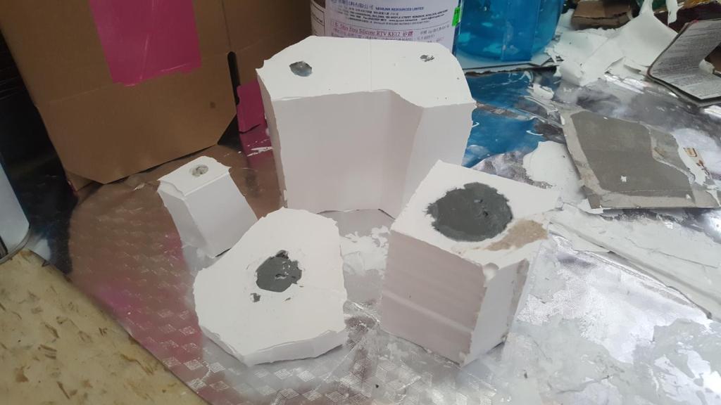
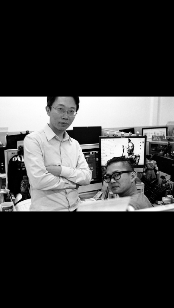
3000 has bonded me and Yuujin, as a former student I see him as a talented individual with his own set of talents, in which combined with my abilities to illustrate, come up with stories, manage a business and write reports, I called him up again in talks of an art toy / comic company with our sights set on government funding and he said yes! So the first thing I told him was: we are now equals, I am no longer your instructor.

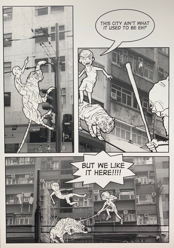
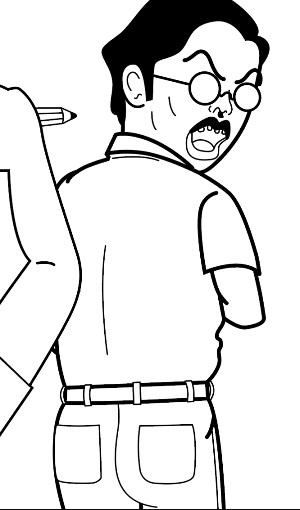
I went into my hard-disc to retrieve these panels I did for my degree, and quickly saw the advantages of a simple super hero story.

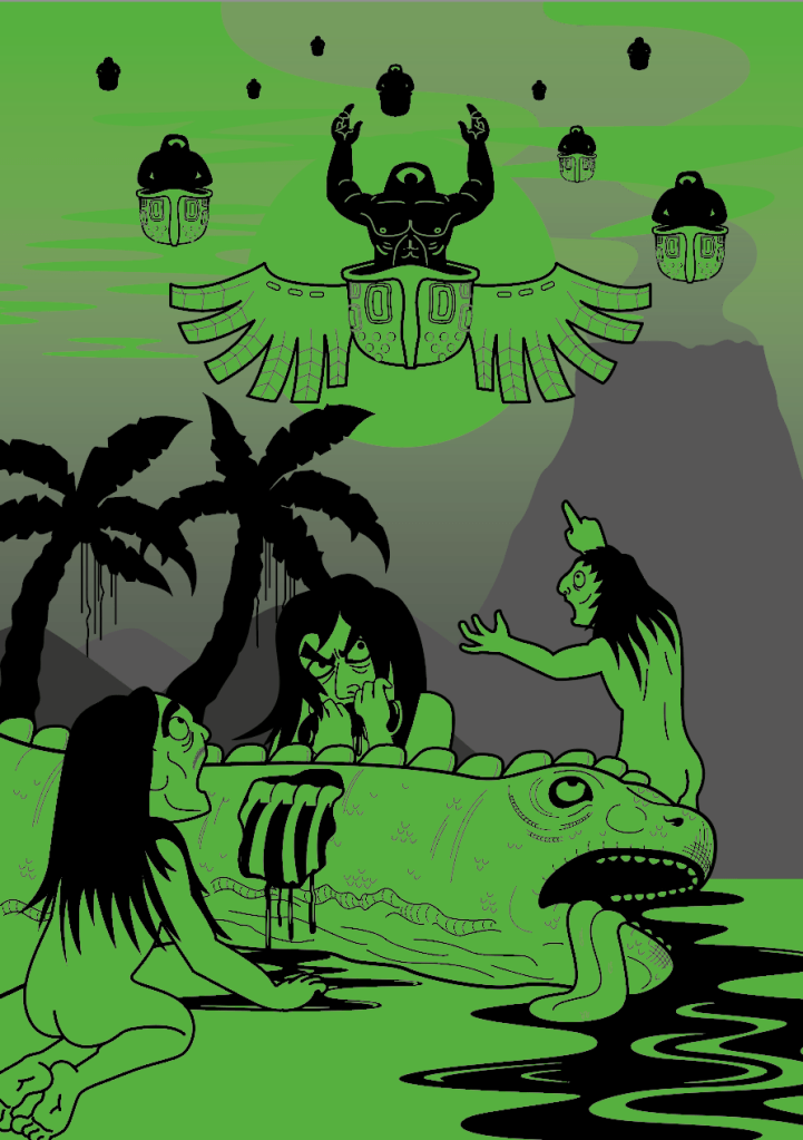
The idea was based on the Monkey King from Journey to the West, and that the gist of it was to base villians off of urban legends, fight scenes that happen at unexpected places within Hong Kong and that dealing with issues of everyday city life would be a running theme in this story.

Quickly Got to Work

With 3000 which mostly happened in the past 4-5 months of time, a lot was I suppose unclear. Now that I am starting a new project, I think a better grasp at what is needed is there, (excuse me) with acedemia put aside, a lot of my time could be focused on pure developement, and here are some things that were achieved in past months. This time, I have learnt to rough some story boards first.

Storyboarding

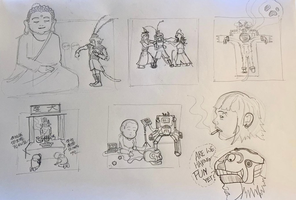
The original Journey to the West ended with the rebelious Monkey King (aka Wu Kung) becoming a god; and as a buddhist god they are not suppose to interfere with human affairs. Wu Kung being Wu Kung now complains of all the crimes and unjust happening in the 21st century, complains to Buddha why the gods are not “doing something about it”. As a result of his complaining, Buddha sends Wu Kung’s mostly powerless soul to the modern society in the conditions of him only being able to possess objects which resembles a monkey, and for the first century, he was placed in a statue seated at a Monkey God Temple.

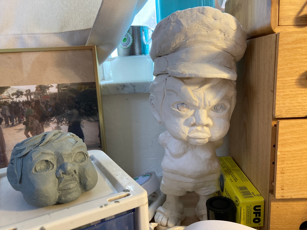
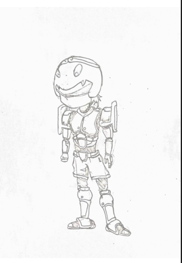
By chance, a genius little boy that lives behind the temple was building a robot with his spare time, and he was shaping it’s image based on the Monkey King himself. The adventure begins when a teenage girl breaks in to the temple one night and puts the head piece on as a helmet…

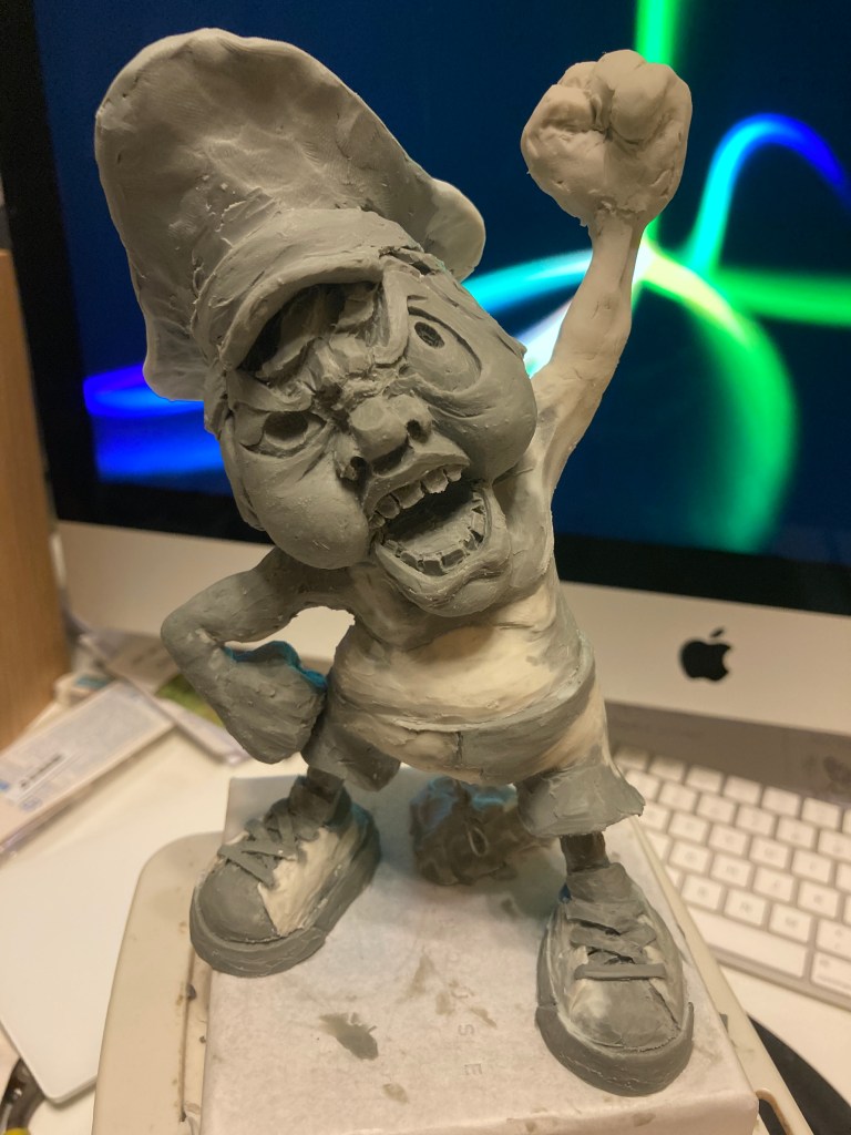
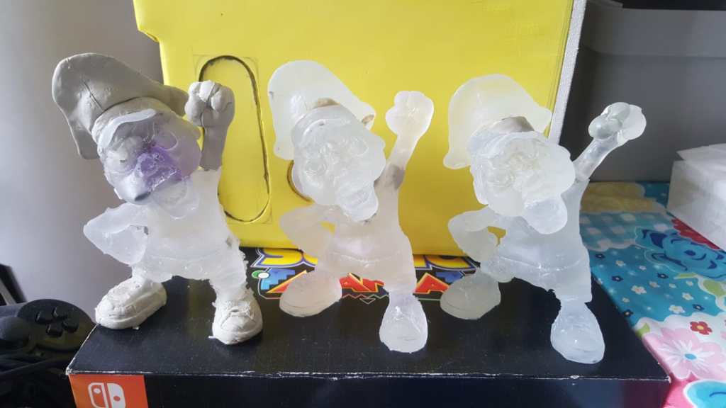
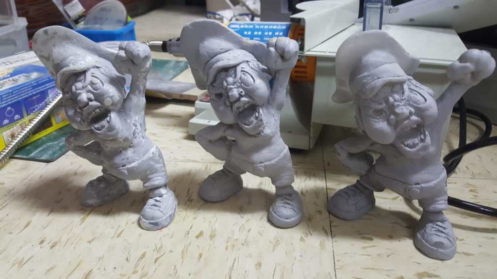
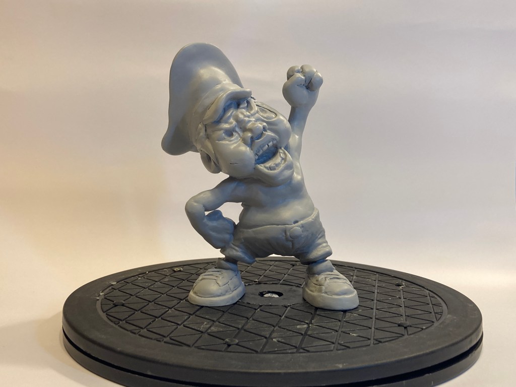
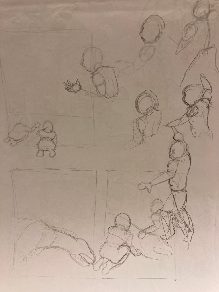
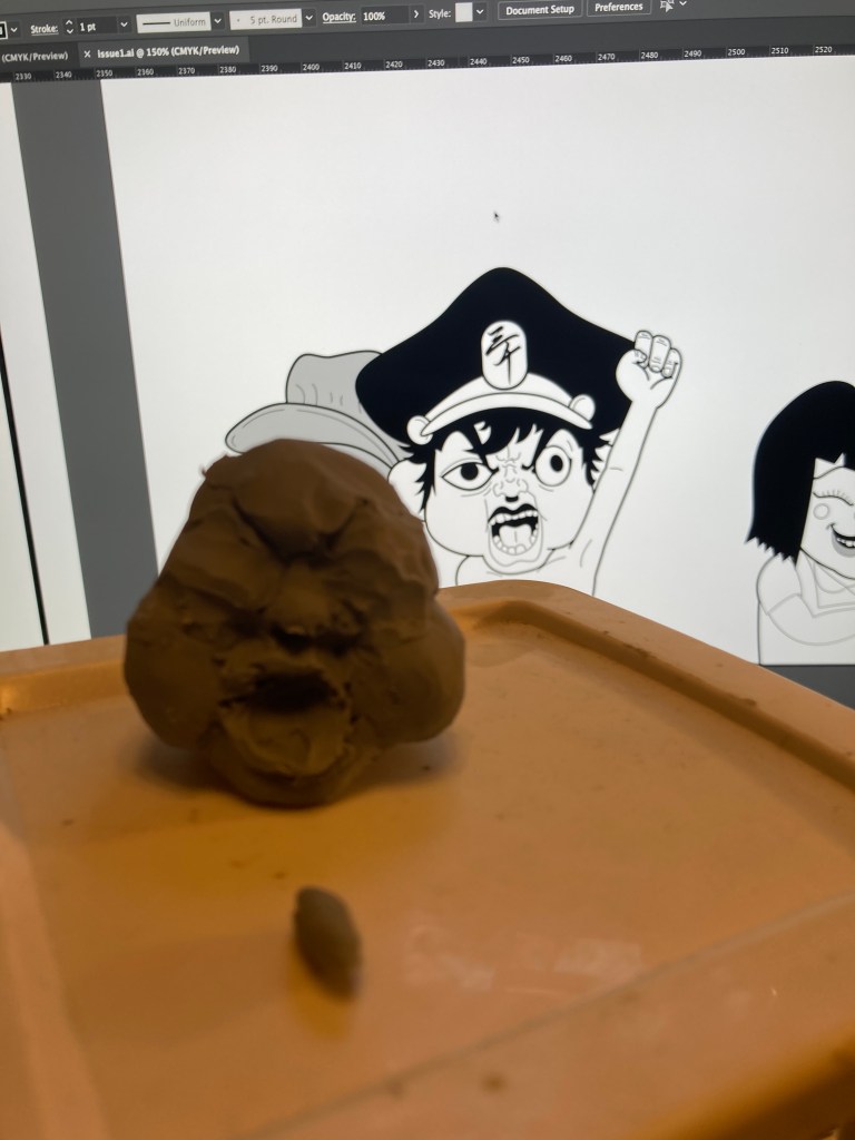
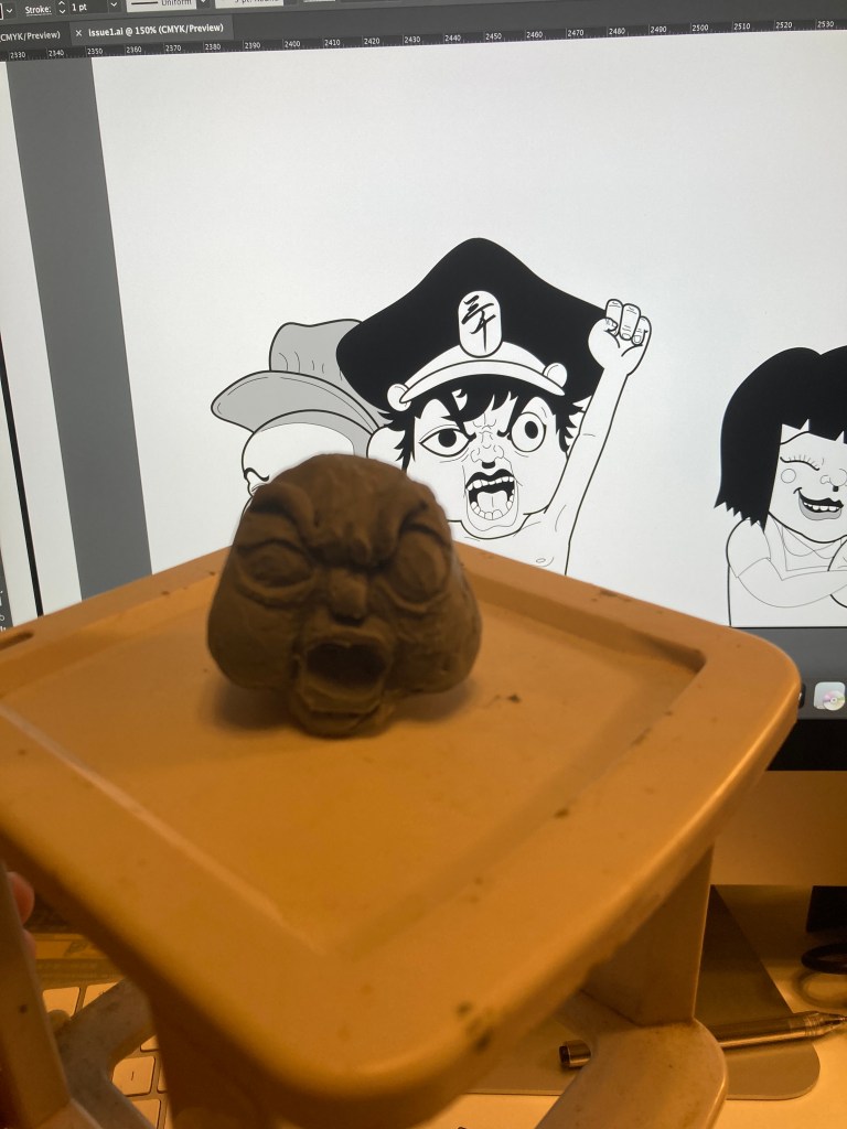
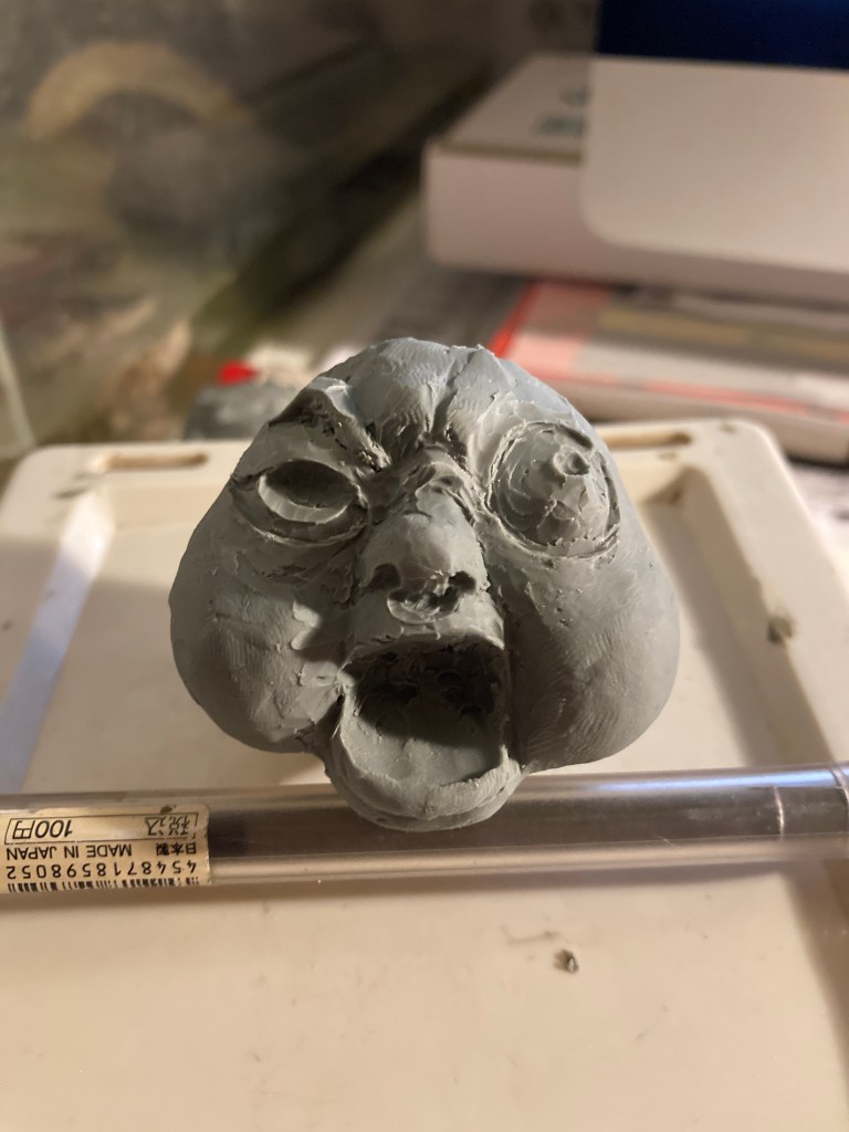
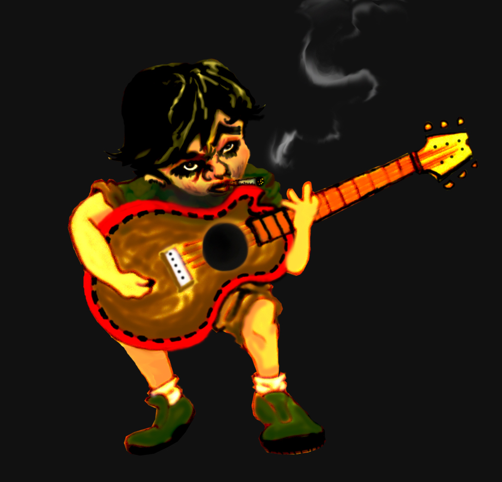
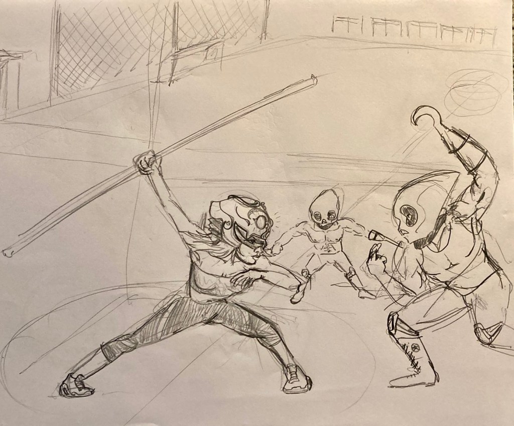
Character Development

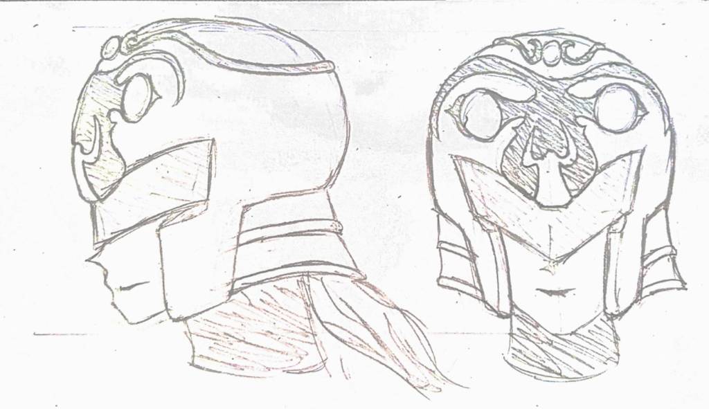
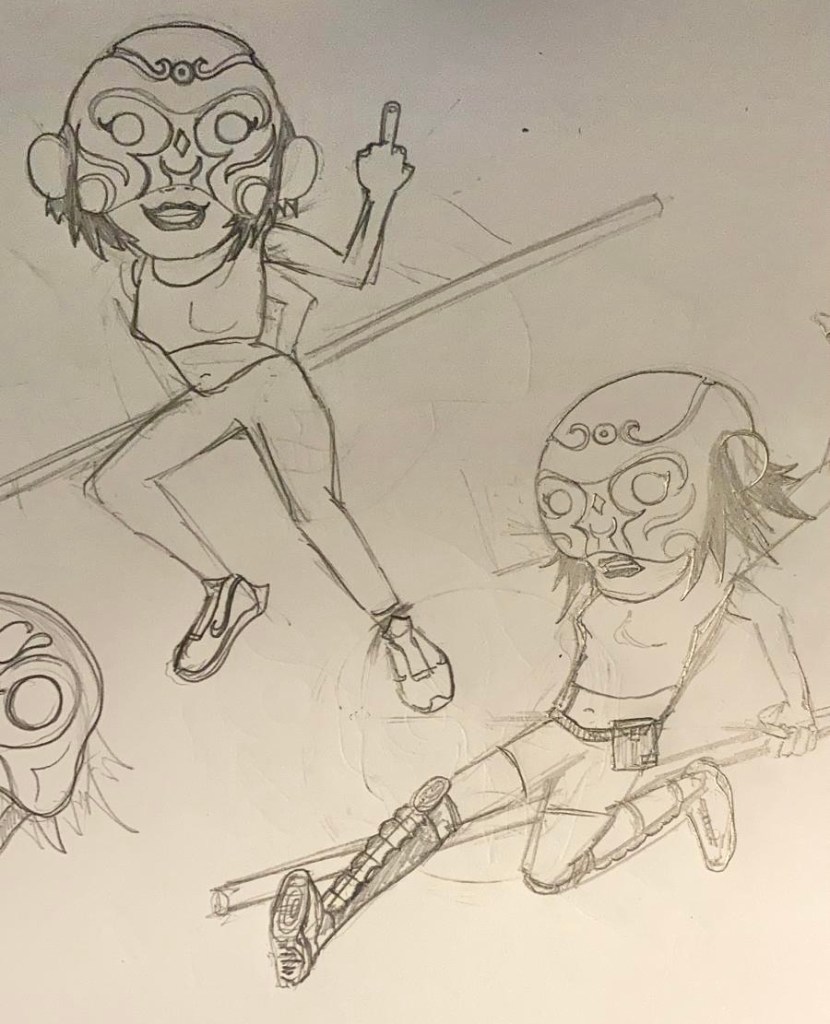
I started initial concepts and kept showing them to Yuujin, and after we kept trading ideas and talking over the design of our main character, this is where we are so far.

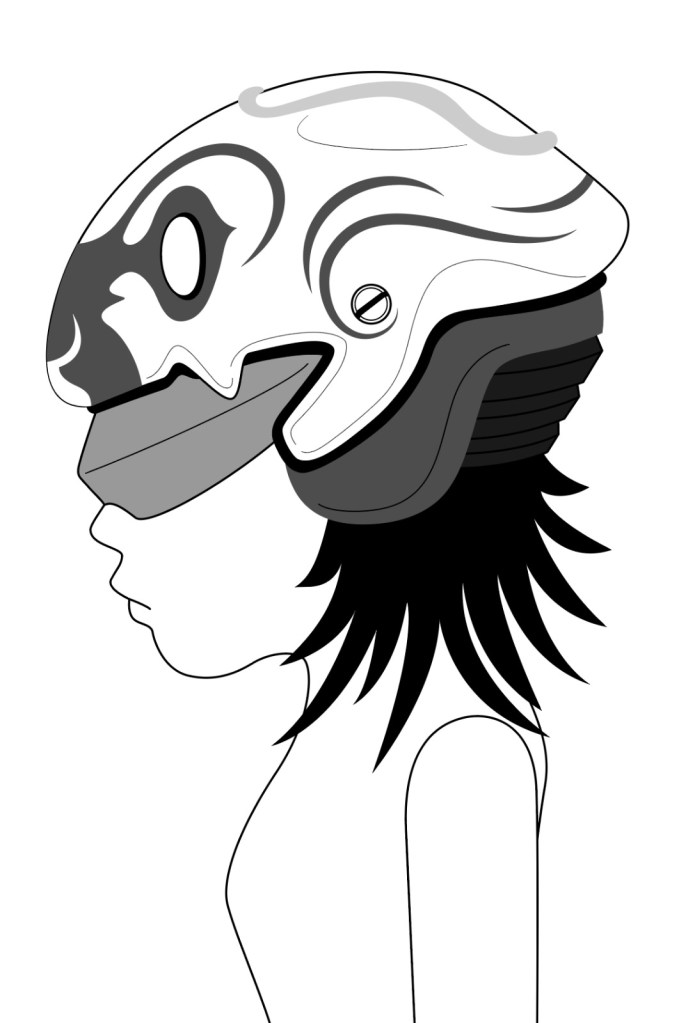
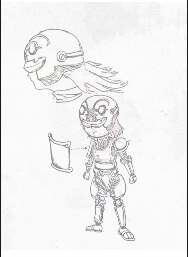
The helmet possessed by Wu Kung takes on a life of it’s own. As the story goes on the female lead also turns from a crook and a thief into a heroine. With her, she reflects the struggles coming from a low income family, started off living life by performing scams, later on with her experiences fighting against crimes and demons, learns to become a better person along the way. Wu Kung on the other hand, learns to accept karma and fate with the support and run-ins with some old friends and foes along the way.

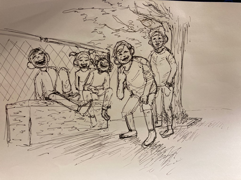
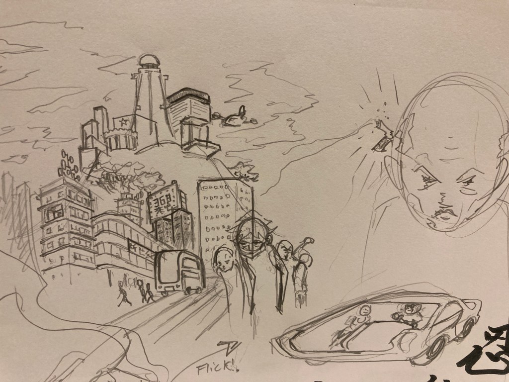
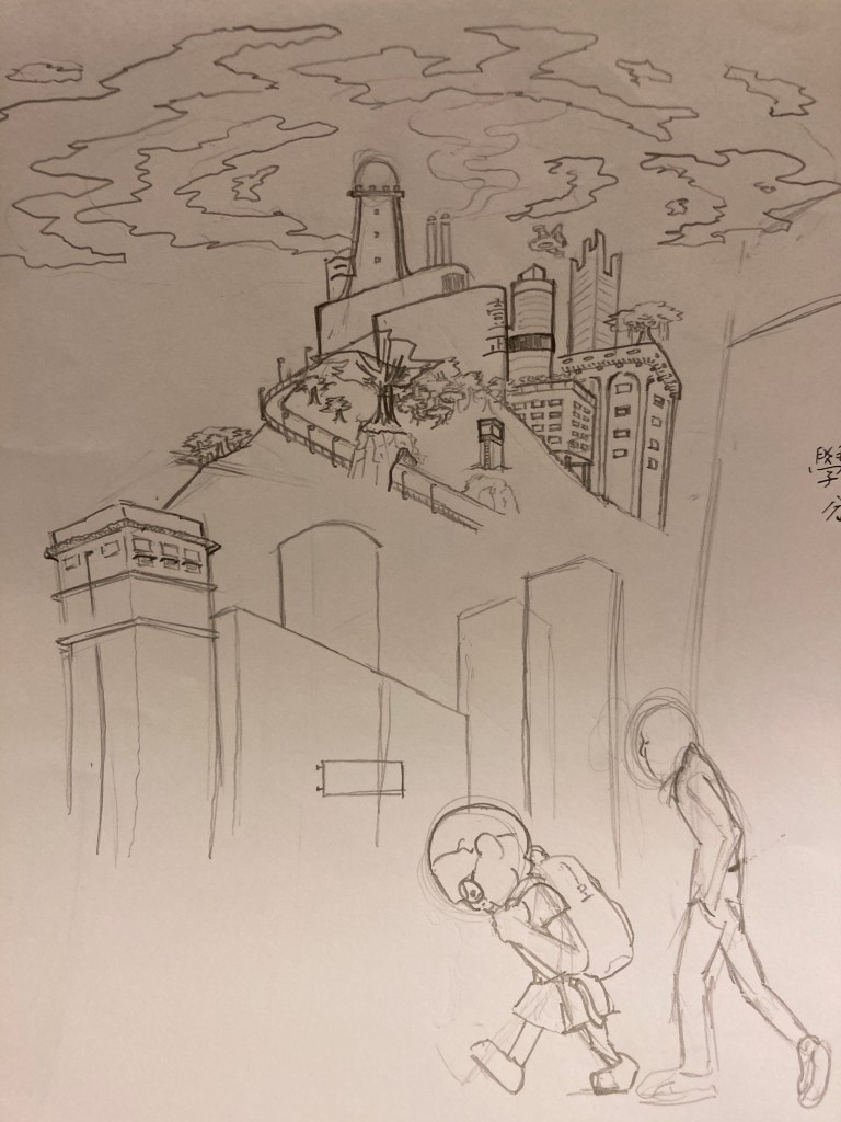
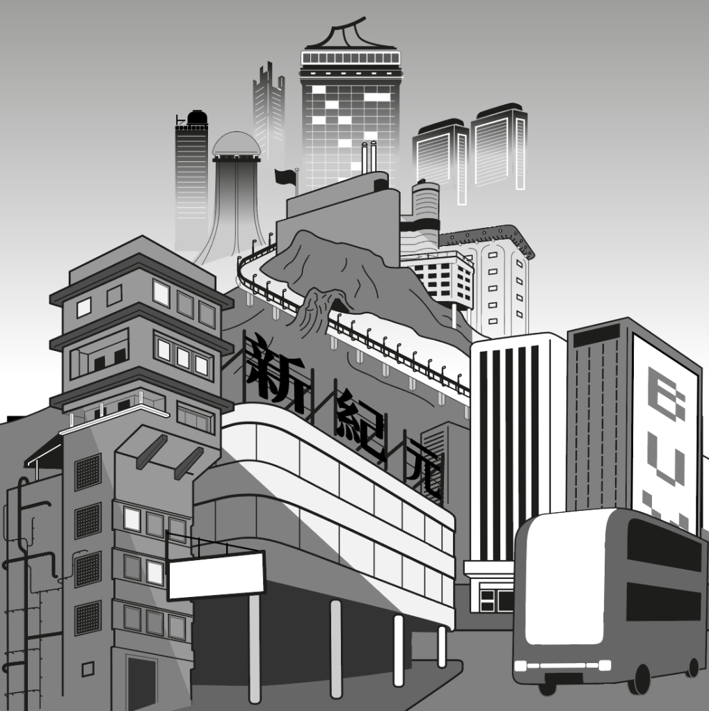
Environment & Concept Art

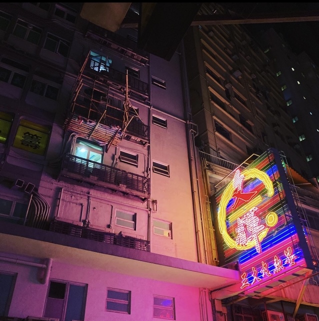
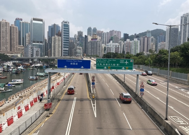
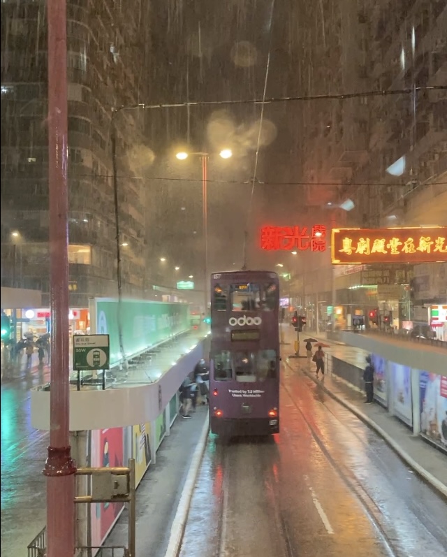
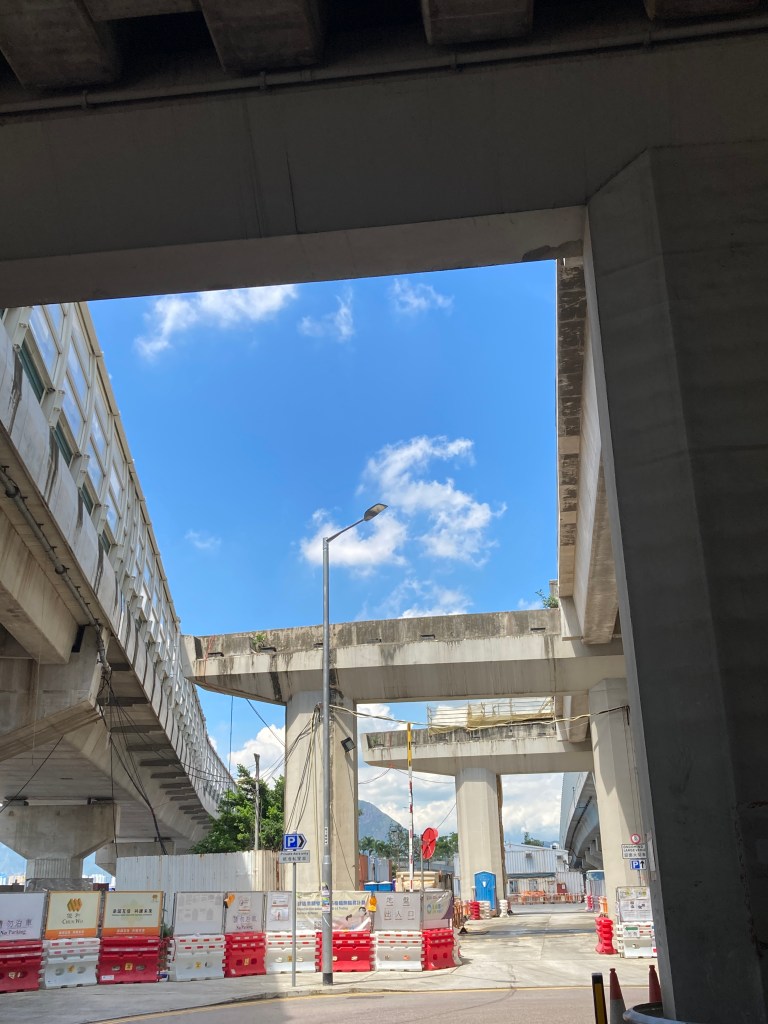
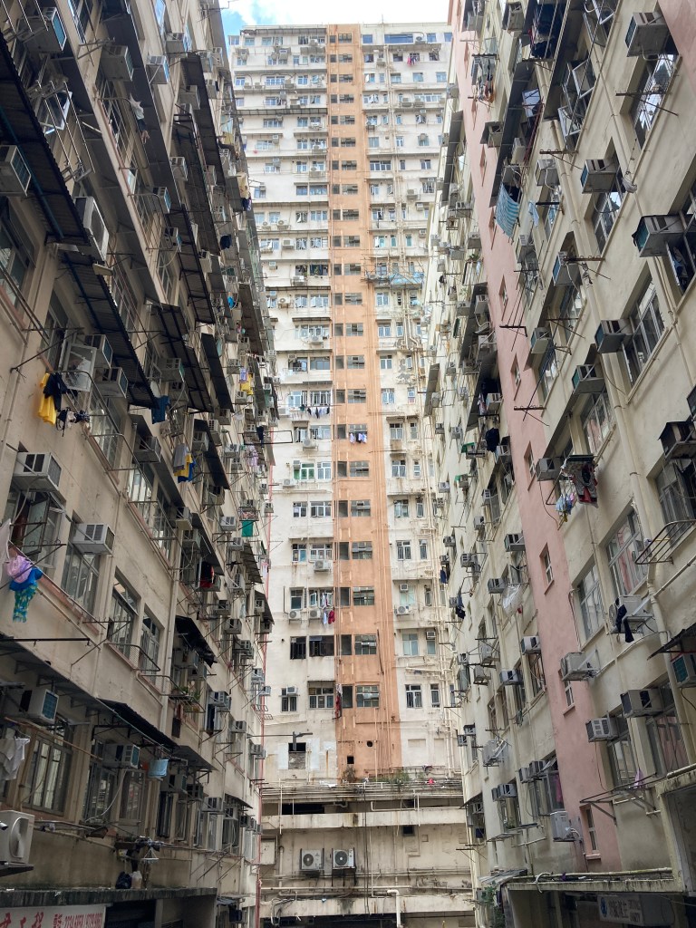
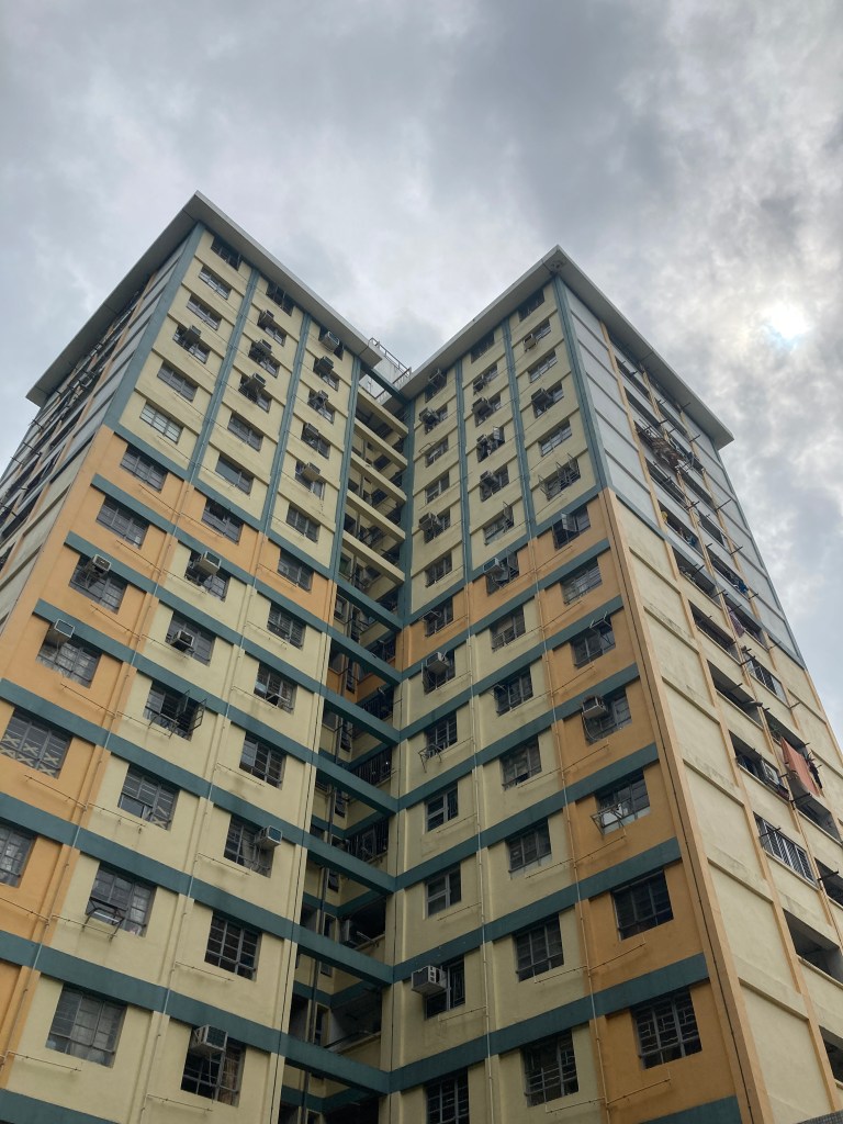
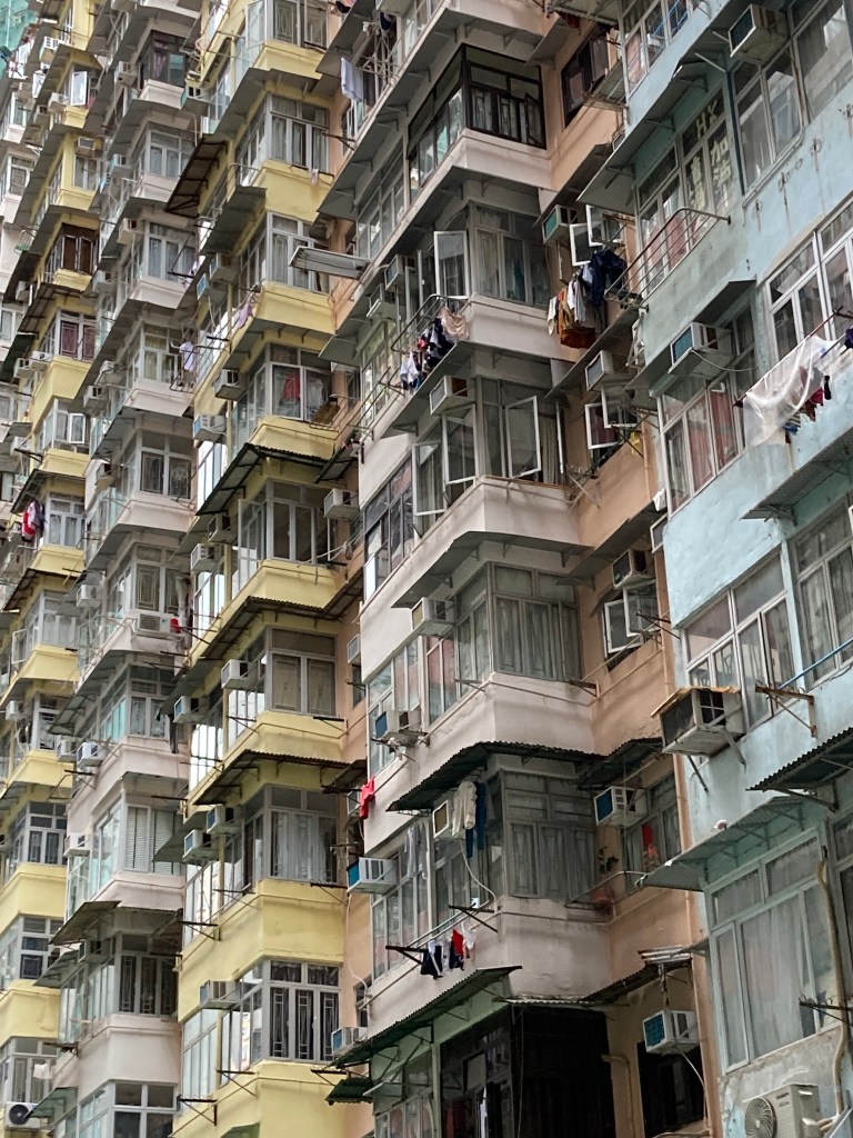
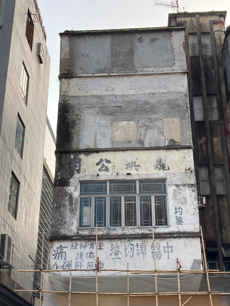
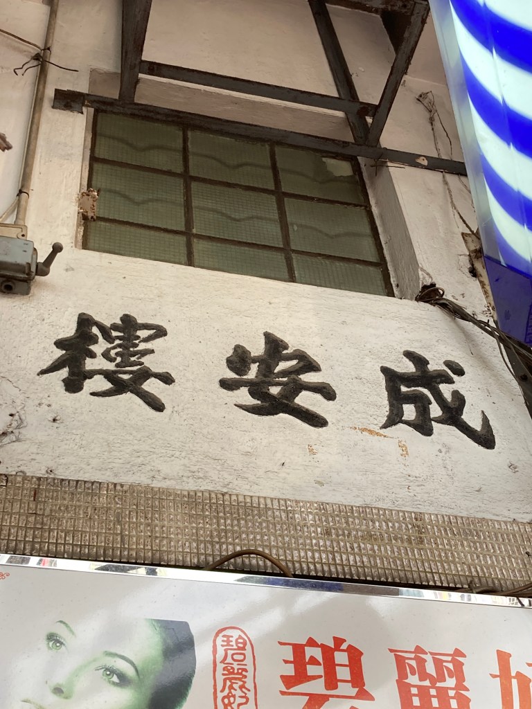
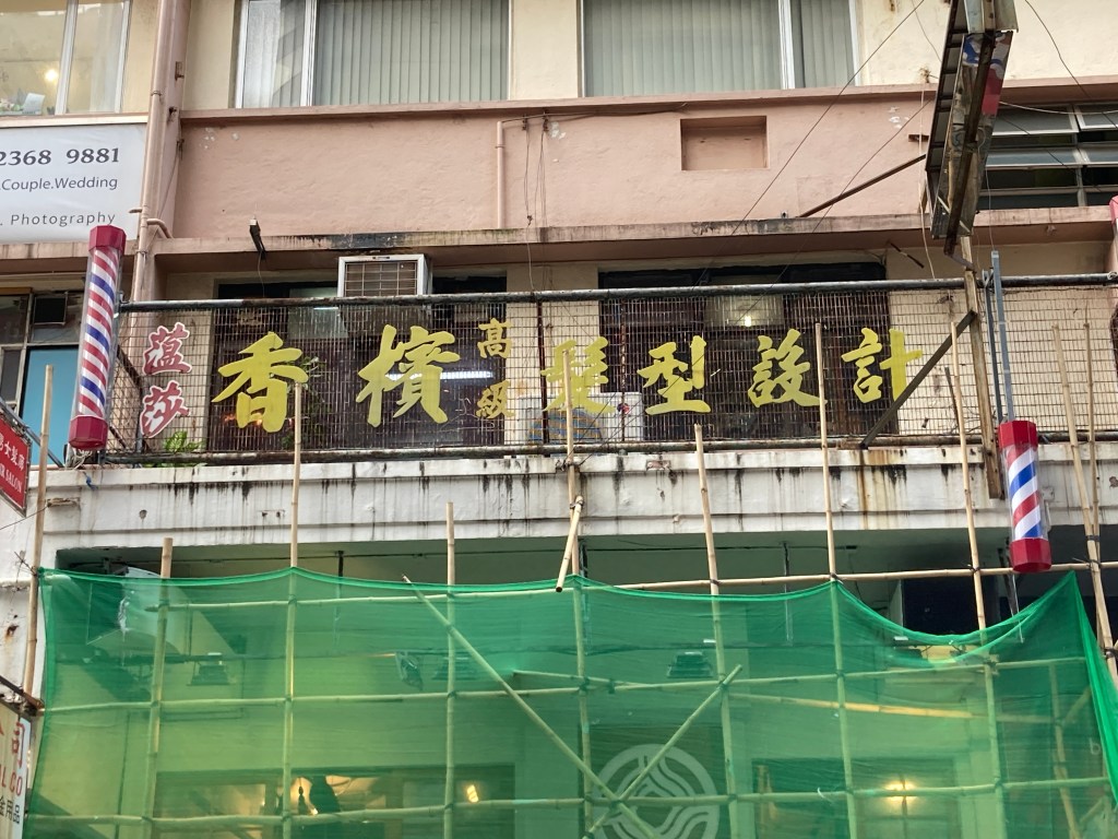
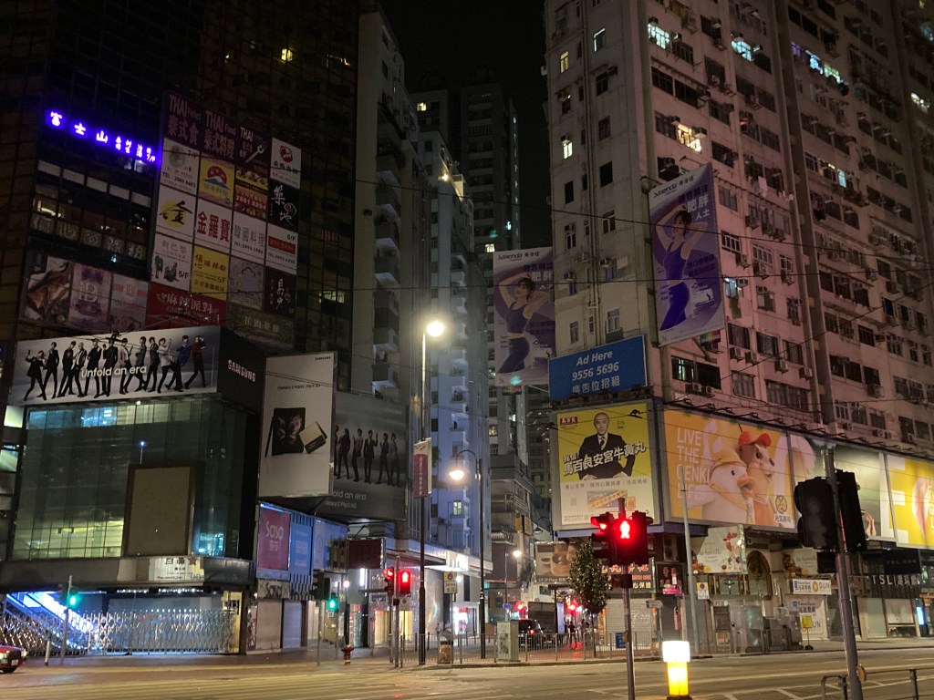
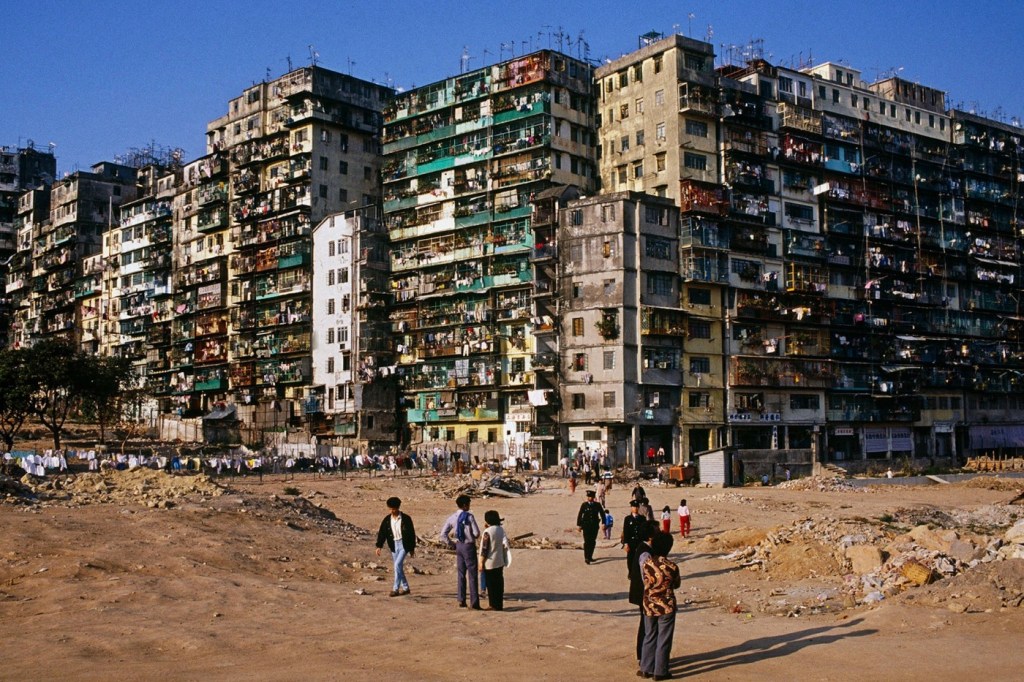
Locals would relate and foreign readers would feel the exotic atmosphere as fights happen on top of structures like : tram cables, signage and building scaffholding etc. Compared to 3000, a lot more action and sensitive graphic material could take place and deeper stories could be told.

There are much inspiration to be drawn from after having looked in to urban legends, tales, rumours, unsolved and odd crimes. Our idea is to fuse those with mythical Buddhist characters that appear in the Journey to the West in achieving a true comic for Hong Kong.

Advantages

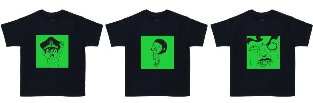
All the distribution methods and plans derived from 3000 are to be applied, and with Yuujin being on board helmets and toys could be made while I focus on illustrations and the business side of things. With the sensitivity issue flung out the window, this would allow use to apply to government fundings and quickly grow these ideas and productions in to a business.

I truely feel that it is the right decision to make, all that was experimented and achieved with 3000 could be fully translated in to this project, taking this it further heights. It’s the first time I have had to let what felt like a baby of mine go like this, but that seeing the new project grow so quickly and with every previous obstacle out of the way, I am really looking forwards to dig in on this.

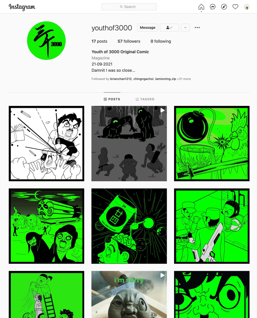
So keep paying attention to the youthof3000 I.G. account, new updates would be posted!

ANDY WAS HERE again

FYP week21 : distribution and concerns

Instagram

The Instagram account was launched way back in February, but I haven’t really pushed it for followers since everything was pretty much still in progress for the past months.

My idea is to color code all different issue: hence issue 1 being neon green, 2 being neon blue ans do on.

The reasons for using Instagram only is that I think I could utilise the layout of the platform:

1st: No speech bubbles are needed for the online version, all speech and wordings could be typed in to the captions section. Not only does it free up space for my panels, but it also allows multi languages to allow the material to be understood by many other countries!

2nd: Instagram posts goes in an order where later panels would appear on the bottom, and one would swipe upwards in seeing new posts. So if I upload say : the cover to issue 1 first, the reader could easily be reading panel from panel as they slide upwards until they’re done.

AirDrop

Sahre with friends, encourage help in spreading material when they are on streets of HK

Even if the new National Security laws clamps down furrther, there is always AirDrop to turn to for safe distribution.

Not only could AirDrop be utilised as distribution, it could also be utilised in serving as a form of advertisement, or random give out for coupons for product purchases.

Reflection

I have had the idea of an Instagram distribution since months ago, but one consideration I missed out on was that I should’ve made the composition of my panels with the intention of them going upwards, instead when I was laying my comic out the “eye flow” was more fitted for a printed version.

Products

The comic is free to view online, my ultimate goal is that the content could gain enough traction and then side products such as the bust, tshirts, posters etc. could be sold for profits.

The idea is to have a range of products, the bust being the most expensive, then the tshirt and mugs at a mid range and the hardcopy of the comic at the bottom. This idea came from my friend Miu who runs his own shop and brand named Still House, chatting with him he suggested that : as a brand, there should be a range of products that could allow anyone from a student to an established adult to jump on the wagon.

Reflection

For the printed version I have encountered a problem very later on: that I found out the most vibrant neon papers only were colored one side. Due to that I only could only side with a lime piece of paper that was closes to a neon green.

Print shop/ factory production should’ve been considered. Like the Yuujin lesson I have learnt weeks ago, I have put too much faith in my ability to produce a mock up, but what I should’ve done earlier was to consult fitting experts on the matter.

Last Concerns Before Final Distribution

The political environment is sounding and looking bleak, more arrests of past publicists regarding National Security have been shown on the news everyday.

For submission for this course, I feel safe for all the precausions I have taken to assure that I do not offend the new laws, yet to put the material online I do hesitate a little bit at the moment. After turning the full issue 1 to the school, I would need to take a good look in to the content of issue 1 and reconsider if more changes to the story would need to be made.

Although there was mentioning of AirDrop distribution, but to be honest I am not willing to go there just to get my work out in to the public and risk an arrest, the story does kick start with kids starting a riot against adults afterall. Again, an idea I had 12 years ago before all the turmoil occured in 2019.

ANDY WAS HERE

FYP week20 : Yuujin

Yuujin

I actually wanted to do the moulding by myself, but as the deadline is coming to a close I started thinking bout the fact that I have only moulded something once, I would have to buy the materials required and is expected to go through a lot of trial and errors. That was when I student I taught while teaching at the college came to mind.

Yuujin is really talented. My first impression was that he entered the school with the ability to do very smooth animation, having been trained in animation for a bit, I am still a little clueless in how he achieved certain things in that video assignment which wowed the whole teaching team. 

Then the other was his ability to make costumes

As seen here he made this costume by himself along with the helmet. I remembered my eyes lighting up thinking I need to learn from this kid. The funny thing is he talked very little and I thought that he might have disliked me as an instructor, but at this point he is my best bet, and he kindly said yes! 

I agreed on paying him a small $1000HKD (around 95 British Pounds) for his troubles and also to for materials. He declined the payment at first out of respect, but I always believed in how one should take an amount of payment if being put to work. 

Original sculpt

The Moulding

What Yuujin had to do was cut my original sculpture up to mold in individual pieces.

I was told that having this passion of his, he has all the necessary tools right at home : Sanding machine, spray gun, air ventilator etc. It was after I was told the many steps and tools required in the process that I came to realise how good of a decision it was for me to reach out to him. It gave me time to focus on what I do best : to continue finishing my illustrations and setting up my presentation. If I would have done the molding on my own I think I would’ve failed.

This made me think about where my line is. When I do have ample time, learning a new skill would certainly be beneficial, but how ever coming to think of it there are points in my designing career where a line has to be drawn, that I would have to know that somethings lay beyond my expertise and better results could be achieved leaving it to people with ample experience.

The Final Result

This shall be considered a prototype, but I am already really pleased with what I saw. To achieve an extreme polished look this has yet to go through retouching and molding for atleast 3 more times.

I told Yujinn to mould me 2 more just to be safe, and that he has focused his efforts in polishing the one. So here it is:

Lost bits of details such as the smaller right eye

Here’s a rotation vid of the bust!

The line work for issue 1 is finally complete, and now I am to work on the extra material : A 4 panel comic intending to be a teaser to the series and illustrations to tell the completed story

ANDY WAS HERE

I would like to take this week’s blog to document the sketches that were generated for this very project.

Drawing Probelms

Having drawn since a young age, I have given up on achieving clean line work with pencil or pen. I gotten really serious in to drawing when I was studying cell animation in Canada, I think the drawing lessons and life drawing lessons given by an instructor named Rose changed my life. As mentioned before, I was always in to cartoons and had started drawing up characters since I was in grade 8, but it was when I had a better grasp of the human anatomy that was when I started improving alot.

I always faced a problem in which I have only over come in recent years : I press REALLY hard, it was so bad that 5 pages in a sketch book one could still clearly see the drawing marks I made. Thinking back I think it reflects my psychology a little, I have always presented myself as a really easy going person; but I guess I have certain anxieties and that in the previous post, I have recently cleared a big hurdle having just entered my adult life. Back to the drawing problem though, it was just 3,4 years ago, I started realising that I could not work long hours with my shoulders up tight, back slouched and pencil hard against paper…it took constant reminding myself, but now I have managed to let loose and also discovered that doing pull ups is helping my posture by developing the none existing back mucsles that are giving me necessary support now.

To be honest I do not know if that is a good thing or not, but the point when I only focused on being able to draw and lay ideas down was when I started getting efficient with Adobe Illustrator. I remember having first picked up how to use the software in college and was instantly captivated by it’s many tools and effects, combined with Photoshop I felt like I could achieve everything I have ever wanted to create.

It doesn’t bother me as much not being able to produce good pencil drawing now, for I think that as long as I have ways in producing output as a designer and illustrator that shall be fine. I guess though if I ever have free time in the future a little practicing wouldn’t hurt anyone.

Maturity in Output

It’s amazing to see the output I can manage now with years passingby. It is a very out of body experience to me and I always wonder if it is the same for every designer, artist or illustrator around me. I am not saying I am currently a master at something, but that I certainly have developed a style over the years and would panic less in the face of a project.

As one gets older with life and a job, there is less time to learn new tools though, and to me the simple route to take is to just focus on what I currently do best.

The desire to learn 3D software, to clay more, to learn to mold, Kung Fu lessons….will always be there, but am I lazy? Or is it the fact that in mid 30s, it is just normal for things to stay the same for a while? I guess time will tell.

ANDY WAS HERE

FYP week18 : story and character

Defusing the Story

Had my chat with Jonas about the possibility of reviving a past project and he ACCEPTED! YAY!

But now, Jonas wants to see a complete story, for the issue 1. Alot of the original ideas and stories I was planning to tell are increasingly getting more sensitive for the atmosphere here in Hong Kong, so this is the point when I realised that I needed to reshape, and point the whole comic in to a positive conclusion.

I am to complete issue 1, yet the story so far does not reflect my intentions for the Yellow and Blue political stances to put down their differences; if anything issue 1 shows fighting and resonates the 2019 protests here in Hong Kong. In order to display the intentions of the whole project, my plan is to produce a series of preview illustrations in presenting how the story would go on and end.

What I did was that I started with a hybrid of a story layout and a mindmap. I have certain stories that I want to tell = events that would take place in this comic, and basically started filling in the gaps to achieve a greater, more complete story with characters that would play their respectful part in expressing my views towards HK society. 

real social issues being considered such as the pricing of housing, tough to keep business running due to rent, the education system etc.

90s Cartoons and the PowerPuff Girls

I think these toons are sort of a lost art, not as in the quality of movement in these cartoons themselves, but the facct that pausing on a still frame, the consistant quality of objects in the surroundings, mood, attention to facial expressions and posture are things that I was facinated by as a kid.

A good example would be comparing the quality of the PowerPuff Girls cartoons from the 90s and the recent 2016 reboot. The most notable would be the storyline and the humor, it could be the result of different teams of writers, and the involvement of original writer Craig McCracken.

The major draw to a super hero cartoon are the attagonists, I think what made the 90s PPG so great were that every villian was a stereotype of some one we would meet in our daily lives, someone with a bad habit, flaw in personality and even a hated vegetable, and having that deep rooted purpose and building a character on top of that gives the show draw and even benefitial, educational purposes. With the consistancy in art style, this has made the world of 90s PowerPuff Girls a vibrant and memorable one.

My Villians and Story

The aliens is a representation of foreign influences on HK during the 2019 protests, as “rumoured” by many having played a huge role in fanning the flame and esculated violence. In my story, they are the ones who have granted the rebel kids super strength, intellegence and a violent mind by spicing milk formula.

The idea of a cyclops is based the on going conspiracy of Illuminati keeping control over world order.

The Teacher (on the right) was based off of a collegue working at the college. The first time I met him I instantly thought to myself : he has the sterotypical look of THE local highschool teacher. Of course, in real life, Patrick is a great great dedicated teacher.

But taking his look, would resonate with the local reader : The hair, the glasses, tucked in shirt and dress pants.

Pounding On Lines

On the other hand, the line work for issue 1 is REALLY taking time. I am doing this in having recognised a trend in people completing everything on iPad’s pro-create. Is it the auto fine tunning of line? The repeating sets of brushes? To me the results are too polished and lack a human touch.

top : retrieved from digitalartsonline.co.uk bottom : Procreate drawing by Elliott Scobell

What I want to achieve is a 90’s cartoon look. I know for a fact that back then many of those animated panels were pencil line drawings that are so clean that would enable easy later on coloring in with computer software, but to shave time off I was not ready to take my not so mature penciling skills to the panels, so instead I turned to the tool I am most familiar with which is AI.

The process I am putting myself through is to first sketch on paper, and to pick every line out with Adobe Illustrator. Although time consuming, I find myself landing the general outlook I am looking for.

Reflection on Process

I am starting to realise the little rules I would add as I went along, and when those are realised at a certain point, some completed panels would require a rework and eventually those rules would stick and carry on to panels later on.

It’s in the amount of details in the drawings : creases on a facial expression, folds in clothing, composition and how my line work could guide the viewer in staying at a critical panel or lead on to the next. There are also the considerations of portraying an environment, as in how much detail goes in to the background art in setting the environment.

Here’s a video of me doing AI work!

ANDY WAS HERE

FYP week17 : given face

The sculpture of my main protagonist is about complete! This is the first time I have realised I am capable of handling this amount of detail. I have only taken very short classes in sculpting before and was taught very basic knowledge of moulding, I am really happy and proud of the resulting bust.

I probably took way too long with this, but sculptig first gives me a 3D, inside and out understanding of my character and I have always found that to improve my drawings alot.

From the “kill me” face (Aliens 4) to having finished was very satisfactory yet it was a lot of work, a whole month and a half worth of sculpting time, but he didn’t started out looking like this at all.

Revolution of the Face

I was really going after the communist art look when I first developed my main protagonist. As I mentioned before I have only recently came to realise my stiffness in viewing work and a lack of flexibility ; I always tend to lock myself within a box and it could take me years to come out of it. For years, I was thinking I was being a good sculptor in pursuing symmetry ; both sides having to be exactly alike.

The only good side to it is that it has infact made me a better sculptor, but if I have realised how boring this looked early on, I think I would’ve made more progress in the past years.

Reflection

The master of this would be Bill Watterson. I have read most of Calvin and Hobbes as a kid and they always made me laugh, now as an adult have I only came to appreciate the artistry that went in to these comic strips and I think that this has influenced me a lot as a comic illustrator now : I do not have to stress myself over symmetrical facial expressions, having it off balanced is for one a lot easier, two it actually makes drawing a lot more interesting to look at.

I think in the past years I have sort of wasted my time stuck in my own thoughts, it is so obvious now that the right decision to make is to exaggerate the expressions and enable my character to act and dance with emotions through out the comic series.

Reminder To Self

I think I have faced simular situations of being stuck inside of my box enough times to REALLY second doubt my initial decisions before I get started on any project. Take the time to visit successful examples, analyse pros and cons, talk to others.

The best of decisions should be made and considered right at the beginning before I slave myself over details, trust my gut feelings that something is wrong and experiment until everything feels a’ okay.

Here’s a video of me sculpting!

ANDY WAS HERE

FYP week 16 : city

Surveying the City

I have developed the habit of taking pictures of signage in Hong Kong, I remember having started this in semester 2? When Syed was our instructor. 

I started off being very specific with documenting old buildings or structures, a part of Hong Kong I dearly relate to while growing up : old streets with what we call Tong Buildings, most of them well over 30 years old, no elevators and that most of them are under 8 stories high ; on the other hand there are the skyscrapers and new projects, LED covered walls with the glass reflecting everything around it, luxurious hotel and malls, the kind that would have one hesitate to enter when you are slightly under dressed. 

The charms of Hong Kong as a city was the merge of the old and new, but that is slowly changing as the HKSAR government have their sights on development and would rather neglect, or do a very bad job in repurposing old structures and coming up with new projects.

Rant on City Development & Aesthetics

This city is known to be a financial hub, and that a long time friend of mine has pointed out an interesting fact that : nowhere else in the world would a city leader be titled Chief Executive, a term only used in a business/corperate setting, and that says alot about what kind of a city Hong Kong is.

The fact that the city is run like a business is shaping how things look, and in that there are examples of decisions that I think are out right baloney, take the Handover Memorial by the Wan Chai pier for example :

Some idiot (excuse me) decided to move the Comic Walk (originally located in Kowloon Park) right next to what is supposed to be a dignified piece dedicated to a meaningful time to this city, where flag raising ceremonies are held on Chinese National Day…is this a joke to somebody?

Another thing to point out are the “installations” placed by the Wan Chai waterfront park just a walk away from the hidious, dis-tasteful Comic Handover Memorial of a mess.

The question is are we not stressed out enough in one of the most populated, dense cities in the world? At one of the only open areas on Hong Kong island where citizens would get to see some open sky, take a breather and relax, they decided to just stock pile on “art” installations. There is no consistancy or method in these items and i’ll be down right direct in saying they are useless, dis-tasteful and an eye sore.

These are only 2 of the many recent failed development projects that scream HK Gov. mentality. Get experts or real designers to be involved, look in to the purpose of these locations and get out of this shallow, cheap impression of : oh, people are going to love it because they could take photos and post on Instagram.

ONE of these days i’m writing a proposal and addressing this before my city becomes a joke.

First Environment Concepts

Now that I am trying to create the look and feel of Hong Kong without actually addressing recent city planning hell. Although the whole city planning issue is bothering me, but that has only occured to me very recently and I sort of want to construct this fictional version of a city in a more fashionable manner. In some way, I see this version of reality where the high society doesn’t even bother giving it a second thought about entertaining the people “below”.

My concept is that in the year 3000 when everyone is expecting flying cars and a high tech city, in reality nothing much is different, aside from the occasional transport, weapons or some small devices.

The running theme in my pages are direct in the old vs new, low vs high society ; as I want to emphesise the awkward wealth imbalance in Hong Kong.

ANDY WAS HERE

FYP week15 : approval?

A Revisit?

For the past half a year, I have been working on 3000, an idea for a comic I had 12 years ago. I revisited it t a semester ago, if I recall correctly was part of a 3 week project and was a little upset that I didn’t get to see it to full completion.

I always wanted to produce my own set of characters, a story, and see them become action figures I could proudly place on a shelf. Having always find that to be super cool since I was kid : Ninja Turtles, Power Rangers, Ultraman to the more recent Gravity Falls, Adventure Time, Rick and Morty….the list can go on a lot longer. 

The idea begun with these kids having had enough of school and some rough illustrations were done from 12 years ago. Over the years there were attempts in claying the main character: a practice I turn to when I want to see a character design from a certain perspective, but I was never fully satisfied with those attempts.

Yet to ask for permission, I am hoping that a past project would be accepted as a submission for the FYP design piece. Before I propose this idea I need to gather everything I have now and look at this from a new angle, so far the content seems to match the intentions of my critical report, and that I think that in tweeking certain details in storyline and distribution of the comic itself, everything will be able to fall in line. 

Vision

Before getting in to the details of the developement in to my characters, environment and story in the coming posts, I would like to share what must’ve been the biggest inspiration; yet my biggest ghost of a piece of anime that has lingered in my veins for the past decade or so.

more about the anime on IMDB

The anime which inspired me the most when it came to thinking up project 3000 some 12 years ago was Tekkonkinkreet. The original manga/comic was by done by Taiyō Matsumoto in 1993 and it’s a real shame I haven’t read that yet, but, the later 2006 anime was directed by Michael Alias was crowned by many as an absolute masterpiece.

It showed the two lead orphans/brother and sister : Black and White establish themselves as the owner of the fictional city of Takaramachi. In plot (without spoiling anything), the two are the very definition of rebellion, how they jumped from building to building in a packed metropolis on rooftops, lamp posts and on top of people’s heads, changing their wardrobe from one silly costume to the next, bashing full grown men in the head with fluid kung-fu moves, this, was a life changer for me. The background work really made this work for me also, the setting holds resemblance of anything to Tokyo to Hong Kong’s now demolished Kowloon Walled City, which are foundations for cyber punk today: Blade Runner, Ghost in the Shell, Tekkonkinkreet etc. It is this anime that made me realise that constructing a convincing environment equals to attention to detail.

Kowloon Walled City, demolished in 1994

The problem is, when something as epic (to my world) is THAT established, it really stuck. I have spent so much of my teenage life trying to put this behind me and to establish something uniquely my own. Although I do think that fully doing so would be impossible, but in some way or another, the washing away of this big chunk of inspiration that has loomed over me for years needs to be done, or else I worry that I am just making another Tekkonkinkreet.

If I were to work on this comic say 5 years ago, the influences either I like it or not would be obvious, but having purposefully not watching this anime in years, I think I am ready to take my own cue and be thankful the influence of Tekkonkinkreet exist only in my genes but not on the surface.

Looking back it even feels like a childhood crush or something, but believe me when I say this: this was one hell’a piece that I knew would be toxic if I keep on obsessing over it.

ANDY WAS HERE

FYP week14 : writing wrap up

Leaving Space

I think I was doing this unintentionally ever since the writing started, that I have been purposefully leaving a lot of space for any kind of design outcome. 

With this intention spearheading my critical report, I don’t know if this intention is considered correct to the world of academia to be honest : Like am I supposed to step in to the design process with a clear goal in mind or is it normal to still be a lil’ misty in what I am to produce? 

Small Thought On Peer Feedback

Another thing, I want to be honest here and hopefully it will be able to improve certain aspects of this online learning experience also. No offense to anyone and that personally I haven’t come across as the most constructive critic myself : My peers are all the lovely of the loveliest human beings I have met, but when it comes to seeking advice, I think everyone is sort of being too nice. 

This is actually a thought I have had ever since the beginning of this MA course. During my time as a graphic design college student, my instructor then was very specific in having everybody share their thoughts, at least providing 1 positive aspect and 1 negative aspect. 

I think realizing this could be a part of the learning experience also and part of stepping into a working environment; Some groups of people are more gentle in approach, and some can get more harsh in terms of criticism. How I treat it is that I sort of just ride with the general atmosphere, knowing that I probably held certain comments back, but still tried my best to express them beginning with a “it’s good, but…”.

Again I am not complaining about anything, but then I think this is an interesting aspect I have come to realise during this whole experience.

I talked about this with a few friends and they told me that it’s a very British thing to do (hahaha). So this might be one of the things I picked up as my first time experiencing a UK dominant cohort, and that if so, I guess I could approach this as an admirable art of speech. If not, I guess I just happened to be with a very lovely, peaceful group of peers.

Cover for Critical Report

I have always grown up hearing about the government announcing the publication of White Papers (in Cantonese it’s traslated to : The White Cover Book), and that has got me thinking of the reason behind it. I found out that government documents are color coded in indicating distribution, and that the color white means that the paper or report is intended to be accessable by the public, they were documents which addressed problems and are intended to educate the public in how to deal with them, hence White Paper.

for more details in to the history of White Paper, click here for a guide published by Standford.

So, my search for a word play on Hong Kong’s Blue VS Yellow political stand off was done, I am to name my FYP critical report the Yello Blue paper: I am addressing problems, observations and is intending to arrive at suggestions or even solutions in how to deal with this problem.

I didn’t want the graphic to appear that the 2 sides are “going at each other”, and so I took some care in making sure the negative spacing is even and that at the center criss-crossing that the text would merge smoothly. The yellow is BGed by blue and vise-versa in the meaning of : Blue should come to understand the Yellow and the Yellow to understand the Blue.

As an English document, I hope this could provide an insight to people abroad about what happened, and be able to provide facts and documentation on a neutral stand point reguarding the 2019 events here in HK.

ANDY WAS HERE

FYP week13 : focus

Thoughts & Progress

At this point I am clueless in what the design solution is going to be. The essay writing is coming along fine, although I am a little worried that I am taking too much time with the writing. 

I think through talking to people, I have gained a better perspective of myself in how I see my city now. The National Security Department was established and the funny thing is it’s basically right next door to me, them having taken a hotel that ran out of business during COVID as there temporary office. 

On the surface and first impression: It’s taking away my freedom of speech, it’s limiting what I could produce as a designer and all, those are very true. Yet, a part of me recognizes that if the government doesn’t do anything about the situation, the feuds will never cease and that Hong Kong, my home would keep on breaking apart. 

Focus of Project

This is not the first time I have commented on my own people, but here I am to do it again. Hong Kongers have the characteristics of providing, following and obeying orders, so basically when people that would speak their opinions openly with no consideration of consequences, different aspects and level of society or the fact that a young audience is present, the results could be very dangerous. 

It’s no wonder the people that are pro-government would constantly bring up how foreign countries are fanning the flames. We all know there is truth to it, but in my opinion : Why are we not taking the time to try and establish better means of communication instead of taking extreme and even violent measures? Don’t get me wrong, I am not happy with the PRC style of rule either, but simply I don’t think meaningful discussions towards the future of Hong Kong, as a collective: what are the general directions we would like to take in establishing a better environment? How are we to define our identity as a past colony and return to our rightful government?

Citizens in major cities from Mainland China have their own characteristics: in Shanghai, they actually have this Shanghai pride, and Beijing citizens (I have plenty Beijing friends) have their own attitude. As cities, these are the things that are unbreakable by any sort of rule, it’s the confidence and sense of being that keeps them together, clear minded and there for focus on to their day to day lives while loving the place they are born in. 

It’s harder for Hong Kong to achieve that, for we would always admit we are money driven and with the population so high, we have trust issues towards our fellow citizens and also everyone is pretty much stuck in their own ways and philosophies. 

So this identity crisis is something I would want to take a look in to addressing or solving with my design solution. 

Current State

There has been wind of how the government would clamp down on the freedom of speech and what content would be allowed on social media platforms at this point, our guess would be: anything related to the protest, anti-government and the PRC. On the other hand, it’s understandable from the HK government’s view as they are paying their best efforts in putting a stop to the esculating violence that are seen in these protests, also there is suspicion that certain groups and organisations have been taking funds from foreign parties.

Next Digital was one of the first ones to be eliminated by the newly established National Security laws.
Another example of “a children’s book” banned under the National Security law, more details here

1 : Communication Apps

The tech savy Hong Kong citizens then have done their research and has turned their backs on the usual social media platforms and their communicative functions, such as : Facebook, Instagram (which features their own messengers) and Whatsapp are said to not be reliable, that it is unsafe to have a history kept when having said sensitive things and that the encryption to these major platforms are full of insecurities.

2: Social Networks

MeWe CEO thanking HK users for surge of users

For social networks , there were small attempts by citizens in turning against Facebook and Instagram, most notable in the form of MeWe, yet the lack of features and users has quickly led HK citizens in abandoning the hope for an independent social network.

This has given rise to smaller apps, specially communicative ones, such as : Telegram and Signal. These apps both advertise their ability to stay off the grid with double encryption and also holds functions in auto terminating messages after a certain period of time.

Other means of sharing content and communication also include the populat Hong Kong forum LIHKG, were the a wide range of mostly young users were known to be active in trading information and improvising ideas reguarding the protest.

3: File Sharing Methods

A method of file sharing according to Jenny (interviewed on week 7) improvised by users on LIHKG was the use of the AirDrop feature on iPhones.

AirDrop image during 2019 protest

This shocked me as a very smart way in dodging arrest while being able to share sensative material. One would ride the MTR (the Hong Kong subway line) and recieve a request in accepting a simple JPEG or not, and these JPEGs were basically pamphlets often writen in Simplified Chinese in explaining to confused Mainland Chinese tourists of what the whole situation is about.

Conclusion on Findings

Although I am not clear of what form “the message” would take, these are some methods in spreading an art piece, an electronic exhibition or some kind of reading material.

These are just based on facts and creative ways of spreading a message during the protest. I am not interested in breaking any laws or even coming close as to alert any authorities.

ANDY WAS HERE