FYP week1 : searching

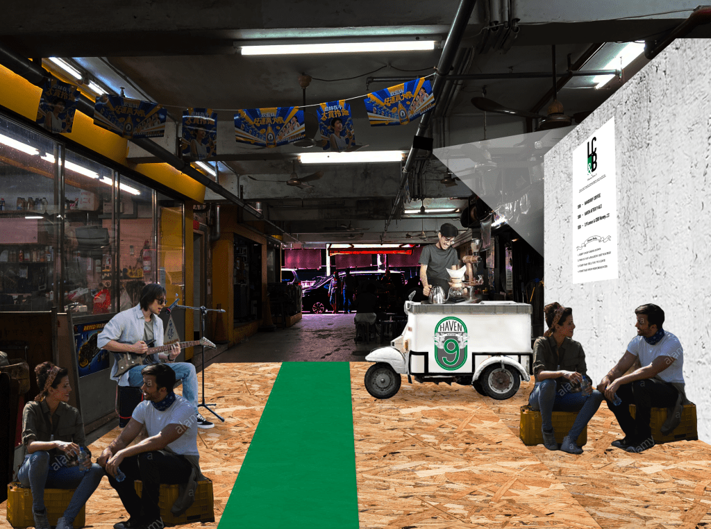
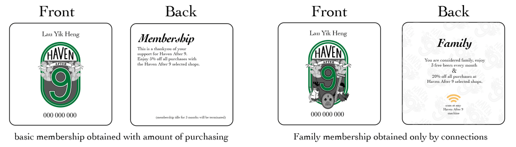
It’s the first week of the FYP semester for Falmouth Flex, and first off here’s a little update on what I have been up to :
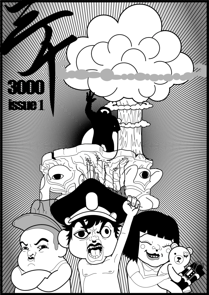
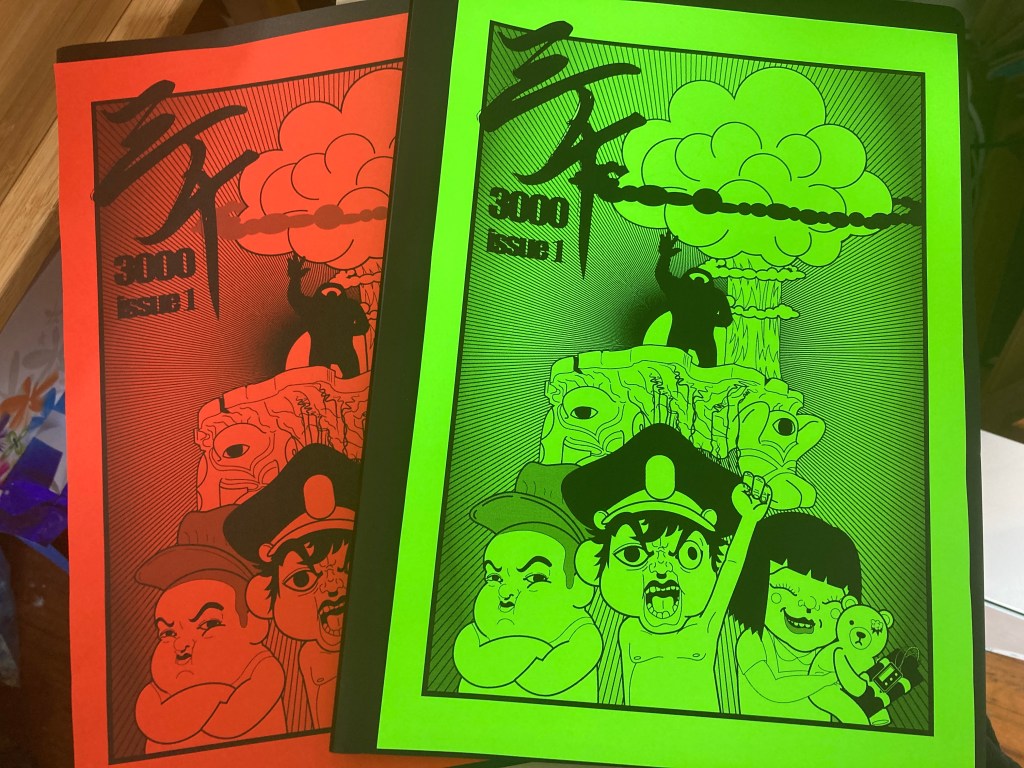
1st : 3000

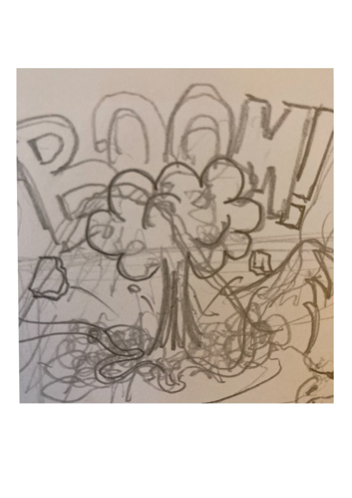
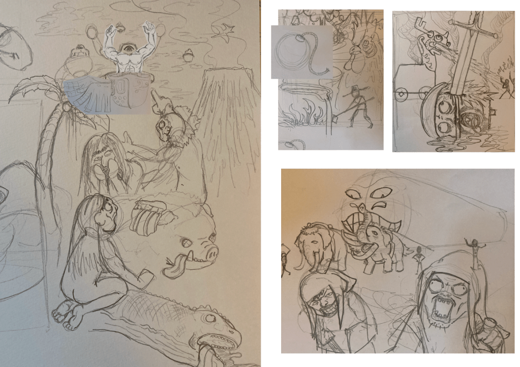
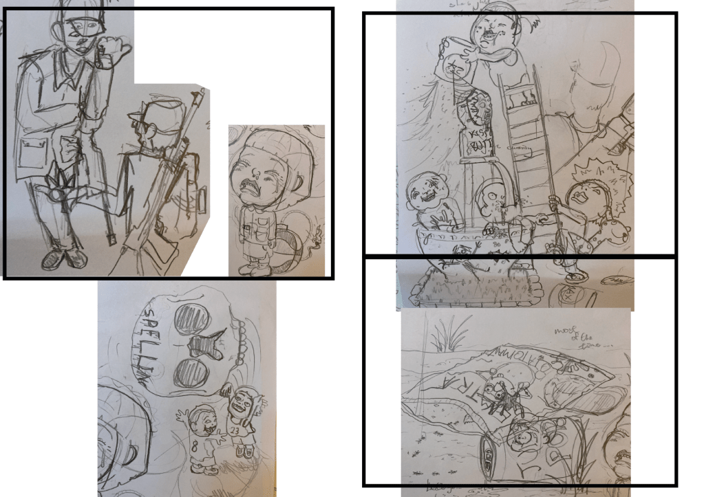
Having started on my comic project titled 3000 last semester, I have started an Instagram account in launching the project to the public. 

The comic is to be released the content/issues free to view on IG, and a PDF will be available to download on darkmatterworks.co. I think that in this day and age no one would be willing to pay for something they have never heard of, and so : view it online, or print out your own copy at home with the most basic of printers. Gather some attention and then I will work on putting out physical copies and other merchandises. 

2nd : Organizing Andy Was Here

Noticed the title bars? Yes, I have been planning this since the last semester ended, and since the amount of blogging is going to be greater than before, I thought that a tite bar of some sort would make the blog a lot more pleasing to read. 

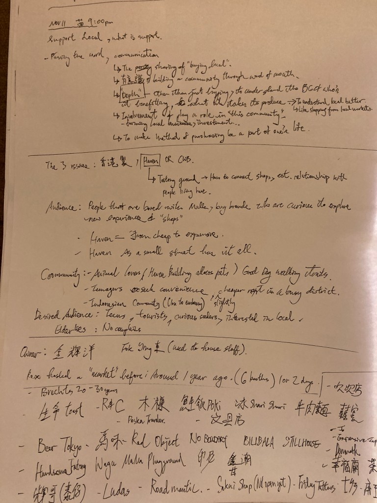
3rd : Chinese New Year

The semesters always begin with running right into the biggest holiday in China, so having anticipated this I really focused on settling on a topic for this FYP semester

The Topic

It’s funny how I actually sort of started to regret having covered comics, social networking/ friend app, I sort of feel like I should’ve saved the above 2 for last. 

Initially I started off by walking through book stores, walking around the city and kept my radar locked on to Dezeen for the first couple of days, until I found out that it wasn’t helping at all. With time running out I resorted to drawing up a good ol’ mindmap. 

Fast Food

I have always took an interest in how a fast food company operates. In a simple world I think that fast food does the job of feeding many in poverty and has the potential to be a better source for a cheap meal. The industry itself has also provided many employment opportunities and has helped many college students pay off their daily expenses while studying. 

I made a couple notes on the side regarding dietary, health and doubts about the food pyramid. Yet, I have somehow banned this route, a quick thought about the relationship between, let’s say McDonald’s pricing being too closely related to it’s source for raw materials made me feel that not much could come out from this topic. 

Minorities in Hong Kong

Many Middle Eastern, Philipine, Malasian, Nepolese families are settled here in Hong Kong for generations, and that I feel that they have never truly merged in to the Hong Kong society; in other words, they seem to do their own thing, and the Cantonese language itself has always been sort of hostile towards these minorities. 

But then having remembered a conversation I had with a Pakistan student I taught in my days working at a college, he gave me the insight of how strong their community is with their culture bonding all of them together into a sort of brotherhood. It made me realise that they don’t feel much negativity towards their lives in a Chinese society, the student went as far as telling me that they don’t even worry bout not doing well in school, if they want a job or any sort of qualification someone is willing to forge certificates and recommendation letters from people with authority. 

Here exists separate ecosystems where they live their lives not much different from back home, feeling safe from the extremes of their homeland. I am not saying life isn’t tough for them here, but from what I heard they get by and they seem happy. So again I don’t think much could be achieved in this aspect. 

Media

The Hong Kong media has always been considered a little premature, specially in recent years with stakeholders not seeing much of a future in production, it is obvious to everyone the golden days of HK cinema, quality TV shows and music was long gone. YouTubers seem to draw attention really well in recent years, offering a huge variety of topic selections for audiences to tune in to. Foreign platforms such as Netflix, HBO Max and Amazon Prime have been sought after especially during the pandemic. 

So now in these thoughts regarding the media, in a BIG star is the news. 

News

During the Hong Kong demonstrations of 2019 which lasted for a good 3-5 months, the coverage on the happenings was all around the clock, it could’ve been 2am and the news channels would be shooting alerts on Facebook, it was as if you were there, walking through crowds, running off at the sound of teargas being fired and so on. 

We have witnessed how news networks here in HK have adapted into the  live coverage frenzy which is still going on today. My guess is that people want to see everything for themselves and generate their own opinions, oh and don’t forget : right next to these broadcasts is a comments section, people familiarizing themselves with the reporters and camera crew, leaving comments and firing away at people with opposing comments. 

People have also decided to take sides, the pro and anti government feud has led to the selective support of shops, restaurants and even media outlets. Some newspapers were flying off the shelves due to the owner having expressed their beliefs with much support, while another might be faced with complete hatred with people swearing to not believe in a single word it has to say. This is referred to as the Blue (pro) and Yellow (anti) economy. 

The government in efforts to rid the city of these disputes decided to put a ban on content and any mentionings of anti-government. Having established new laws and an Office for Safeguarding National Security of the Central People’s Government of the People’s Republic of China in the Hong Kong Special Administrative Region (yes that is how long this name is..) and has made arrests not only on people that were heavily involved with the demonstrations of 2019, and also media industry heads accusing them of spreading negative messages and disruption of order. Lai Chi Ying, owner of Apple Daily is serving his sentence under these new laws. 

I am not diving in to the political side of things, but only news as a medium itself. How have they adapted to these changes in viewing habits, social media platforms and live broadcasting? What do people see in the future for news production in Hong Kong? 

With so much having gone on in the past couple of years, I think it is time to take a good look at the news outlets here in HK and identify the attitude and tactics of the industry. Ultimately as a graphic designer to figure out if the current state is effective or not, and discover ways to improve on the content and delivery of news here in Hong Kong.

ANDY WAS HERE

Final Week MOD4W12

This video is sort of a failed attempt to cover my results and reflection in 5 minutes while this lasted for 15, but then to present everything I got completely I believe that this would be the best way in displaying all my final items.

Overview & Interview with Miu

Miu was kind enough to take the time to answer some questions I had for Haven Street and the project in general. I think that there are certain emotional attachments and personal feelings in every community project, so one of the best ways to sum things up would be to take the questions to the man!

Reflection

Thinking back I think that the Kickstarter part is the most significant moment for both Miu and I. The potential for all these plans to be carried out seem the most ideal at this point, and we were no longer just dreaming up things as time went by.

Things To Improve on

I think with this project I did reach a good level of completion, and that I am happy with most of my output, but then I have spent way too much time working the little details of designs that I have neglected the time I needed to package and present everything in the final week.

I admit that I did not reserve enough time in presenting everything (including the videos and the interactive PDF). I think I was about a week’s time off of having enough time to first set everything up and then taking the time to fine tune and all. So the next time tackling something so big I will learn to schedule my time better.

At some point I did leave out certain things such as the advertising at tram stops, mentioning a clean up and the railing decorations, but then I don’t think that they are core to the project…although they would be fine editions to the final.

With the coming semester break, I will continue working with Miu in delivering these intentions and concepts to the shop owners in making this project a reality.

Final Words 3000 and Haven After 9

I really wish that I could present a completed comic book at the final week, but only having 2 weeks to really work on the content of the comic, I was told by Richard to only complete more of a general look, and that I do feel that when we weigh the 4 weeks we were given, to make it to a finish is not that realistic.

The same might not be able to be said about the Haven After 9 project, again, on my behalf that was all due to a neglect of time needed to wrap everything up.

This is a combination of project 1 and 2.

It took me many attempts to get this right. As mentioned above I did go through many attempts before and ending up with videos that were too long. After getting a grasp of what could be presented in 5 minutes though, I started to get a sense of what is to be expected in the video(s).

I will update this blog when Ive completed the first issue of 3000 and keep posting about the Haven After 9 project.

ANDY WAS HERE

November7th MOD4W11

I am continuing to finish items and just taking things sort of 1 by 1 for the remaining weeks.

Map

Before this project even have started, Miu has always talked about a map of selected stores.

I have gone through a few versions before reaching a look I am more satisfied with. At first I tried doing color coding and other categorizing methods, but then I feel that the map should be stripped back and simplified since there is not a huge amount of shops to include.

For the cover, I purposely chose a color not being present anywhere else, I want people to go “oh just grab an orange booklet”. I think it’s a very Hong Kong thing to name things on our own, and I often take advantage of that in designing things, so yay there’s the “silver machine”, and there’s the “just grab an orange booklet”.

LC&B

The name being based on my slogan of “Love Craft & Beer”, this is to be the “chill space” I was talking bout.

OSB wooden boards to cover the floor for easier cleaning. The moped is customised with a secondary logo, menu projected to the wall, opening up the potential to even screen some indie-films in the area.

There is also a simple open mic for individual or small groups of buskers to perform at. The green line in the middle is to have comers stay clear in allowing normal pedestrian traffic.

Miu did pitch the idea of inviting our friend Him who is in to woodwork in creating a chair, but after having sketched some ideas I think that the mobility, maintenance and the bulkiness of actual chairs or benches are too great, so I thought crates to sit on would be the best solution.

Membership

The membership system is one of the main attractions in the Kickstarter fund raising.

2 memberships are decided on so far, with the most basic membership acting as a discount card for shopping in selected stores. The Family Membership can only be obtained with big commitments or being a solid member of Haven After 9, it offer’s a greater discount and also 3 free beers every month, equipped with a scanning function, the holder could claim their beer by scanning the card at any of the beer vending machines.

Haven Credits

These are to be held at all or most selected shops and to be used at vending machines, this is in place to prevent beers sold to minors and to cease any one that is drinking abusively.

The token also has it’s own collector’s value to it and I think is one of the staples of the branding to this project.

ANDY WAS HERE

December3rd MOD4W10

Prototypes

Applying the logo to different things can help me see the possibilities, I think this is an important phase in materialising a project as such.

My list of things to complete goes :

Beer, Coin/Token, Vending Machine, Chill/Space, Membership Card, Kickstarter Page, Website, Lobby “Museum” Display, Signage, Map, Uniform?, Mailbox.

Things completed this week

Display

This location is a significant entrance in to Haven Street inside of Leishun Court. The museum rack is made of oriented strand board, a material which would be used in other parts of the designs as well.

In erecting the preserved signs at the entrance is the ultimate “this place is taken care of” statement, with the welcome sign (silkscreened on to the wall), I think this will be a great start to the project.

The Vending Machine

The design was inspired by streamline designs of the 30s, 40s. I want the machine itself to be an icon and that it will blend in with the environment seemlessly. The reflective quality to it also holds the meaning of : telling people to take a good look at Haven.

I have talked to some shop owners I already know, and everyone feels that there is a need to sort of keep the rawness of the building. If someone is to step in, light and polish the building up, “it will not be the same thing” as everyone puts it.

Its also worth mentioning that the effect of the machine was done in Photoshop, a spray painting and smudge techniques I have always used in achieving metallic textures.

ANDY WAS HERE

November30th MOD4W9

With the logo, I can start applying it to all sorts of things in making the project come to life. So here I am to lay out a series of ideas and the work of Haven After 9, how we are to improve the area and attract more foot traffic. But to be honest, I do not think that all could be finished on time, so in the next weeks there are going to be certain ideas left for later on.

Originally, Miu and I would think that we would be able to go deal with the shop owners within these weeks, but with nothing in hand, my target is to complete concepts and imagery for handin, and have a more complete proposal in the weeks following the deadline for the course. So please forgive the fact that the following may or may not be included in the hand-in.

Sci-Fi

With a homework assignment, there is no one on top in approving a budget and limiting ideas, so I made it a point to Miu in early stages that some ideas might appear “Sci-Fi” as in there will be things which will neglect the possibility of carrying out. But I would include some in to the actual proposal to show and persuade shop owners in joining the community.

A couple years back, launching a beer would be pretty out of reach for me, but having simply met Henry in one of our social gatherings have already changed that significantly. So I do think that there is always a chance that some of the shop owners might know some body to lets say : aquire a vending machine, and then that would completely strip the “Sci-Fi” from. that idea. So who knows?

Ideas and Concepts

Advertising

The tram stop made famous by the film Ghost In The Shell directed by Rupert Sanders in 2017 is located right next to Haven Street, getting off at this tram stop in going to Haven Street has led me to think that directional ads or banners could be installed to this station to attract awareness for people to come to Haven Street.

Railings

I was walking near where I live in North Point (20-30 minutes away from Haven) when I encountered this outside of a mall. This “public knitting” was made popular some 5 years ago and I guess the mall has invited someone in doing so at the place where I passed by. The same could be done at Haven Street (Leighton Road to be exact) in attracting passer-bys.

Clean Impression

As a follow up to the above, I think cleaning the buildings and the street itself (possibly even diong something about the rat problem) is vital to the actions of the people working or living in the building.

Due to old age and the potential of the whole lot being claimed by developers, both Haven Court and LeiShun Court are being neglected, with no management in maintaining or improving conditions.

The action of removing bills posted, graffiti and cleaning up trash clicks with the book Tipping Point by Malcom Gladwell. In the beginnning chapters there was an example of crime rates soaring in the NYC subway, the first step in improving the situation was to remove all graffiti and fixing small things such as window, these little actions have improved the state of the subway significantly, hence the term “broken window effect”.

The attention to little details is a great way of spreading the message that “someone is taking care and looking after” a certain area, and when these little details are done right, people will get the sense of self-discipline, improving the state of a place.

Signage Relic Rescue

(top left) Old Brithish Colonial sign outside of the soon to be demolished Haven Court

This also follows the “broken window effect”.

I guess as a designer these things hold more emotional meaning and value, I find it a pity if no one would preserve these signs that are at least 50 years old. My idea is to create a sort of museum display some where on the street to protect and preserve relics such as these signs, again a visual display in line with the “beoken window effect”.

Beer Selling

The classic moped fridge is the perfect match for the love of motorbikes of this street, and one should be acquired to serve as the table top for a handdri coffee guy to serve coffee and the “chill space”.

The vending machine is the most “Sci-Fi” idea I have in my head right now, firstly : I do not think that it is legal to have a machine selling alcoholic beverages (although popular in Japan), secondly I think it might be expensive?

But the thing is, I would like to introduce a token system to avoid under aged drinkers and so that shop owners and members of Haven After 9 would be able to control who to sell these beers to.

Speaking of Beer

The beer is intended and made for shop keepers, for them to have a relaxing time after work as a reward for a hard day of work. That is the main consideration when Miu, Henry and I were discussing flavors and alchohol percentage, a thick, flavorful ale which is slightly stronger than the average beer.

I cannot stress the fact enough that I do not want people getting drunk and silly off of this product. That’s why I need the token system so that our members to take control and stop consumption when we feel that some one’s been drinking too much.

ANDY WAS HERE

November25th MOD4W8

For Real

Miu and I have been coming up with all these great ideas to set Haven Street up as a community, but I problem emerged and sent us baffled : How are we going to get the funds to accomplish all these? The ideae for a website itself can already cost us a minimum of $20K HKD. Miu had the idea of collecting a regular $2k from all shop owners that are willing to join the cause, a membership fee to keep things running so to say.

I have turned this riddle in my head for the longest time, thinking that no matter how good these ideas are, to ask for a financial commitment will turn off many of these shop owners, and I think in the case of persuation this will become a big bump to our plans.

So I started thinking about sustainability. We need something that is able to generate money in the long run; and that is when I thought of Henry.

OCBD beer at UM99’s first online DJ session

UM99 (also the result of the Haven Street community), is a group consisting of the members of 3 brands (3.9 CBD honey, Bak Tee Jai tshirts and OCBD beer), and out of the 4,5 DJ streaming and live recording events we have done so far, OCBD beer’s income has almost single-handedly maintained our spendings. There is no ignoring the power of an alcohol beverage.

So my idea was to come up with a beer for Haven After 9, it has the potential to bring all shop owners together, and Miu and myself have witnessed the profit margin of a beer. Exactly right when I came up with the word “beer”, the word “crowd funding” followed, I was so excited about this I called Miu straight away : “we will head this thing with a beer, crowd fund it with the network of all the shops + the community!”.

The usual Miu is a very calm and composed person, who is known to take his time and think carefully about ideas and development, but this time he was like “Ho Argh! Jiang Argh!”, we now have a solid plan to make all these brainstormed ideas in to reality.

So Miu and I met up with Henry Leung, close friend and owner of OCBD, told him about the idea of a community, the sharing and launching all plans with a beer, and Henry loved it! He shared to us the amount of money it would take to brew a barrel, and is even willing to bring in his brewer to discuss the flavor of the final product itself!

Development and Design

My initial idea for the Haven After 9 logo was to go Art Deco and create a moody, stylised design.

I thought the idea of creating a silhouette of the street was a great idea, so I went on and made pages of sketches based on the idea.

I was not happy with the results, there’s a difference between concepts seemingly working well on paper but not translating well in to an actual logo, I think there is no avoiding this 100%, but then to accept it as a part of development I suppost, ideas never really gets wasted.

I really want something that would work great on a beer can or bottle, but is able to stand on it’s own and become a symbol for the street.

Grand

I don’t want to end up with one of those gradient, geometric matte black cans we see everywhere now a days, I want to replicate the grand, detailed beer labels. This will make Haven After 9 feel more trust worthy and accepted by a wider range of an audience. A grand looking, instant classic.

Rats and pigeons are the most commonly seen animals on the street, I thought of this jokingly when trying to come up witha replacement for the usual lion and unicorn but did worry about the negativity this might be attached with.

I went and showed the first concept (on the left) to Miu and Henry, they reacted with much laughter and thought that for us to present ourselves and act boldly is part of our characteristic, although Henry suggested to make the animals more human, resulting in the final on the far right. American Tail (animated movie directed by Don Bluth) to quote Henry exactly.

Final Logo

I think I have reached what I am looking for, the right amount of complexity and with meaningful elements hidden within the logo to make people think and to spend more time looking at the logo itself.

The animals are obvious choices to those who come to this street enough times, and the way they are dressed is an exact reference of the retro, Eastern mixed European industrial style many of the Haven group would dress. The pencil signifying craftsmanship, and the T-ruler precision and attention to detail. Finally I want to pay homage of the odd time we are experincing by stating it on the bottom of our logo.

So overall I think there’s enough meaning and humour that would click with the vibe of the many shop owners of Haven After 9.

ANDY WAS HERE

November18th MOD4W7

This week we were to look in to trends and then establish a moodboard which is able to reflect my direction and the targeted audiences. There are 2 parts which I have looked in to: the first being the trends related to shopping, and secondly what are some trends in graphic design.

To start off, here is a recap of the ideas and plans I have for this project:

1: Branding of the “Haven Street association” (un-named).

2: P.O.P. at the front of the street to distribute reading material related to “Haven Street association”.

3: To set up lockers on Heaven Street or inside Heaven Court to able a comfortable day of shopping, this could also help encourage shoppers in CWB to drop by Heaven Street.

4: Increase the amount of seating outside of shops for people to enjoy a coffee and take a breather, to enjoy the peacefulness of Heaven Street.

5: Website with a “spendings calculator”, offering a combination of individual items or meals offered by Haven St.’s restaurants and shops at a desired and could help determine how much one will be spending. Listing out all shops that are part of the “Haven Street association”, mailbox etc.

6: Regular schedueled events : exhibitions, block parties/silent discos, markets, talks and seminars.

7: A coaching/advice programme for people interested in starting their own business or shop, as far as techniques of designing clothes or being a tattoo artist, appointments could be reserved with the talents of Haven Street to have a friendly chat in-shop or on the benches outside of Haven Street’s shops.

SHOPPING TRENDS

Having lived through 2019-2020, there was a certain something something in which I have totally ignored before I begun researching on shopping trends….THE PANDEMIC!

An article titled 10 Great Ways To Attract New Customers To Your Small Business on Criteo.com posted in April, 2020 has shed much light on some existing points I have made and are able to further these plans.

Indoors

I was a lil’ upset with myself not having picked up on this earlier. The year 2020 as decribed by some of my friends as “an experiment” in seeing how to maintain a normal life on the internet, still with no clear end in sight. With activities such as courses and live shows being carried out online, businesses have depended on these online activities to advertise and stimulate purchase, taking advangtage of the situation in further strengthening their brands and businesses during the pandemic.

To prove this point, I went over to check up on one of the most popular shopping centers in Hong Kong : K11 Art Mall.

K11 Musea, building designed by James Corner (James Corner Field Operations), Forth Bagley (Kohn Pederson Fox), and LAAB Architects.

K11 Art Mall & K11 Musea is known to be the first malls to use art and design as their main theme and attraction, they are the first to introduce Hong Kong to it’s first : MoMA store, Offwhite, Arc’teryx, Boy’ London etc.

What have the K11 group been doing when most Hong Kong citizens prefer to stay home? Webinars of course!

The Online Trend

I think this is such a smart and quick reaction by the K11 group, by carrying out online workshops, such as : ARMANI Makeup Workshop, Moss Terrarium Workshop, Creative toys for children, they are teaching participants in how to use the products they are selling, despite the times they have taken the form of friendly leisure courses online yet is still able to poke at that human desire to purchase.

In response to this trend,

6: Regular schedueled events : exhibitions, block parties/ silent discos, markets, talks and seminars.

&

7: A coaching/advice programme for people interested in starting their own business or shop, as far as techniques of designing clothes or being a tattoo artist, appointments could be reserved with the talents of Haven Street to have a friendly chat in-shop or on the benches outside of Haven Street’s shops.

These 2 shall have the flexibility of being held online. This will benefit people that might live further away from Haven Street and if a pandemic does hit Hong Kong again these conversations and workshops can still carry on, connecting “Haven Street Association” with it’s supporters no matter what happens. Content, is a vital part of any branding now-a-days.

The Haven Street Influencers

Based on 8 Innovative Retail Trends to Watch in 2021 on Tinuiti.com, the use of social networks like Faceook and Instagram is to be added to:

7: A coaching/advice programme for people interested in starting their own business or shop, as far as techniques of designing clothes or being a tattoo artist, appointments could be reserved with the talents of Haven Street to have a friendly chat in-shop or on the benches outside of Haven Street’s shops.

As Miu would like to highlight the many talents of Haven Street, a schedule could be set up for each shop owner in introducing and vlogging their own skill or craft. These short clips should not add extra work load to shop owners and would be set on a schedule, for example : Still House : week 1, Handsome Factory (barber shop) : week 2 Friday’s (tattoo shop) : week 3…

By setting up more content with social media platforms, the influence of “Haven Street Association” shall be able to be much greater.

Selective Shopping

As I mentioned in my slide presentation on week 6 , Haven Street has gained some momentum in recent years due to a shared belief in keeping things local (or yellow, Are You Blue or Yellow, The Colors Dividing Hong Kong by FCC). With that said, one of Haven Street’s best advantages is the fact that most shop owners think alike, falls into the age group of mid 20s-40s and has aligned values (political or not). The above trend mentioned by Tinuiti.com has solidified the core of “Haven Street Association”, although personally I do want to avoid the mentioning of political standpoint and views, as a design project though, IF shop owners & comers do feel that : being the most yellow street in Hong Kong is one of the main draws of this street, I guess there needs to be room for this trait of Haven Street to be expressed through the content within this project.

GRAPHIC DESIGN TRENDS

Graphic Design Trends 2020 : Breaking the Rules on Graphicmama.com have reviewed 13 commonly seen graphic design trends of this year.

For most of the shops on Haven Street (full list yet to be confirmed), some of these trends I think ill have to pass based on observation of these shops. To describe most shops being considered by comparing with the usual shopping in the Causeway Bay area, they tend to bare a middle high range price tag (classy so to say), they are owned by local owners but most of them are heavily influenced by foreign aesthetics.

With the above said, I am to eliminate certain graphic trends that don’t really align with this classy, mature yet energetic vibe which gives Haven Street it’s appeal.

In order to prove that the list by Graphicmama.com is relevant, I went to 2 other websites that are well known to the design industry to do some checking : 1 being dezeen.com and the other adsoftheworld.com , and came out with these results:

Regarding graphic trends, this cross checking has set my first steps in creating the branding for “Haven Street Associates”.

HONG KONG DESIGN

Before I begin my moodboards, I want to note certain design aspects I will try my best to avoid in desiging a local based brand.

Most commonly seen is that when designing for Hong Kong, it equals “old 60s-70s Hong Kong” : that specific shade of red and green, caligraphy, sail boats, trams and lamp shads. Many would place the problem to Hong Kong’s lack of culutral rooting and maybe to pull specific objects that are nostalgic Hong Kong is the easiest way to relate.

I wouldn’t go as far as saying these are not nice…but to local designers these are VERY Hong Kong in an offcial, government assigned way. Most commonly seen with government backed designer events, it is recognizable due to how flat they are and that conservative intent to make things look neutral and friendly. I think it’s easy to fall in to this when one is designing content for the public. The color selection are also worth a mention, is it the quality of sunlight we are getting? Is it the fact that we are surrounded by grey buildings and living in shadows all the time? Most of these palletes seem dull. Old and new, aside from the lack of texture, I think the use of opposite colors is always reoccuring.

Most of all, I think the impression of meaningful, quality graphic design was set by a legendary Hong Kong designer named Kan Tai Keung.

What could be reflected upon looking at master Kan’s work though is that he has done a lot of collaging and word play, most active in the 90s, he excels at geometric forms and structure, compositions often portrait a sense of proportion and that there is one important factor to draw Hong Kong people’s eyes : the play with Traditional Chinese characters.

WEEK 7 CHALLENGE : MOODBOARDS

Typography Craze

Traditional Chinese is not used in Mainland China, in fact it is said to be slowly being replaced by Simplified Chinese. Aside from Hong Kong, there are still havens (no pun-intended) for use of Traditional Chinese, mainly in Taiwan and the seldom application seen in Japan and Korea.

As mentioned in the trends, Typography Craze is being widely applied in graphic design as of now, my intention of this first mood board is to explore how designers have broken up the Chinese charater’s form, often collages with graphics, and some neat twist and displacements in typography design in general. Mainly this is to be applied to the logo of “Haven Street Associates”.

Patterns and Textures

These are also in sync with trends mentioned above, the application of this is intended to be applied on surfaces and graphics such as signage, printed material and web banners. I think this takes care of my concern with the flatness of “government designs” and is in line with the hand crafted, classy tones of Haven Street and it’s shop owners.

(on the right) red and green is a graphic dating to the 40s, the orange and green the 60s, and the blue one the 80s, then after are modern sets of palletes : peach, pastel and nude.

I was laying in bed trying to come up with a name to replace the temporary “Haven Street Associates”. Haven Union? Haven United? Safe Haven? No….then I started thinking of the habits of a shop keeper : Open shop, light switch, turn on the air-con….then I started remembering the times I go there when the clock strikes 9pm, shop owners at Haven Street rarely just lock their doors and leave, the chatting happens outside of their shops, on benches at 9 when they smoke or have a beer ; THAT is when a Haven Street shop owner’s union thing would gather and come up with ideas, hence Haven After 9.

Now back to the 3rd mood board, the background of concrete and tiles reperesent the setting one would see in Haven Street, the point of this final mood board is to identify textures and colors that would hold up against this aged concrete grey setting. The top half are pulled from traditional references (the red and green I was talking about), and the bottom is a route more modern.

Personally I find the old school orange and green against wood, the peach colors with metal working & that dirt blue working pretty well, it’s kind of what I want to see, but I guess that will be up to Miu and the shop keepers of Haven Street, maybe I can catch them at 9 tonight.

ANDY WAS HERE

November18th MOD4W6

I have fallen behind for a couple of reasons and would like to start off by explaining them a little bit:

1 : Me and my collaborator Miu (owner of fashion brand Still House) has been communicating constantly about the collaboration, but in the span of around 3 weeks, we haven’t came to a conclusion and that it took us some exploring to have came to agree on a direction.

Reflecting upon the time spent thinking about 3 individual topics, I think that I should have been a lot more stern and have recognised that 3 scenarios were being discussed at once. I’m super glad that Miu was really helpful and involved a lot in to the process along the way.

2 : After the college I worked for did not continue my contract, there was a period of time in October when my bank account was close to $0 after last month’s rent was paid. I was lucky enough to have landed some long-term parttime gigs but they are not paying right away. During that financial instability I put in a lot of effort in to obtaining design work in the past weeks and started crawling back with deposites being paid by clients. Fortunately I am doing extremely well now and am glad that the rough couple of weeks are over.

I have commited in documenting every move and meeting with my collaborator, but since it took some time to identify a clear direction, I think it was difficult for me to follow the pace of the course as it went on, but thankfully the clouds and mists cleared up and now, I hope that the following blog posts will be able to state my intensions, progress and efforts fully.

WEEK 6

Made in Hong Kong

As I said, Miu has hired me as a graphic designer for Still House and that we have met up at least 8 times in the past 4 weeks. Refering back to week 5, we first picured a campaign that would promote made in Hong Kong products, but that quickly did not gain momentum because there does exist too many HK brands big and small, such as Red A plastics, Lee Kung Man clothing, SaoTao noodles, Top Soya foods, Leung So Kee umbrella etc.

Made in Hong Kong clothing tag for Still House

I produce a tag for Miu’s clothing which is being printed at the moment, but for other brands to bear this tag we concluded that it will take a lot of negotiating and knocking on doors before any actual work could commence, and when we want to include all of Hong Kong, the scale is not managable in the span of a short 8 weeks ; we both want the results to be real and has a better chance of being applied.

MAPPING SMALL LOCAL BUSINESSES

A short clip of Miu and I walking around Causeway Bay

The other thing which we discussed was to make a map to locate small local businesses, and on November 7th, we both took a walk around Causeway Bay to roughly locate all the shops that we find fitting, the walk took us around 2 hours to complete and afterwards we sat down for a small lunch, reflecting on which shops would fit in to our list of (as mentioned in week 6):

  1. Scale : store size, number of staff, backing or funding
  2. Pricing : of items and products
  3. Own Branding : majority of products bearing a name which belongs to the owner
  4. Uniqueness : businesses that push’s the boundaries and adapts to the ever changing market
  5. Community Value : to have a positive impact towards the located area or HK in general

and yet we both came to agree that MOST shops are on Haven Street, and that only around 3 outside of Haven St. we found fitting to our requirements. Naturally our attention were brought back to Haven Street.

HAVEN STREET : Awarness & Promotion

a walk around Haven Street and Haven Court (aka Haven Building)

Miu has actually approached his neighboring shops about the idea of a map before this project has begun and was met with an amount of interest, in hearing that response I instantly though to myself that these shop owners on Haven Street are opened minded for some change or awareness.

So the date now is November 11th, I have called Miu for a meeting at Still House, and as I was on a 45 minute ride to Caueway Bay after work, it then first occured to me that I needed to focus on 1 thing to work on! I took out a piece of paper and started to:

Brain stroming ideas to promote and improve Haven Street, they are:

Street Mall POP for flyers/ guide membership offering discounts signage indicating stores that are part of this “association” provide lockers for shoppers more benches for shoppers (Causeway Bay is infamous for a lack of seating on shopping sprees) website with shop listing & spendings calculator regular exhibitions, seminars and talks

I also prepared some questions for Miu to see what could come out of these, including:

What is support (supporting local, supporting Haven St.)? Could the hall inside of Haven Court be used for events? Is Haven Street providing enough variety of things to do? What kind of an audience would you like to attract? Do you think people would think it is expensive to shop at Haven St.?

I actually cannot read or write on car/bus rides, I get dizzy REAL EASILY, but this time I pulled through

INTERVIEW RESULTS & CONCLUSIONS:

Notes from Miu interview on November 11th

Having came up with the determination to square down on a topic on the bus ride to Still House, I made the mistake of not having arranged my brain stormed points prior the interview, but the interview itself did end up going smoothly, the round up of this interview is in this slide presentation, which is my:

WEEK 6 WORKSHOP CHALLENGE : SLIDE PRESENTATION

As for the ideas I brain stormed to increase foot traffic and awareness of Heaven Street, the following were approved and elaborated with Miu:

1: Branding of the “Haven Street association” (un-named).

2: P.O.P. at the front of the street to distribute reading material related to “Haven Street association”.

3: To set up lockers on Heaven Street or inside Heaven Court to able a comfortable day of shopping, this could also help encourage shoppers in CWB to drop by Heaven Street.

4: Increase the amount of seating outside of shops for people to enjoy a coffee and take a breather, to enjoy the peacefulness of Heaven Street.

5: Website with a “spendings calculator”, offering a combination of individual items or meals offered by Haven St.’s restaurants and shops at a desired and could help determine how much one will be spending. Listing out all shops that are part of the “Haven Street association”, mailbox etc.

6: Regular schedueled events : exhibitions, block parties/silent discos, markets, talks and seminars.

7: A coaching/advice programme for people interested in starting their own business or shop, as far as techniques of designing clothes or being a tattoo artist, appointments could be reserved with the talents of Haven Street to have a friendly chat in-shop or on the benches outside of Haven Street’s shops.

INSPIRATION & EXISTING REFERENCES

Lee Garden’s Association

Now ill have to wind back the clock to 1 year ago when Miu was approached by a representative from the Lee Garden Associates, Miu did not know what they wanted from him and so he asked me to join meeting.

We were told that the association has built a relationship with around 30 shops in Causeway Bay and are determined to promote them, Miu first proposed the idea of a map to them and that the representative first found the idea interesting. Before she left after the meeting was done, I thought that there is more that could be done in improving the association, and so I told Miu I was gonna make a pitch to the association to see what might happen. The pitch was made and the story ended up with them having said a couple of nice things back and we have not heard from them since.

BUT what was done and suggested in the proposal and the Lee Garden’s Association has made Miu think about taking matters in to our own hands, to benefit friends and talents of our own with simular methods. So I think it all started with the Lee Garden’s Association incident.

The result of the final outcome could shall be packaged in a proposal just like the pitch handed over to Lee Garden’s Association, and that it was agreed upon that having such a booklet in hand would make talking to the interested parties at Haven Street a lot smoother.

HK Food Works

Although based on food produce, I think this site is in efforts of drawing attention to something local and is in nature an issue that does not come across the minds of most Hong Kong citizens, which is closely related to the kind of awareness Miu and I are trying to draw towards Haven Street.

One of the person in charge of this project is Sherin Siew, Associate Design Director (UX/UI) at FITCH (check’em out her related work here : szs.io). I think the amount of data provided reguarding food production, distribution & consumption is plentiful and clearly laid out in a easy to read template, a good direction for the website for the “Haven Street Association”.

Blue House

The Blue House is a 100 year old heritage grade building in Wan Chai (right next to Causeway Bay). The house was commonly known to have been painted blue during a shooting of a film featuring local celebrity Kelly Chan in the 90s, and now it has become a land mark to it’s surrounding area and has since led the transformation of it’s surrounding area in to a cultural gathering spot, leading the overall development Wan Chai in to a hip district.

The Viva Blue House project can be described as a self-sustaining housing project, as in people with certain skills to offer are selected to live inside of this building, running workshops, shops and activities in maintaining this historical building, revitalizing it with activity promoting : culture, environmental awareness. As they put it : Bottom-up, community led collaborations.

Aside from the general branding, the positive impression it leaves the public and the depth of the project itself, the above link desribing the architecture is a great UX reference for setting up the introdution of Haven Street’s shops.

ANDY WAS HERE

October29th MOD4W5

For this 8 week assignment, we were given 4 routes to choose from:

International Competion (Live) : A competition hosted by Creative Conscience to come up with a creative solution in aid of those with mental issues.

I’ve participated in some competitions in the past, and I think the most effective way is to look at past winners in seeing what the judges favor, and in what sort of a creative range competitors tackle subjects.

This one example really caught my eye, it was a campaign done against the possession of guns and related violence by Leli Stella Leitner and CoCo Shellim. https://www.creative-conscience.org.uk/winners/leli-stella-leitner-coco-shellim/

The first thought which came to mind was the issue they uncovered : That the popular shooting game Call of Duty has been paying gun manufacturers directly in order to license the weapon’s selection within the game, which pretty much means Call of Duty has been fueling a lot of real life violence directly. Leli and CoCo took the issue and came up with the solution of directly replicating the Call of Duty game covers with photos of school shooting & war zones. The graphics themselves I think are not the most outstanding of designs to be seen in the list of prize winners on the Creative Conscience website, BUT the action of selling this “game” on Ebay has completed the whole thing! Sometimes its not about what people did, but I think the creativity and genius could be seen in how it’s distributed. SO cool.

YET for the brief we were provided with we are asked to tackle the issue of mental illness. I wish there were more issues to choose from, not that I don’t care about mental health issues, but as a person who have experienced a deep depression and dementia on a personal level there are things Id rather not re-live, and thinking back I have gotten better with the support of family and friends around me, but MOST important is to be conscious of oneself.

At a very initial do or not-do stage, I think it’s rather a complicated issue to tackle : I think there are too many reasons one could result in bearing mental illness, it could be background/family related, relationship, sex, finance, losing someone, and in my past case my doctor concluded it was a hormone spike at a certain age. Then secondly, I do not think there is an ultimate solution aside from encouraging people to just spend more time and patience if the issue happens to someone close to you, to get over a rough patch takes time and a lot of thinking done individually…so those are the reasons I started digging in to the other briefs.

International Competition (Concluded) : Hosted by D&AD, the brief is that Adidas wants a creative solution to see sports as a catalyst for change in 1 or multiple targeted cities : Paris, London, Berlin, LA, New York, Shanghai, Tokyo, Moscow

The first reason is simple : the competition is concluded and I just don’t think it’s exciting…I want a project that could make an effort in changing something real time. The second reason is also VERY VERY simple : I am a Nike head (period).

I think its funny that I got turned off that the brief was not Nike, but then I did consider this brief because it does fit my personality and my love of sports, then the other concern solidified my choice in the fact that the closest city I could relate to is probably Shanghai, but even having said that a boy from Hong Kong will never fully understand the ways of the Shanghainese. As a part of China, Shanghai is truely themselves, they have their own language which roots back hundreds of years ago, they are known for having their own characteristics or may I say temper…but not even Shanghai, all these other cities one could do all the reading in the world to understand them (which I think could be super interesting), I am stuck at the point in which I don’t believe my outcome would be authentic enough, and again I am a Nike head.

Research & Development (The Science Museum Group) : The brief is in search of creative ways of helping visitors source or locate a MASSIVE number of artifacts.

As you can see, I am blogging a week late (and there are good reasons for this, will further explain later). But for week 6, Mr. John Stack, Digital Director at the Science Museum was kind enough to host our weekly webinar which was super fascinating to see the different ways in tackling the sourcing and categorizing of 425,000 mind boggling artifacts! Never expected there to be a whole nuclear plant control room either…

Despite how interesting the whole webinar is, seeing how UX designers play around with keywords, timelines and even colors, I am personally more of a image person…I think as a designer I get my “high” off of building from scratch, tackling and resolving problems is another thing, but when given a choice I would rather prefer being able to brand something or even to illustrate or hands-on graphics.

Live Collaboration : To find an existing contact, client, industry partner or professional body, understand their needs and come up with a solution/ project.

Now this is what I selected, the range! Woopie!

So the reason why I am blogging a week later is that I am working as a graphic designer for a clothing store named Still House and I was waiting for the weekend when he would bring me along to one of the few clothing factories left in Hong Kong.

Still House, Haven Street, Causeway Bay

Now story time first, how I knew owner Howard Chan (we call him Miu), is that when me and my girlfriend first decided to move out, he rented us a small room behind his shop, and at a time of financial despair he and another friend Gwai taught me how to make handdrip coffee, and there : I paid the cheap rent by serving coffee and took on freelance design jobs, that lasted for a year until the cafe side of Miu’s business had to shut down. Now Miu is left with his clothing store selling pieces of his own designs and also brands that are owned by some of his friends, and most recently, after taking the initiative in approaching a local clothing manufacturer, Miu is taking orders and projects for the factory, to source materials and enter the production line as “Hong Kong” as possible.

Made In Hong Kong & Small Local Businesses

First off: I was not tryig to jump ahead to conclude that I am to take on the Live Collaboration route, but that I knew I was going to tag along with Miu to visit the clothing factory on Saturday, I wanted observe and see if I am able to pick up a few things through sitting through a meeting with Miu and the manufacturer, to further discuss the possibility of taking the opportunity of the assignment + work on a project with Still House.

Miu has hired me as graphic designer for Still House about a month ago and that he has been talking about 2 things: to promote “made in Hong Kong” and buying local, also a map in locating small local businesses in the Causeway Bay shopping district.

We had a nice long chat on a 45 minute bus ride to Sham Shui Po, Miu needed to get some buttons and fabric before we head over to the factory. Sham Shui Po is known for being the lowest income area in Hong Kong, yet home to over 50 fashion materials and trinkets such as : Roles of fabrics, buttons, zippers and other related items such as feathers and silver decoratives.

The political clash of 2019 and the COVID-19 pandemic of 2020 has shut off a big portion of foreign trade of raw materials, I came to realise this when later on Miu was told that certain linen fabrics he has been using will cease production due to atleast 3 times the regular production cost ; which is the reasoning behind why Miu wants to help ignite the local small scale production units and businesses, he thinks that it is vital for the future of Hong Kong on a cultural and general survival of this city. One of the main reasons behind the 2019 rebelling of teenagers could be pointed towards the many years of big corporations aggressiveness, bumping up Hong Kong’s rent to an unaffordable world leading rate, making home purchasing or simply running a small business almost impossible for the Gen Y and Z.

Defining Small Businesses

On our bus ride, we focused on the idea of a “map” to promote small busniesses, but first our conversation landed on how we are to define small businesses. There is this barber shop named Handsome Factory which happens to be right next door from Still House, but in the past year there is word that they have connected with a rather wealthy backer and the original 5 person shop has opened up 5 more shops around Hong Kong…small? Miu might not think so. Miu being good friends of Handsome Factory, I raised the question of : ” If you are to not include them in our map…wouldn’t that be sort of awkwards as a pal?”.

So we started coming up with a systematic approach, Miu started by suggesting listing out around 5 qualities of a small business, later on when we approach certain small businesses (which some of Miu’s shop owner friends are already excited about the idea of a joint effort or a leargue of some sort) they would only have to meet 3 of these criterias then we could include them in to our map, and they are:

  1. Scale : store size, number of staff, backing or funding
  2. Pricing : of items and products
  3. Own Branding : majority of products bearing a name which belongs to the owner
  4. Uniqueness : businesses that push’s the boundaries and adapts to the ever changing market
  5. Community Value : to have a positive impact towards the located area or HK in general

The Factory

We then called a delivery van, hopped on and went to the factory with 5,6 roles of fabric in the trunk.

Uniform Apparel LTD is located in Tsuen Wan, which includes one of the oldest factory districts that could date back to the 60s. They house around 100 staff including designers, tailors, floor workers and the owner which is this pleasant little ol’ lady named Carol.

Miu, Carol and her assistant first went on to talk over some jackets for Still House winter season and a hoodie for a local magazine. It’s really the first time ive seen Miu in a formal meeting, most the time we drink, laugh and playcards, but the technical terms and the composed mannerism in this meeting room setting made me realise his many years of know how and determination in building his definition of the perfect clothing brand.

I was only briefly introduced when I walked in as a partner, but has stayed quiet for around 10 minutes when sort of put my hand up like a grade school child and said ” do you mind if a snap some photos for a project I am working on please?”, there was a moment of silence before Carol asked “what for?”, so I announced that I want to collaberate with Miu in promoting Made in Hong Kong. With her mask on, her eyes turns from “what the heck” in to the friendliest smile and what she said was the moment I decided I am taking Live Collaboration, she said: “O so good of you young people to still care so much and wanting to promote Made in Hong Kong. After we are done here, would you like to take a look at the factory floor?”. I thanked her and nodded.

Carol told us that during the 80s, every factory owners and technicians flocked to Mainland China or South East Asia due to Hong Kong’s shift towards being a financial hub, rents went high, people were better educated and demanded a higher paycheck. She (and her family) has opened another factory in Malaysia, but has kept one factory here in Hong Kong, after she finished saying that she lowered her head and looked like she was thinking bout the good ol’ days, she didn’t say why but I think we all got the impression that she kept a factory in Hong Kong for being a Hong Kong company’s sake. She seemed real busy at the time and left us with her assistant to guide us through the factory.

Why?

Why did Carols’s family keep a factory here? why are the 100s of workers here? Why does Miu want to promote Made in Hong Kong?

I think we are all looking for some diversity. There is a reason why I am not sitting in an accountant firm tapping away on calculators like most others, there is a reason why Miu is trying his best at running his shop day by day with no great reward and why Carol and her family kept their factory : Hong Kong’s production was once great, and now we want to help build Hong Kong in to the diversed city it should be, the fine craft of our tailors, the creativity many of us recognize in Cantonese and the worksmanship we call the “Lion Rock Attitude” (made popular after a pop song by Roman Law : Under the Lion Rock).

For too long our city has been blindly serving and generating money for foreign brands and corporations, and within that time a lot of crafts, culture and art has been lost. After the handover of 97, many of us in Hong Kong sort of stood still and went “what now?”. That’s why it is so important to preserve and evolve Hong Kong’s talents in clothing, culinary, design and arts etc., as our status as a financial center gets replaced by Singapore and many fast rising cities in Mainland China, it is so important for us to better define ourselves, not with just by voicing out, but action.

This is what this trip to the factory has taught me.

ANDY WAS HERE

October13th MOD4W4

Pack’em Together, Cut & Paste

The 4 weeks is almost up! For the little time there is, we were not expected to have everything finished, but for me, I atleast wanted all my frames to read.

For me it is super important that even without the speech bubbles that one could understand the sequence just by looking at the pictures. So after having laid out what is to go on for every panel, I ended up with 18 including the cover art. So with my drawings scattered through different pages, I started taking pictures of them and essembled them in order by roughly masking them in Illustrator first, and it looks something like this…

As seen in the examples, I tried my best to toy around with the camera tricks I picked up from my comicbook collection and camera angle tutorials on https://www.studiobinder.com/blog/ultimate-guide-to-camera-shots/ (I highly recommend this site for a quick guide to camera shots and tricks). I utilised insert shots, establishing shots, POVs and crowd shots…The extra tricks I think is a great improvement from what I did when I was younger and that the pages are just THAT more engaging to look at, I am finally on my way to achieve a comic I can be proud of.

Here’s a look at how I create my panels in Adobe Illustrator, the original process took around 45 minutes.

New Found Love For Calligraphy

Due to the massive amount of drawings before I ended up with a selection i’m satisfied with, I decided to finish the cover art to make my presentation date. During that period though, I ended up with 2 individuals freelance jobs which required me to dive in to some Chinese calligraphy.

In HK, we were required to practice a traditional style of calligraphy names Kai Shu, but after years of not having touched a calligraphy brush, the form I was aiming for was a more free form of calligraphy coined the Real Type by Master Au Yeung Cheung.

He is a true master at calligraphy and sign making, with an estimated 700 signs hanging all across Hong Kong island, but to be honest I have problems really talking to him. The couples times me and my fiancee met him he was around 70 years old, he never really seems to sleep much and that I would honestly say that he is suffering from some slight mental issues.

The first time we started chatting we had a sign made and took a 3 hour lesson (inteded only 1 orignally), by just writing over and over again on scraps of newspapers…he differs his style from the rest by emphesising on specific strokes such as: the very first strokes should always be on a 10 o’clock angle, the thicker tails should always look like a knife and the tips of vertical strokes should end like a chubby carrot. The amazing thing was after the 3 hours of practicing, we walked out to the many signs and billboards on Queen’s Road to find ourselves being able to pick out every writing and stroke, recognising a whole lot of signs done by Master Au and how they differ from the others.

Here comes “the problem”, we went back for visits but every single time we had to reintroduce ourselves again and Master Au would (with understanding and respect) repeat every single thing he has said before…

I’m really thankful for what he taught me and I do wish to take more lessons from him to further improve my calligraphy, but since everytime I see him ill basically have to go through hours of him repeating the same things and including the actual lesson it will take a good chunk of a day’s time…so ill leave that til I have more free time. But he showed me a standard uniquely his, and I am able to produce some type that is true to Real Type for my freelance work and the comicbook cover.

The tactic was simular to the comic drawings : pages and pages until I get one that I think fitting! With the essence of Real Type, I wanted the writing to look more wild which led me to take some influence from a Japanese calligraphy style called Wild Type and ended up with this,

I popped the writing in to Illustrator and did adjust some points I think which could look better.

The syllables means 3000 (pronouced : Siam Cheen), which is the current title for my story cause it’s set to happen in the year 3000…for years now, I have always tried to think of a more fitting name for this story, but Siam Cheen just kinda got stuck, so I think I will leave it for now until i’m done the first issue. (but it’ll most likely stay the same, haha)

Cover Art

After the cover art was lined and shaded in Illustrator, I want my issues to differ greatly to the traditional binding, make my presentaion pop more and I thought a huge improvement could be done by experimenting with colored paper.

I then had the idea of slipping the pages in to a black paper folder, the color of every issue going forth will differ and in it will be a colored poster in hopes of raising the collectable value of eash issue.

So my hunt for paper begun, nothing special at first, having came across primary colors and pastel colored paper, picturing in my mind that “eh, ill give em a go when I get home”. But then this magnificient neon glowing stack of paper just simply stood out on the shelf, in contrast with the others next to it, I knew exactly that is what I am looking for.

Although I think a bit more could go in to the illustration, the result almost brought a tear to my eye, although the panels are yet to be completed, this cover art came a LONG LONG way…it reminded me of the time when I was struggling with mental issues a good 10 years ago, and in contrast with the Photoshopped illutrations done back then I have really matured and that I think I am becoming the designer/illutrator I have always wanted to be. During the last module, Alec and Richard told our class something like “build your portfolio in the way you end up wanting to be.”, and that stuck with me since then. Now I think this single cover piece is as close as what I wanted to be.

As a self-initiated project, Id like to thank Richard for guiding me to take more graphic design considerations through out the process, without the advice I think it was really easy to have fallen in to the trap of “just doing drawings”, the extra research, dive in to camera angles and calligraphy has made the illustration come together with a lot more content and making this piece closer to a graphic design project. (he also told me to go on the streets to do live drawing…but I wasn’t able to squeeze the time, ill rememeber to do so in the future!)

ANDY WAS HERE