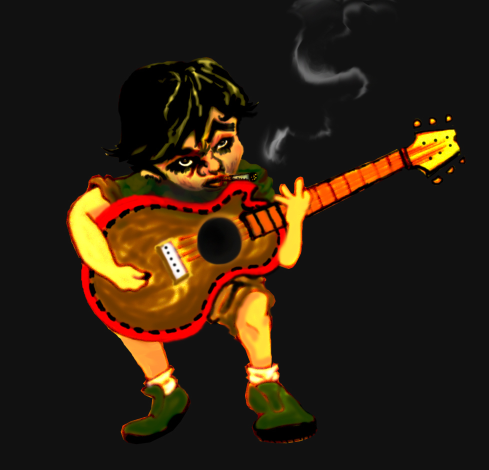
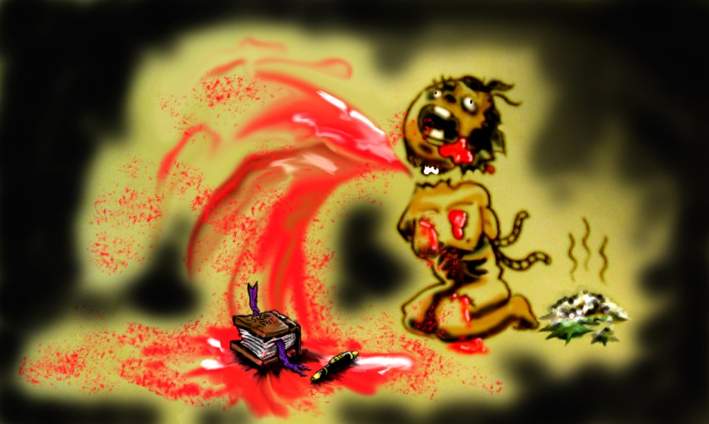
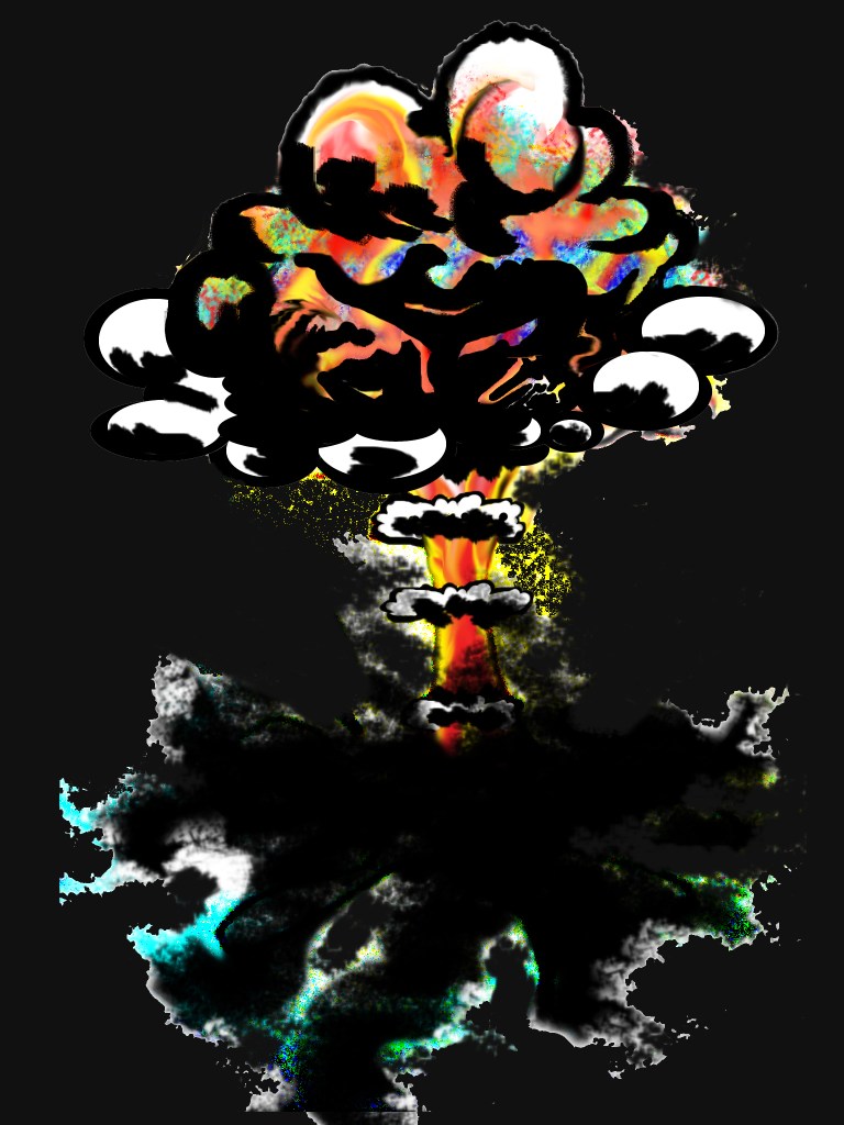
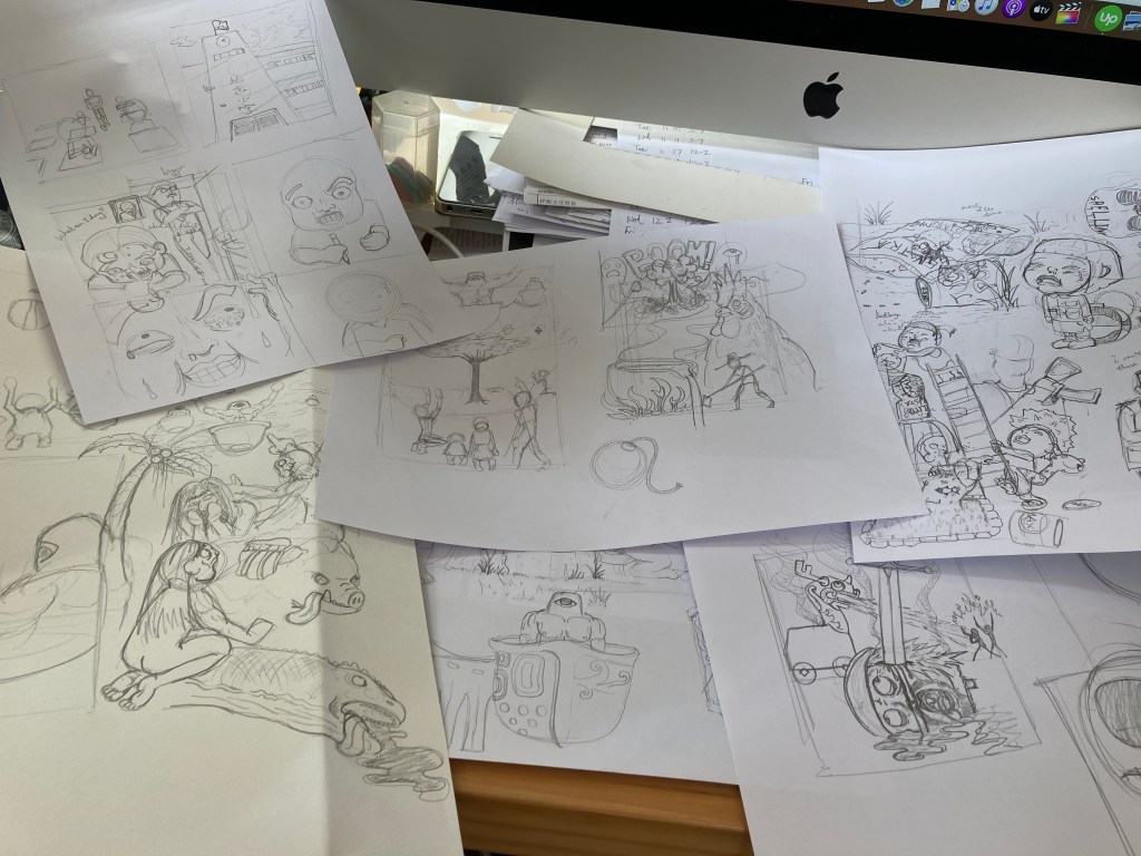
I have dug deep in to my harddrive in retrieving the very first illustrstions done around 10 years ago.
In Touch With Rawness
These where done at a time when I only knew a little Photoshop, with no plans what so ever in how or what to make of these, and like most teenage projects : I did a handful of these illustrations until I grew bored and kinda ran out of ideas. BUT, thinking back these were done around the time when I started getting depressed and I think the crazy, outlandish teenage emo. me really came through in these decade old drawings.
Ive would always remember these drawings though, despite the fact that they were rough and lacked a proper know-how BUT I think they held an energy, the sort of energy that could only be done when going through a mental breakdown as a struggling teenager. As I gotten older, that raw expressiveness is lost, thats why I think in developing my new comic art it is super important to revisit these in order to get back in touch with that energy.
Reflecting On An Epic Failure
There was an ambitious attempt during my top-up degree in completing a WHOLE issue, a whopping 30 pages 5-7 panels each! Although it came out looking like crap, a valuable lesson was learnt back then: ALOT of time is needed. I think I remembered having stayed up like 2 days in a row having realised that my time was almost up, and that it did not come out as I intended it to be.
Reflecting on this piece of failure made me wiser though: I will chop my story up and only draw 15-20 panels tops per issue and that experimentation of how the panels would come out looking like BEFORE I dig-in is also super important.
Getting Better All The Time With Attempts
there is ALOT more…
Ive always loved to draw and during my brief time in an animation course, the 2 life drawings classes did improve my drawing techniques by ALOT, but that was like 8 years ago.
It took a while to have that touch with the pencil kick back in, page after page of attempts were done and finally some of these figures start to make my standard. I then came to a realization: Countless comic artists sit at their desk on Youtube videos and on their drawing board is this ever polished drawing, the footage of that made the cut, but behind the camera how many attempts have they made? Even master artists like Alex Ross and Todd Mcfarlane might have quite a pile of sketches and layouts that end up in the trash…so who am I to not go nuts and just make attempt after attempt? That’s exactly what I did.
Extra Advice
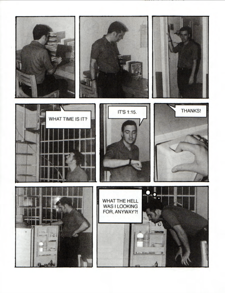
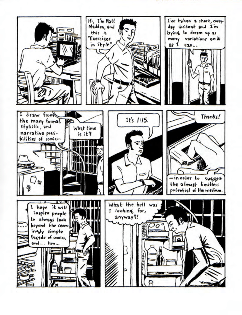
As my drawing started to look a bit better from just drawing around 2 hours a day, Richard provided me with some splendid advice in looking into comic panels vs film camera angles and techniques + to have a look at Matt Madden’s 99 ways to tell a story.
and….there are 97 more, same sequence but in different styles, perspectives, narritives , REALLY bloody brilliant!
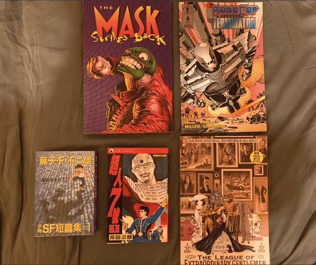
Then I had to go back to mom’s to dig in to my comic book collection…
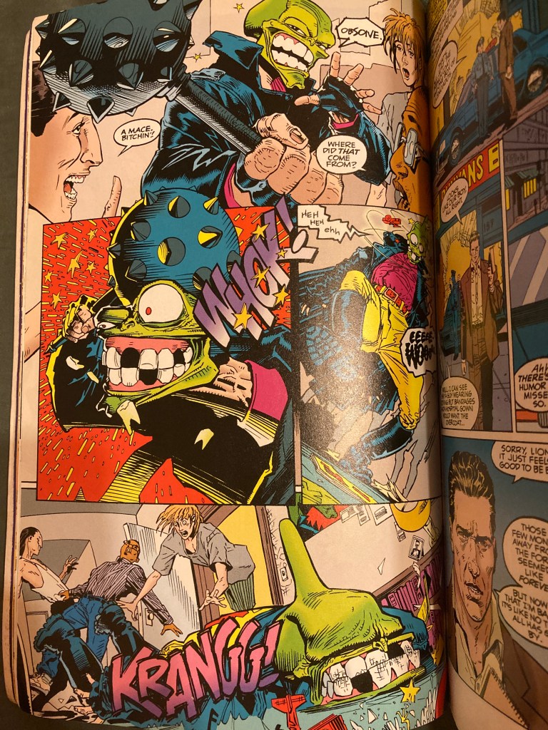
The Mask Strikes Back by Titan Books is such a GREAT comic, I own bigger well-known titles like Maximum Carnage (Marvel), Zero Hour (DC), Deadpool : Killustrated (Marvel) etc., but nothing beats the framing, inking and writing of The Mask Strikes Back. Just on the 2 pages above there’s : worms eye view, extreme close-ups, two shots and crowd shots AND comic techniques like flow of read and continuity. The success of utilizing all these techniques has allowed this story to jump from realistic to cartoon, dramatizing all that is happening in a fun to read, engaging piece of pop-art!
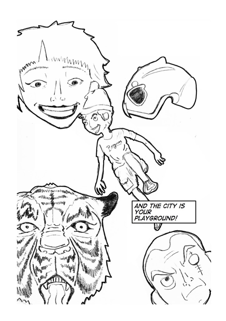
Armed with a more polished drawing hand and having took a deep dive in to my comic collection in identify what makes some comics great and other’s not as much… I decided to go back and re-frame and redo everything I have so far.
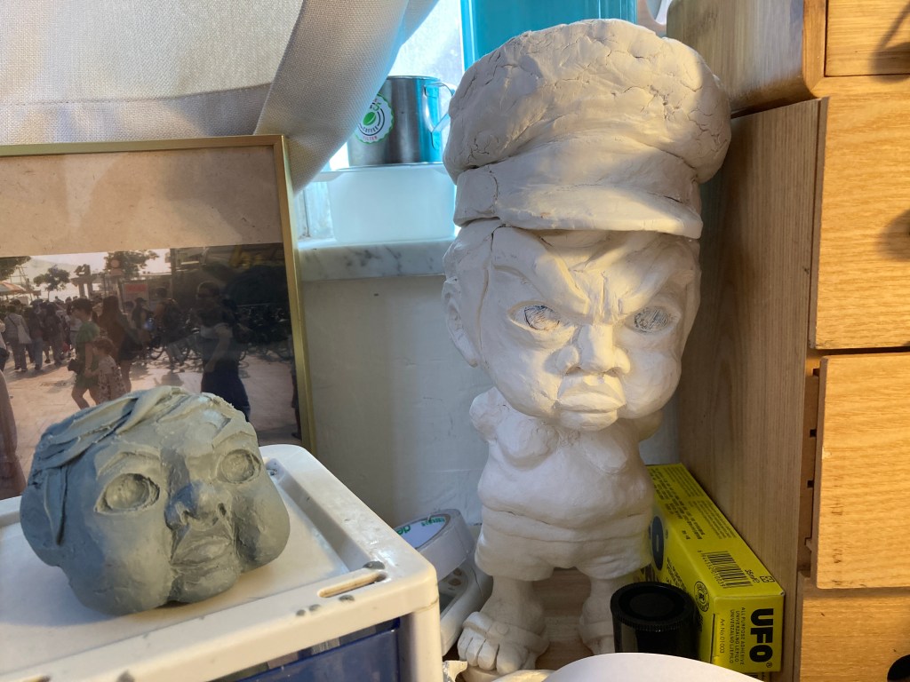
clay work of my main character Webble (not able to pronounce or spell “rebel correctly” as a 5 year old)
Now if I were to work on this comic strip on my own, I don’t think I would formally go through the process of research and moodboarding at all. Having just finished these mood boards though, I think it made everything a lot clearer and also extra considerations came with these moodboards to have this become more than a comic but a well developed, targeted piece of graphic work.
Struggles
When I was earning my degree here in HK, I have attempted to create a super hero character that people in Hong Kong could be proud of, and I will never forget this instructor I had named Gary. He was my instructor for essay writing, so I showed him my first draft when I had around 1000 words, and he told me : comics are not graphic design. He wanted me to rather back it up or change topic which he highly recommended. I did not want to back out.
After having hunted for more research content to back myself up, I came across a lecturer from the US named Arlen Shumer, author of Silver Age of Comics and at the time was touring around US on the topic of graphic design in comics. He was super kind and we spent 2 hours on the phone talking about research, history, typography and composition in comics, I thought I hit my jackpot and will be able to change Gary’s mind. But even with this strong backup he gave me a marginal pass on my essay and left these words in my feedback report : comics are not graphic design.
New Realization
Of course I was upset and all, and for the comic part I totally bombed that too…I think skill-wise I was not ready back then and I did not spend the time to find a good way to produce comic panels. BUT in the last module, I did a small Batman strip that actually restored all the confidence I need to attempt a comic again.
At first, I was worried the whole “comics are not graphic design” issue might surface again, but during the webinars I found my intentions for a self-initiated comic story not so far off from a video game. There is work to do in pin pointing all of my coming panels, character designs, settings in a meaningful direction, to bring the atmosphere to the intended audience (Hong Kong people) through graphic art, and ring the right bells with my story.
The Plan
The idea of 3000 has developed in to a project with commercial/ marketable intentions.
I have read many interviews by Japan manga artists like : Akira Toriyama (Dragon Ball), Eiichiro Oda (One Piece), Naoki Urasawa (20th Century Boys), most of them claiming to have achieved their master piece in a crummy apartment surviving on instant noodels, never expected huge success years later but worked purely fueled by passion. Financial success for them came in the form of TV/ anime adaptations, leading to related merchandises and toys flying off shelves. I have been greatly influenced by this methodology while growing up with Digimon by Bandai and 4WD Brothers by Tamiya.
Instead of “just working on a story”, I want to appeal to a younger Hong Kong population. So in the following is a walk through of my planned story along side mood boards to explain the complete idea I have in my mind.
I intend for the story to go on, but to balance my work load as a self-initiated project, my plan is to release and develope the comic slowly in short 12 panel strips at a comfortable bi-monthly pace.
1 : Ancient Super Cyclops & Their Curse
The story of 3000 has always been thought out to be based on kids rebeling against adults. Having came up with this simple story 8 years ago, the scenario sort of took place here in Hong Kong in 2019 when teenagers headed protests and later riots in expressing their negativity towards the government and “the people on top”.
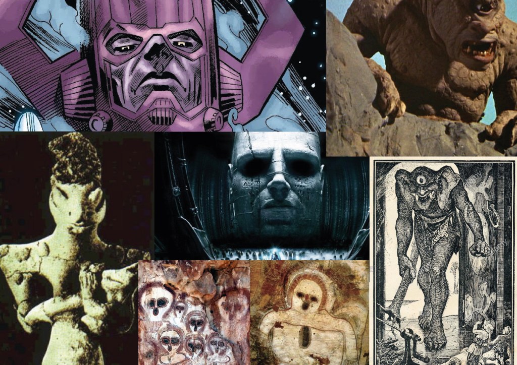
But in my comic, I want a more distant explaination to how young children (not teenagers) would have the strength and know-how to go berserk. So after years of podcasts on ancient civilizations and conspiracy theories I landed on one which made myself super happy with : The Annunaki or as some claim Cyclops Giants.
The super beings of these ancient civilizations millions of years ago were said to be super advanced and were responsible in kick starting human civilization, after humans got out of control and having struck an ancient nuclear war, these super beings went underground in to hiding.
In my story, all of the above happened with one twist : Before the “beings” went in to hiding they are to curse mankind by saying : “Evil will return in the form of a white powder and infest your children”. (please bear with me, after this connections are to be pulled with real word issues).
I settled on the beings to take the form of a race of Cyclops about a month ago, and that I wanted to include the mystic element in to my story to make things more interesting for people in Hong Kong. Escapism and fantasy is very popular in busy cities such as Hong Kong due to daily stress and mundane tasks at work, that is the reason why I wanted to slip a mystic higher power early on in my story to be able to add a further layer to a relatively “normal” storyline of : kids taking arms and rebel against adults.
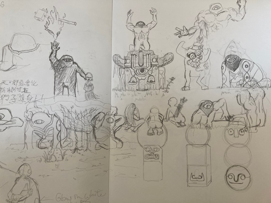
mood borad 1 : look and feel of the “beings”mood board 2 : look and feel of the settings and hieroglyphs first drafts I did a month ago for the issue 1 before deciding to take more time
To be honest, I have only gotten to think of what is to go on for the 1st issue (around 12 panels), I am yet to think of when these beings are to reappear again; I am planting this seed on purpose for the future.
The Year 3000
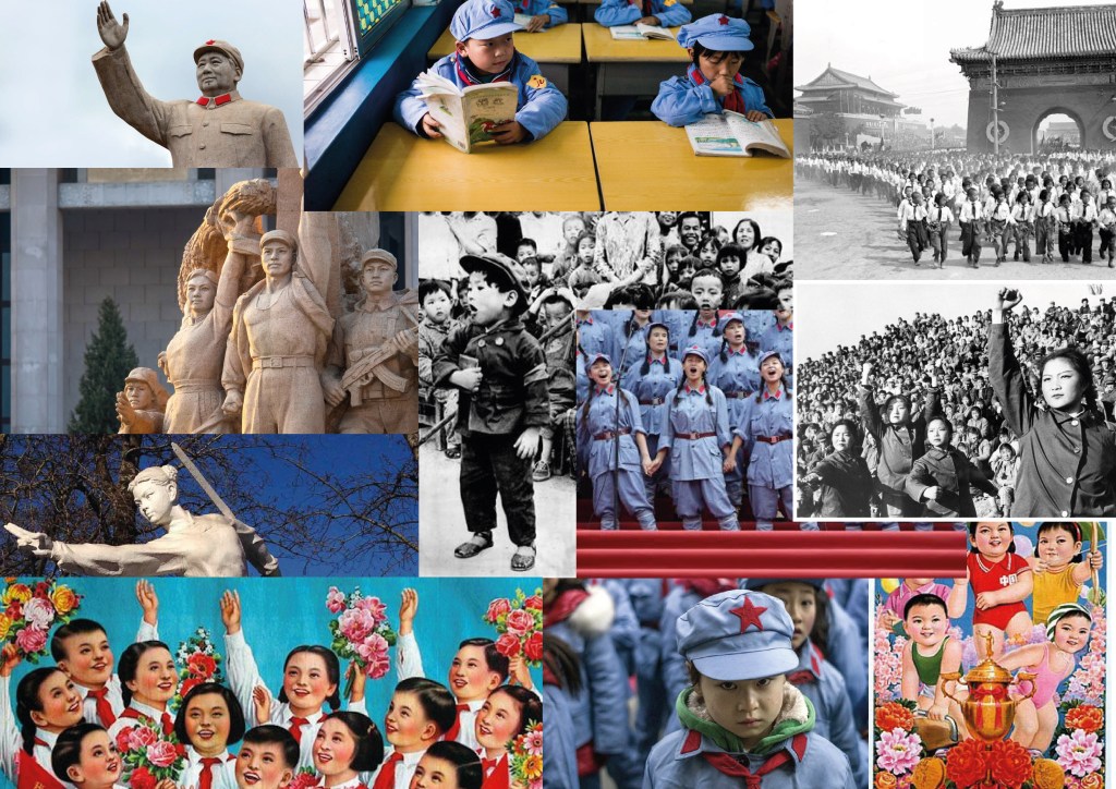
mood board 3 : outlook, clothing and posture of children
In a Utopian society (which appears to be Chinese), a class of children were seated in a class room, forcing the brightest of smiles while they are hard at completing a math exam. The following panel falls on to a boy in his neat uniform and combed back hair when the reader starts to realise that veins are popping on his forehead, sweat dripping and his smile starts to fade. HE SNAPS, and starts to stab the teacher with his pencil. Chaos, not only breaking within the classroom, but all over the city!
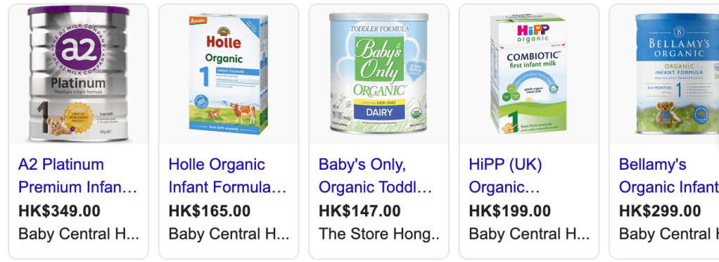
What is the cause of this? Back to reality, in 2008 there was a Chinese Milk Scandal that broke out in China when a baby milk formula was discovered to be responsible for kidney problems with infants and the company responsible having attempted to cover up their mistakes.
Now back to the story, the cause of the children rebeling is tied to the Milk Scandal, remember the white powder? Infant formula.
The choice of this is also led by my observation that children born these days are a lot smarter and that they grow to be freakishly tall, and in inquiring and bring up the issue amongst friends, the answer usually ends up back to milk formula. In Hong Kong, manufacturers pour millions in advertising infant milk formula, coining scientific terms like HMO, Aptamil and other fancy words like that; and since the China Milk Scandal, Mainland Chinese have been buying bulks of formula from Hong Kong, becoming one of the grudges HK people hold against the Mainland Chinese.
the many milk formulas available in HK
Personally, I think it’s unnatural to be boosting growth like this and there has always been talk about the side-effects milk formulas could bring. In a total fictional way, I am trying to include this issue in to the 3000 story.
On the other hand, the selection of the children appearing Communist Chinese is a tap in to the fear of some living in Hong Kong: The era of Chairman Mao’s Cultural Revolution from 1966-1976 was a significant period in time that made HKers fear the handover from Britich Colony back to Chinese rule.
The comic, is raising and highlighting happenings here in Hong Kong, serving the purpose of awareness with the use of story telling and graphics (comic). With decisions like this, I am attempting to bridge graphic design and comic as close together as possible.
Illustration Style
mood board 5 : illustration of comic
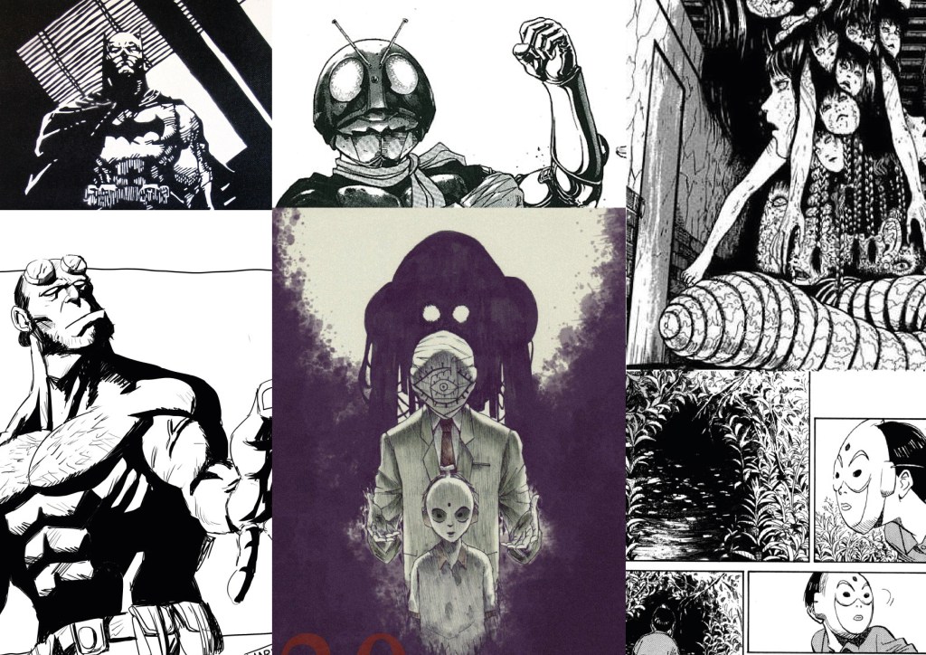
I want the comic to appear dark, giving the reader a sense of unease as one scans the panels. I selected panels from Kamen Rider (Shotaro Ishinomori), Hellboy (Mike Mignola), 20th Century Boys (Naoki Urasawa) and from Japan Horror Master : Junji Ito. They are all known for a solid high contrast, shadow and texture heavy drawings which is exactly what I am after, which I think is great for blood and gore yet pops and stands out in a modern way compared to the inside panels of more traditional artists like : Jack Kirby, Todd Mcfarlane and Alan Moore, which they take more advantage of color print.
On a side note, I want to illustrate in “black and white” and to print my issues on colored paper to stand out in a genre that has much competition, also to attract more attention to my relatively short issues of 12 panels, neatly packaged in to a black folder.
We started off the 4th module by revisiting some ideas we have from mod 1 & to take one to further develop in the coming 4 weeks. I took some idea from Mod1 and wanted to come upo with 2 brand new ones to see if there’s something new I could work out.
1. 3000 Comic Ive been drawing and sculpting these lil’ children in military uniforms, and have always wanted to come up with a story and make it into a comic.
Recently while listening to a YouTube radio show on conspiracy and super natural stuff, a story sparked me and I think I have the first part of the story down : An ancient group of giants goes in hiding underground after a war with mankind (this part is from Anunnaki stories), before they went they announced : “you are all cursed, evil will return in the form of a white powder and infest your children”. The white powder turns out to be infant milk formula, which I think in reality is making kids smarter and mature a lot faster. So these super smart kids suddenly just snapped and rebel against adults and they ran off to an island. My current working title for this story is called 3000. James Stringer coined the perfect term while introducing Sovereign, 3000 is a “magical realist” piece mostly reflecting current issues in HK/ China and pulling connections with ancient civilizations and conspiracy theories and stories.
2. Risky Whiskey During my time as a college student in Canada, every weekend we went to the LCBO to get the cheapest liquor we could find, we always talked about how we didn’t care how the stuff tasted like as long as it got us drunk. So as a graphic designer, I have this idea to brand a cheap whiskey named Risky Whisky. The style of the branding is to have the illustrations look like Renaissance style ink pen drawings, with a pilot riding in a ridiculous looking flying device made of wood and paper. I just simply thought that would be super bold and appeal to a college crowd with its humor and low price.
3. Hey What You Up To? I fell in love with doing interviews, and having watched a few clips on You Tube by Pablo Strong titled : Streets of London, where he just takes a mic and interview random passerby. I want to do exactly the same here in Hong Kong. In Cantonese that will mean a lot to our city, for Hong Kong and Guong Zhau are the last cities that speaks Cantonese as a main language, and producing more in the language can help promote the language. Secondly I want people to understand each other better, with the heavy political happenings last year, our population is split between people that want Chinese rule and the people that don’t. For me it’s important that we all still have a respect for one another and not let this gap widen any further. So it’s kind of an idea someone else (or many others)had, but taking that and putting it in a different context.
4. Mascot Doctor There are many bad mascots here in Hong Kong, ive always wanted to just take all of them, redesign them and put all the redesigns in to a booklet. Having the collection in hand I could just walk up to these business owners and see if they would be interested in adapting them for their own use.
8 Year Head Start
Months ago I was told that an exhibition filled with teenagers who are after indie arts/ crafts is looking for artists and designers to join, so I revived this idea ive always had since around 8 years ago and was going to cast figurines in plaster and come up with a comic strip to go with. I later scrapped the idea of making it in to the exhibition though because I felt that the quality and quantity of work deserve more time and care.
I’m starting to realise how awesome this course is because it’s not the first time I am able to include self-initiated projects, to work on them properly with advice and guidence.
So after I have had my 4 ideas written down, I already pretty much made up my mind to work on the comic strip for 3000.
With the basic set up pretty much decided, the other details in building and maintaining the site is being considered.
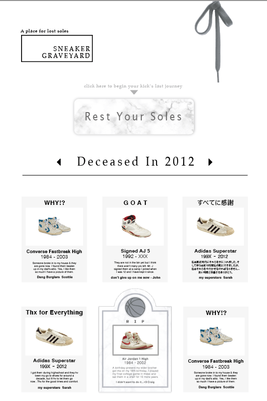
first demo to show web designer with
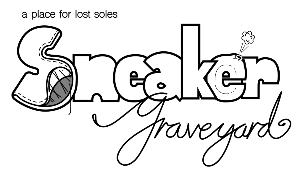
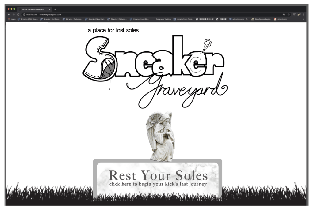
First off is to develop a logo. At first in the demo, the aim was to achieve a graveyard look, but after the demo was complete, the overall look looked too dull. In order to attract teenagers, or people that are more in.
to pop/hip culture, the outlook has to pop more while being recognizable.
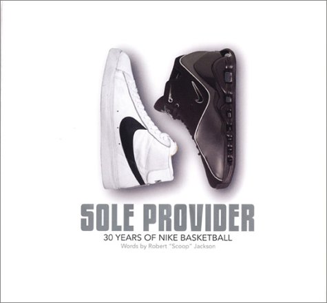
I started off wanting to “wing it”, armed with a couple of ideas, I went on AI and started drawing with the results not even being close to what I wanted. So I went and looked for a bunch of references mainly from Nike, and a book about Nike sneakers named Nike Soul Provider written by Robert “scoop” Jackson, editor of Slam magazine.
Nike : Soul Provider
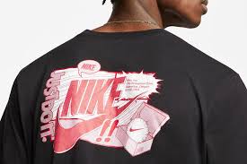
some Nike prints
I started sketching quickly came up with a chubby font paired with a slender cursive “Graveyard” I found fitting, but then was trying to look for more elements to communicate “worn sneakers”, then I started to picture all the heartbreaking things which could happen to a sneaker: separation of leather and sole, hole in air pockets, dirt and grime etc.
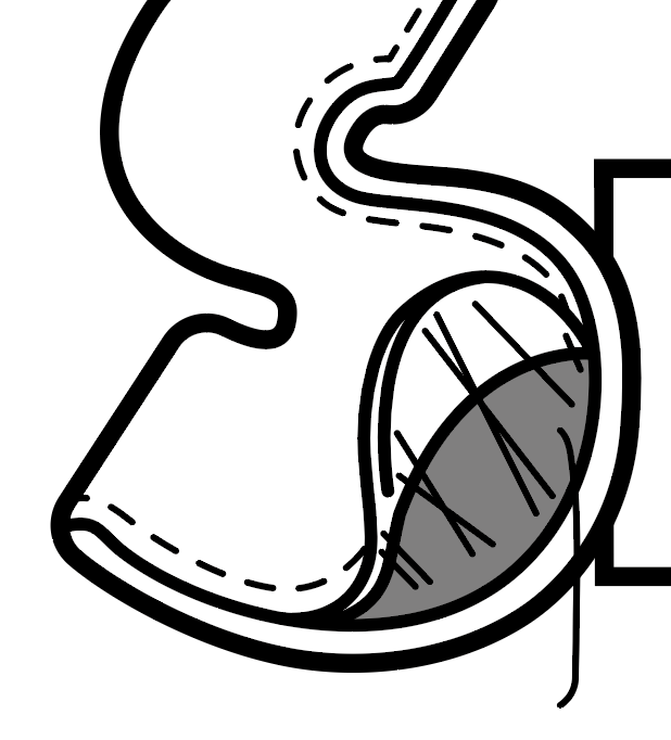
leather seperate from bottom sole
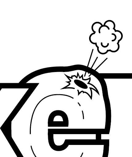
burst air pocket with lump
Eventually I ended up with a logo that screamed “Nike t shirt graphics”, but wanting a sort of mascot to leave a deeper impression, I went online and found a stone angel in creating that main headstone/button, after all that spot is a focal point to the site and needs more highlighting.
site mechanics : seperate smaller window / wall to scroll through
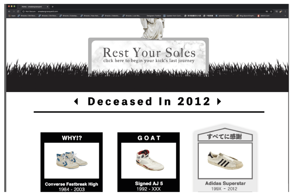
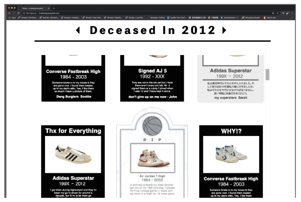
On the other hand, the standard free posts are now in black and white writing, compared to the early beige version, the high contrast of the black and white makes the overall look and feel stand out way better. With all these adjustments made, the site layout went from serious and boring to quirky and pop art.
I have learnt a lot about site building communication with Sam trying to get this built. One interesting mention is when we were figuring out a way to allow public postings. At first, we thought about having people fill in their sneaker info: sneaker model, date, 300 word story, upload their photo and that the post would show up automatically. The problem with this thought is that it might take a programmer to create this setup OR to find a plugin as close as possible and change the parts up. Then I started thinking about control and filtration of content to take out any incomplete fill-in or ads, plus the fact that we are to include selling “E-headstones”, a little design thinking I picked up from this module kicked in: what if it’s as simple as a form being filled in, sent to us and we’ll do the posting ourselves.
This plan would save us lots of starting up money, but the downside is if we ever get popular, we should have to figure out something else.
The donation button is included in the demo, and I am still yet to figure out where other content such as : shoe recycling or data collection should go. But for the beginning phases of the site, our plan is to first promote it enough and encourage visits and posts in gaining popularity first.
GOALS OF SNEAKER GRAVEYARD
By implying emotions into products, we are starting a conversation within the sneaker community that was unheard of before.
1: Having learnt about people with over 1000 pairs: it’s an awesome sight to see, but honestly there’s a problem. For one it is an obvious over consumption, the extra resources could go to someone in need, and secondly using all that space for storage (specially in Hong Kong) is a common house cluttering problem due to the lack of space.
2: An archive of dis-continued shoe models for sneaker fans to see and revisit.
3: To send used sneakers out for recycling and for those in need.
4: To become a source for data related to sneaker consumption.
PROMOTION
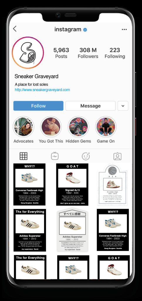
“E headstones” are neat enough to match perfectly on Instagram’s setting
1.We are looking to put a lil’ money on Instagram and Facebook after the site is functionable.
2. Instagram account is to feature the “editor’s choice of the week”.
3. To approach sneaker recycle that are interested in working with us.
4. Enjoy up to 50% off on headstones on the first month!
Improvements
The placing of other features such as : to submit shoe for recycle or to give shoes to those in need is still in considerartion, but the mentioned features might not be added until more activity is seen on site. I do not wish to disrupt the “true horizontal” linning of content on the site, hopefully the features later on could fit in to the design.
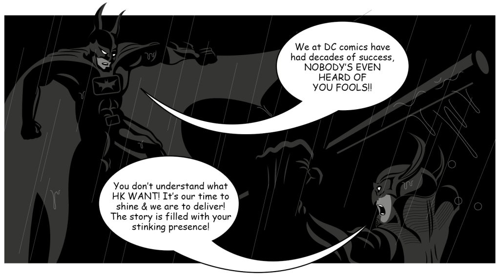
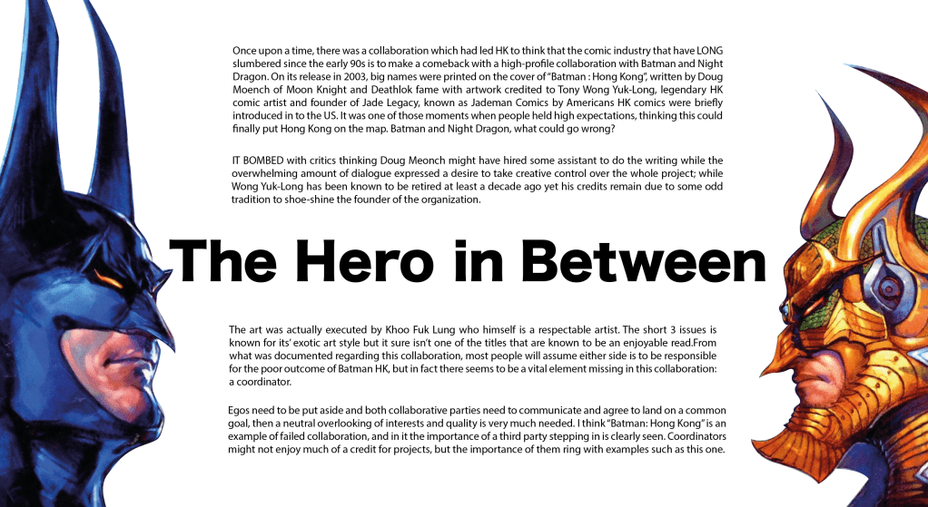
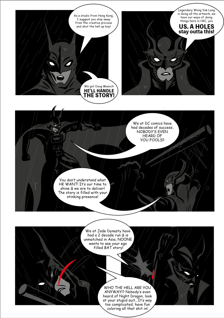
This extremely anticipated, once in a blue moon collaboration happened in 2003, especially for people in Hong Kong, the classic Jade Emperor Comic’s cross over with DC was suppose to mean something, to put HK comics back in to the spot light after a decade of “not much going on”. In the end, it bombed.
Both DC and Jade Emperor claiming to have sent their biggest of guns, GRAND daddy’s of their established companies to do the job, both were later found to have hired someone else to step in while they kept the bigger names of Doug Moench as writer & Wong Yuk Long as artist. The evident struggle which this collaboration have suffered is that there was a tone of dialogue, having pieced together short posts, comments of the very very little documentation online reguarding this publication, the common impression is that the folks over at DC were introduced this project of creating a story and have it sent over to Jade Dynasty in HK to work on the art, and evidently the writing was long, draggy and dominated the whole book, readers having claimed that the story having gone nowhere near interesting, rumours of a then assistant Khoo Fuk Lung was wearing a sad face the whole time he was inking this piece.
What I learnt from this is that : there needs to be a coordinator in between 2 super powers, I think it’s obvious by seeing the results that both comic houses barely even communicated with each other or maybe they refused to do so. Batman Hong Kong did become a classic, but only in the sense that it was a rare crossover of 2 seemingly unrelated publishers and the fact that it’s most likely not to happen again.
Story in detail is here:
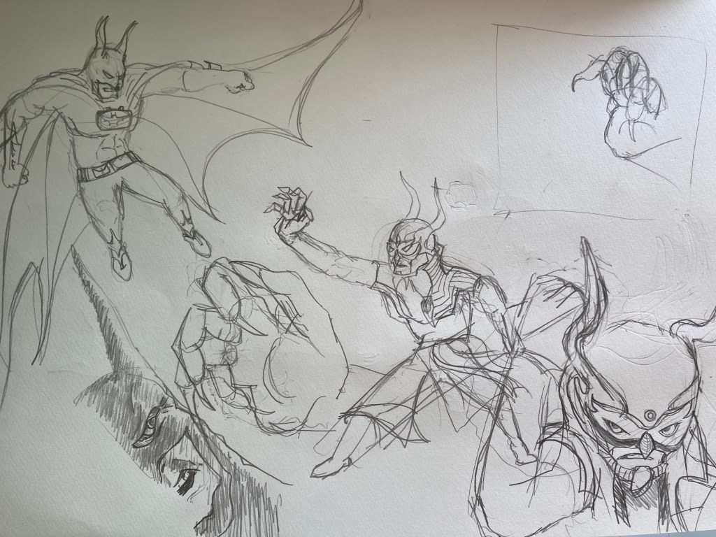
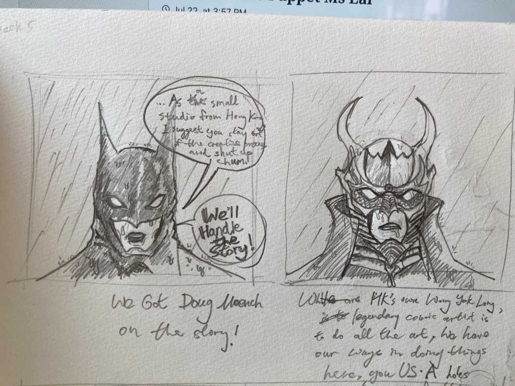
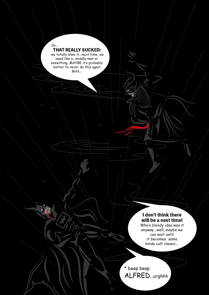
As we were supposed to work on a piece of editorial design to talk about our findings, I told myself I wanted to find the time to work on a comic strip with Batman and Night Dragon slaughting it out with the above writing to be fit in as dialogue.
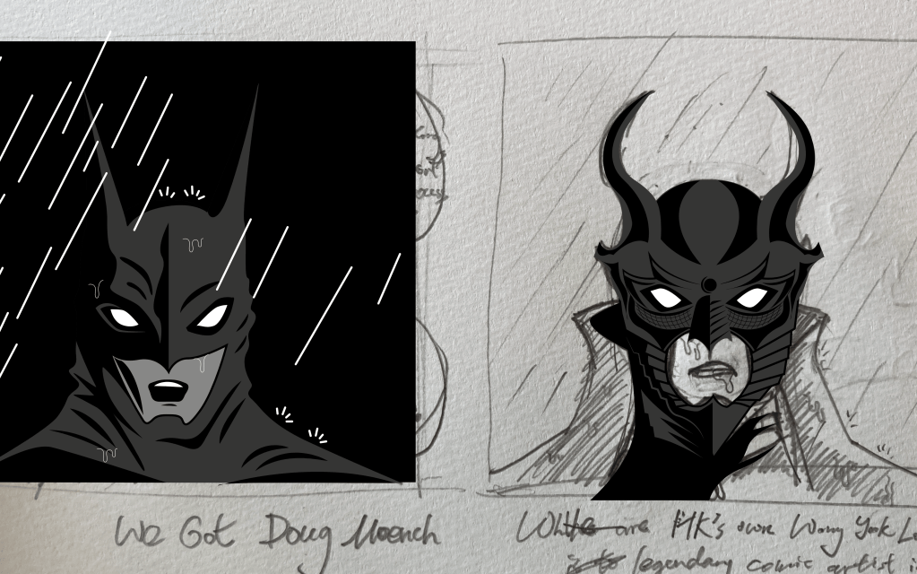
Having not drawn characters in a while, it took me a lot of bad drawings and failed posing to end up with the 7 frames I chose to work on, but I have actually never inked a comic in before. In search for a quick, moody method to deliver the best effect I could, I flipped open my Art of Hellboy book by Mike Mignola, some techniques from my days studying animation and tutorial clips by Todd McFarlen.
One of my favorite art books on the shelf
Todd McFarlane live drawing of Batman
This is how I started off:
Comparing to using Photoshop like Todd McFarlane did in the video, I used a combination of strokes and the pen tool in creating my shapes, I am not sure how Mike Mignola does his shadow/coloring, but the result of mine done in AI does come close to Mignola or even Frank Miller-ish, the line work is straight and tidy with shadows making up a big portion of the frame.
I’d say it’s a pretty good start, but I didn’t have the time to fine tune for better line work, so ill leave it like this for now. Another thing is that I never thought the speech bubbles would take up so much of my frames, although I did have fun thinking bout shorter dialogue to tell the story of this failed collaboration between HK and the US.
Having wanting to do comics for the longest time and finally figuring out a good way to shadow and color, I look forward to do a comic of my own.
As a designer I think it’s normal to have a brain filled with ideas with potential, i’d like to thank the course in helping conceptualize these ideas & make us consider the details in making them a reality.
Having spent the past 2 years at working at a college, working in the graphic design department really doesn’t relate much to personal practice. My urge to set all these ideas in motion is higher than ever, so I think that the course actually gave me the initial thought that the ideas are to be put to work, so a big thanku to Falmouth Flex!
I think I self discovered a thinking method in branching out existing ideas that might not seem to relate at first and tying them together. I started off the list of 10 by doubting a lil’ if I am cheating in doing so…BUT not knowing what sorts of development to expect in the following weeks made me feel that repeating certain things that have been done before might not be a bad idea.
Another doubt I had is that : Am I doing this because I am running out of ideas? But I got over it by assuring myself that i’m doing this because I don’t think I am done with these ideas, and that thinking of a graphic design/creative career in phases/ experiences I am going through at this age, I do want to ultimately let go of what I have now in order to have the capacity to not dwell on the old concepts to free space for new ones. So here goes :
1: Hong Kong Handout A lot of the other ideas are a branch of this, so im gonna spend more time on this one This is a module 2 project I am trying to launch. Based on the thought that Hong Kong citizens need more design awareness in order for the industry to thrive. The Hong Kong Handout is to be a free bi-monthly booklet made free to the public, with every issue based on a specific topic of : Design, culture or profession. If more of us could come to a better understanding of what other’s jobs are like and what their missions are like, only then would the HK public lay down negative stereotypes towards certain professions, eg : design = arts and craft, social work = rely on wellfare.
I would consider Issue 1 is to be abour HK mascots, I need to re-arrange things and have it translated into Chinese. While issue 2 im thinking on talking about social workers for I have 2 interviews done and have learnt a lot about their work and heard stories that are worth a read. Other topics in mind include : Musicians, Minorities (HK has a big middle eastern population and many Philipinos work here), Education, Fashion etc.
2: Online Highlights of HK Handout This home website for HK Handout to have featured articles that are a quick read, to mainly act as an attraction to have people pick up a copy of the HK Handout.
3: HK Handout Collection Im thinking for every 10 issues of the Handout, a collective hardcover book could be printed as a collection of all the juicy content OR even seperate a bunch of these topics in to 3 categories/ volumes such as : Professionals, Design, Culture.
4: The Hong Kong “Hand” I think the sock puppet interviews I did last month was a lot of fun to watch, and that in order to publish this content and have the world understand Hong Kong better, these re-enactment of interviews in English is a great way to go.
5: Handout Archives Since my interviews are all voice recorded, there is no harm in uploading em to a Youtube channel?
6: Help Cards In an interview with a social worker who focuses on domestic violence and women rights, I asked Heidi that about her years of experience and what to do when they witness potential family matters that deserve attention during her off time, and she told me that she keeps cards with contacts or even words of advice with her, in tricky situations she could slip these cards to who ever is in need. As a graphic designer I am really interested in designing these cards for certain NGOs or social work organizations. 7: Online Hong Kong Mascot Archive There are mascots that became a collective memory to HK people that might have once appeared in some ad or commercial, and that the company that used the character might have been long gone. It’s never too late to start documenting them to inspire the generations to come.
8: Graphic Design Workshop for Business Owners I think this could become important for business owners in Hong Kong to learn about design thinking and how that extra perspective could add so much spark to a business. An effort to lift the status of Hong Kong designers.
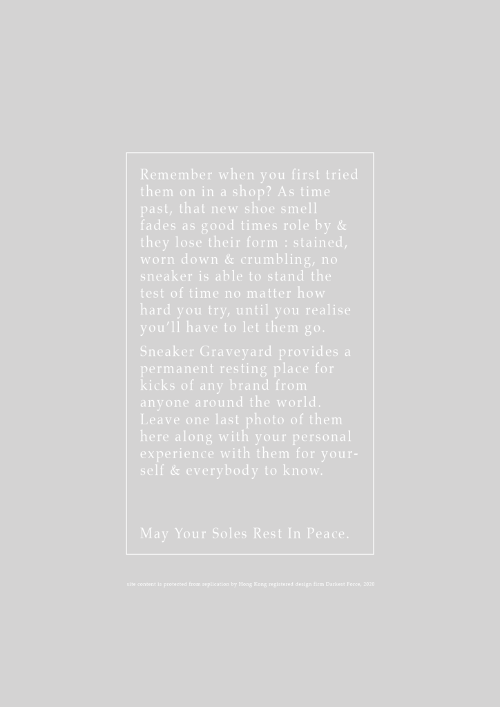
9: Sneaker Graveyard I am a sneaker head, and I would used to do sketches of my worn sneakers before they’re going into the bin ; certified death.
There are sneaker models that do not see the day when they get a retro, and I think about them sometimes…My idea of a sneaker graveyard is to have a set format for the “last shot” of your beloved pair and a 300 word story to go along with it, all in memory of that sneaker that served yall so well during it’s life time.
10: UM99 (HK glued together) A bunch of friends and I are starting live shows and DJ sessions online, eventually we want this to become an online mart where local brands and artisans could sell there goods. The promotion comes from our live streams consisting of : Concerts, live interviews, broadcasting events such as Chinese Shuttlecock competition, poker match for charity etc.
Week 10 Design Authors
Ive never talked to Adonian Chan but he’s an active member of the HK band scene is actually a distant friend of mine. This book is REALLY sought after by designers in HK and I yet to lay my hands on a copy.
A point to reflect on though is that I think it is important to document old Hong Kong as it is fading in front of our eyes, YET HK’s graphic design scene is continuely spinning in circles around the topics of the old, and the main development directed by the government regarding creativity is defined by technological advances. It’s all good but then I think it’s time for us in HK to broaden the topic in to modern aspects of our lives.
Adonian Chan +Ire Tsui
Published in 2012 by Joint Publishing with Adonian Chan (graphic designer) credited as it’s major contributor, this book documents the Chinese typeface : Bei Yi, which saw it’s many application on old billboards, advertisements and packaging in Hong Kong from the 1940s-70s.
In the book are interviews of an old designer responsible for much Bei Yi application on the side of trucks advertisements named Yeung Gai and Adonian Chan himself, who spent time 1st gathering Bei Yi letters from different sources and re-drew them with computer software.
The name appeared a lot when I was sorting out design books at my job at the college, and I am so very ashamed of not knowing this name by heart earlier for I refereced from his beautiful books A LOT! Check out Vista’s site also, really cool lookin’!
Born in Koblenz, Germany in 1982 and studied communication design at the University of Düsseldorf.
Jens Müllers works – including special stamps for Deutsche Post – have received numerous national and international awards. In addition to his work as a designer, he researches the history of graphic design and is the author of much respected textbooks, including “Lufthansa & Graphic Design” (Lars Müller, 2012), “Logo Modernism” (Taschen, 2015), or most recently the two-volume work “The History of Graphic Design ”, which traces the development of design history in a worldwide context on almost 1000 pages.
This week we are to explore how the design process could be fitted in to all levels of management.
After the lecture I went a lil’ browsing online & found a paper written by Serkan Gunes titled : Design Entrepreneurship in Product Design Education.
“…reutilization of innovation frequently embodies as a practice of new product design yet design include the discovery and creation of new kinds of consumer goods that covers creative thinking, planning and also brand, identity, packaging, color, finish and materiality, form, and user experience; in sum values for consumers. The amount of contribution of designer in value creation process has been a controversial issue for a long time; on the other hand, there is a very large pool of empirical studies promoting design and its result as added value in the literature.”.
All the materials I have gone through had me thinking about myself working a Graphic Designer and the fact of how differently we think & conceptualize compared to lets say…the big boys sitting in the top office at the college I work at : 3 day discussions with no conclusions what so ever and some real BS decisions, all so obvious during the pandemic. (I don’t think I should get in to details, maybe) AND sitting at the small 4 person design department, we always seem to make a lil’ more sense, coming up with solutions the 4 of us would agree on during our lunch chats.
But having talked to Chung Lik Lai, acting as a major board member at the school. Although vague but I do come to understand that as a fairly big education organization there are difficulties in driving every one in one direction and that some things are “not as easy as they sound like”. It gave me an abstract kind of realization that a big place is no fun to run nor manage.
A story stuck to my mind when I was really young: A line of kids first started to pass a chicken egg and by the end of the line the last kid would be told it’s a dinosaur egg. This has always made me strive away from big places, to be honest I never heard of any big places keeping their staff generally happy, and for me : I’ve been longing for a place to happily work at…but that might only exist in my dreams. A big place gets big productions done, but it always seems like that can only work with a dictator fully in charge and is willing to look in to the many aspects no matter big and small within his/her realm.
SO, now that I am preparing to start my own studio, I wish to be a fair employer & I do not want my operation to blow up to anywhere above 20, I wish to practice design management in a controlled environment & that all plans & budgets could be visable, I think my experience working in an extreme traditional setting really turned me off and has showed me how badly it works. Seriously, this is no rant on how bad or how upset I am to nor have my contract renewed (in the matter of fact im kinda glad now to leave this behind me), having had the opportunity last week to meet and talk to a couple other staff ranging different departments from social work to airline to the administrative staff, everybody knows they are to lose their jobs sooner or later, everybody talks about the lack of support, resources contradicting to the fact taht they recognise themselves as an established institution while rarely any body in Hong Kong has heard of this college.
(I have said too much already)
This I think is a summary of the levels and a brief perspective of what design thinking could bring to a company operation and the most valueable part in my opinion, is the designer’s ability to think from the user’s perspective & the fact that the main part of our practice is to deliver to the user.
As designer wanting to be owners, I think it is important to first read more and learn about the many aspects of managing business, but most of all : talk to people. SO many useful contacts and advice could be pulled from the many surrounding us, yet I have left untouched over the years.
The video on week 7 took me lots of time to finish and that there are certain apects of it that were not considered until now.
Small Reflection
Now, Id like to leave a little note on how my life has been going lately. I have been notified that my contract working at the college is not to be renewed…which greatly upsetted me for around a week until I started picking myself up again. Reflecting on ol’ times, I think im getting better at doing so, I flunked out of Uni and started fresh back here in Hong Kong from a higher diploma, battled a half year depression & anxiety, and a couple years back was lost and wasn’t sure what to do with myself. This time facing this though this course has given me a lot of knowledge and inspiration to stand my ground…this job ending might not be a bad thing at all! I am actively talking to people around me and has come to the conclusion to establish my own firm, is currently going through business registration and has linked up with an old collegue, now bandmate & business partner, an experienced website designer to make things happen, and these things, include almost all that is happening in this module. So compared to when I first ran a small “room” of 3 right after graduating from my higher diploma, this time I think I am more ready and is fortunate to have signed up for the right programme, recieving awesome guidence in building a design business. (let’s hope the economy doesn’t belly flop on me now)
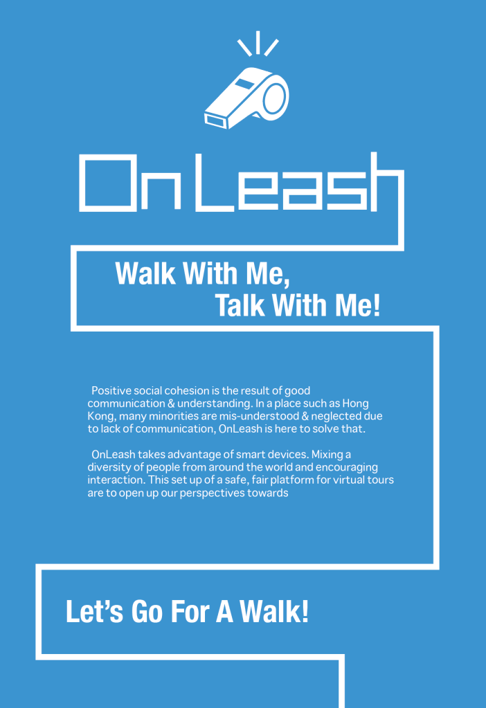
Back to OnLeash
A major part that is missing from the video is the actual experience and how it is to be setup.
The thought of users being able to charge for hosting tours came from last module’s analysing of Food Panda: the fact that it provided a “part-time” job that is free for anyone to sign up really picked up in Hong Kong, many of jumped at the opportunity having been laid-off due to the pandemic & social unrest of 2019, which got me thinking about the draw of being able to earn a quick, direct income with an app.
Name & Logo
Alec was kind enough to have adviced me that people might think that this is a dog walking app, at the time I was only done a lil’ gif as an icon for The Puppies (participents or “people on tour”, see pdf document above for details). That is why I went for the whistle as my main icon.
For the name, I tried to think : Cam On Legs, Walk Me or E-tour…but OnLeash still stuck. The name came from the happy picture in my mind I cannot rid of : Dog owner going “wanna go for a walk?”, then dog happily wag’s tail with all the excitment in the world, and puts on a leash.
This might be able to serve as the project’s name for now until a better name pops up, I do understand and feel that the word leash does give a certain impression of restriction or even S&M, but again, I can’t rid of that picture of my ol’ bipoo yanking on the leash infront of me, excited to see what is to be encountered on our journey together.
A Link To The Handout
The idea of OnLeash is also due to the conceptualising of The Handout. A big part of the The Hong Kong Handout comes from doing interviews (now im making a habit to just record long conversations on specific topics), to get in touch with someone local is already sort of a hassle, but what about somebody overseas?The whole concept actually started as a way to interview others, thinking that if I had access to talk to someone that would be great, then wait…what if they could show me around? Then violia, that’s it!
While I was making the video for week 7, I had trouble looking for locations that are interesting enough for me, then it suddenly came to me that : I could just film any corner here, and for those of you that are let’s say, in the UK, that could be one of the most interesting corners you will see today.
Control
It is most important for OnLeash to be a safe platform and free from the pollution of dating, sex & race related insults.
I would like to assure the user that all happenings are well documented & monitored, which is actually the reason for the clean, simple graphic design choice; friendly and even child like at times in communicating a safe, cozy platform to build healthy conversations & exchange.
The management in maintaining a service like this would be massive, a set of staff would need to be seated in treating complains & over seeing transactions. Servers would also need to be purchased in keeping a massive set of data compiled by recordings of tours being hosted.
Kickstarter
Later on you’ll be shown Sneaker Graveyard, a first collaberation with my web design buddy which has so far only taken us about $1K HKD (around 98pounds), not a lot specially when 2 are chipping in; for OnLeash I never even started to check on pricing already knowing that just a programmer might cost me a minimum of $50,000 HKD (around 5000 pounds) already, and that price was only quoted based on a simple buy & sell app.
Then one day when I was making coffee, it struck me to take this baby to Kickstarter.
So when this module is over, ill be punching on a calculator and working on more details of OnLeash. Compared to Sneaker Graveyard, I don’t think i’ll have too much of an expectation for it since I can imagine having to gather quit an amount of funding to achieve the full picture, but trying out crowd funding would be quit an experience I am looking forward to!
First off I’m really excited to say I am building Sneaker Graveyard with a bandmate of mine who is a website designer.
What happened was we were clearing out our bandroom (we both lost our jobs and there are just no shows to play due to the pandemic) . Web designers carry a very different vibe compared to the graphics peeps, he leans more on the technical side of things and pretty much keeps to himself a lot. I started just asking him how much he would charge if I were to do this and that, and out of my surprise he’s like “Ill join in!”, and that’s how this lil’ idea of mine is starting to materialise. So what I’ve learnt is that always talk to those around you..ive known Sam for like 5 years and never spoke of a single collaboration with him.
I found out that people keep like 100s at home and rent a space somewhere else to stock up on 1000s. In the article these are pretty much local celebrities and successful business owners, but for a guy like me living in a 350sqft apartment, I gather and with good care some of my oldest pairs have been around for 8 years creating some frustration for my fiancee. There are some models I have some sort of an emotional attachment to them and do not want them to go in to the bin, with that said I was sent a video by a buddy of mine, a pair of 10 year old AJ5s were taken out from a shoe box, it just crumbled in his hand…what a heart break.
Community
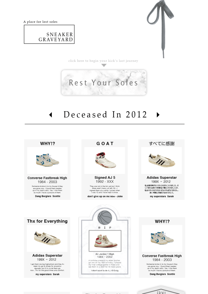
The intended success of Sneaker Graveyard is focused on a community of sneakerheads (believe me when I just say this, it is HUGE), and the confidence in having enough people posting on the site comes from the nature of sneaker heads loving to show off.
The sneaker heads around me are quite conservative, the conversation usually goes : Nice kicks, thx, where did you get em, story of how great a deal, the end. We believe there’s more to it, and that adding an extra emotional level to sneaker heads could be somewhat a stress reliever and a way for kicks lovers to express themselves more. Why do you like AirJordan 5s so much you have 20 sets of them? What was it like when your mom got you your first pair of sneakers?
Striking these conversations are going to be interesting, we do not really know what to expect yet ourselves.
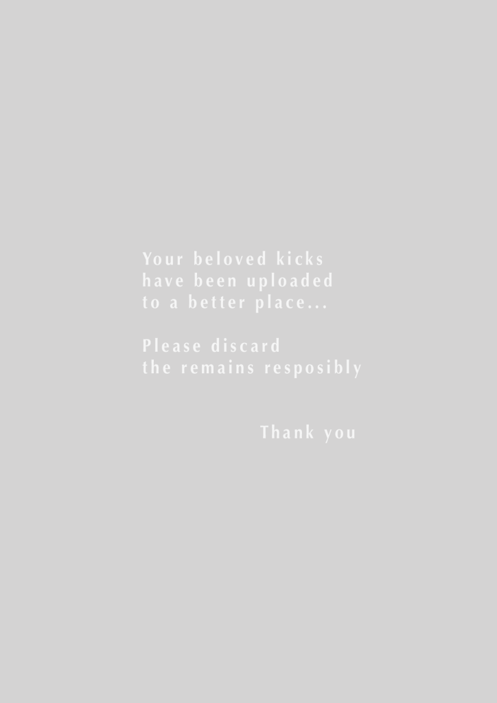
Letting Go
So knowing im not alone and the fact that no sneakers last forever even if you don’t wear them…Sneaker Graveyard plays on the emotional attachment with sneakers and wants to help people let go of their “dead soles” by hosting a permanent platform where sneaker heads could honour their sneakers and properly let go by leaving a headstone with the sneaker’s photograph and a short reflective story to go along with.
Marie Kondo has become some what of an instructor in solving clustered homes, with Japanese Zen methods, she encourages people to properly send their old belongings off with something similar to a ritual, thanking objects for the good times serving and saying a proper goodbye. Sneaker Graveyard comes in line with this method and philosophy that was popularised in the US, this video of Marie Kondo is a great piece of evidence how Sneaker Graveyard could be positive for sneaker fans that need to let go.
On the Business Side of Things
There are 5 aspects in generating a revenue :
1 : Ads, I rather not have in order to keep a clean look.
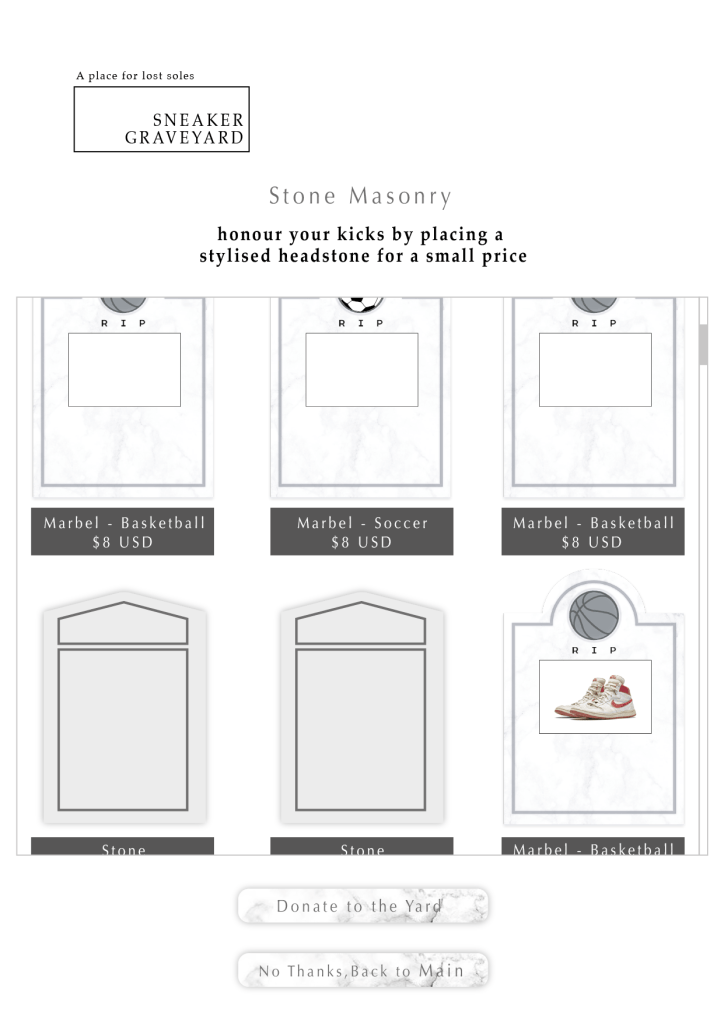
2 : The platform is completely free and is public content in nature, yet before “your soles are send to a better place”, there is the option to set a proper headstone for a small price. We are expecting this to be similar purchasing behaviour to game items, or buying gifts for others in a chat rooms.
3 : Programmes such as: Nike’s Re-Use A Shoe & Got Sneakers are actively collecting used shoes, although un-certain of how this could be worked out at the moment, we could drive traffic to these programmes and on the flip side, direct people who have recently discarded shoes in getting a new pair.
4 : Over a period of time, we would have collected a good amount of data such as : sneaker durability, purchasing intent, product use and most sought after models. This data could be poled, published or sold.
5 : Donations
Skipping Ahead
Having been so excited bout this project after talking to Sam, I built him a lil’ demo to see how he can build this site & what plugins we would have to be using.
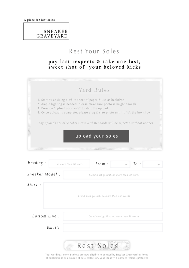
Wanting it to look like an actual graveyard I leaned more towards white and greys with marbel texture, but is still considering if the street element should be played upon more. Since most websites now have drop menus and all kinds of functions and like 20 buttons, I want this to be different and user friendly: I designed this to be 1 flow, the usual “about us” is being shown the first thing when visiting, then the post wall is all there for people to enjoy with 1 big button for you to enter the submission flow, the submission is a simple form fill in and right afterwards you are shown the shop were you could have a better “headstone” for a few bucks.
The donation button is a disruption to the flow right now and I am considering moving it to the main page.
PS : The conversation with Sam started like 3 days ago and all work and thoughts here so far are all my own.
To use technology and improve social cohesion, first I had to breakdown Hong Kong folks’ behaviour a lil’.
As much as we’d like to consider ourselves international (the following means NO OFFENSE AT ALL OK!?), there is a whole lot of racial slang in Cantonese, the slangs are so common that we don’t even mean to offend anybody now a days, but these get blurted out in regular conversation and it’s apart of the Cantonese language…..are you ready? Here we go :
Black people = Huk Gwai meaning black ghost
White people = Gwai Lo meaning ghost people for the white tone of skin, a popular local craft beer is named Gwai Lo, and the word is actually in dictionaries now
Mainland Chinese = Ah Charn or Dai Look Jai, Ah Charn is a character’s name based on a new immigrated Mainland Chinese played by actor Liu Wai Hung in a 70s movie, most of us don’t even know which movie anymore but the name stuck. Dai Look means Mainland China and Jai = kid.
the worst of them all
Middle Easterns = Ah Cha, Cha meaning bad, as in old time HKers find the sturnness of Middle Eastern settlers rude….hence bad attitude = Cha
I am typing all these down just for documentation, personally I avoid using these in describing anyone, but when you’re a native Cantonese speaker in Hong Kong, I am certain no one means to offend ; it’s just the slang.
Now I have Middle Eastern friends here in Hong Kong, and as I explained earlier, I do think it’s the cool, sturn general personalities a lot of Middle Eastern men have that would leave HK the impression that they’re being rude, but seeing for myself, i’ve met one thats’ super hyper active, i’ve met a great father of 5 working 2 jobs, a student of mine was from Pakistan and aside from him not submitting homework….he was very nice to talk to hahaha. Hong Kong have had a long history of minority groups having settled here for many generations, but most Hong Kong people don’t interact for thinking there’s a language barrier, and that a lot of Hong Kong people shy away from other ethnicities for speaking poor English.
I’d like to see this change with an app that could bring you to a “day in the life of…” while the people hosting these “tours” could make a lil’ money on the side.
( demo of app in progress )
1 : People who are willing to take people on tours to : where theyd usually hang out, where they work, they could be walking there dog for an hour, go shopping with friends, joining a religion ceremony or festival…..The occasion will be displayed with a duration, and that the price for joining in could vary.
2 : It’s not one way either! Got some place you want to check out? Leave a request and see if anyone will respond to it.
3 : So, exactly like a regular tour, if you offer the tour in English (which is a pretty common, neutral language) or if you live in a place like…Egypt and you can offer your tour in Mandarian, you could set your price higher.
4 : A text messaging box is available with instant translation meant for simple communication, such as : can you turn your camera to the right ? Is this your home ? How many siblings do you have ? What does that mean ?
5 : Everything is recorded and uploaded to our server, and any disrespectful or sexually offensive act is encouraged to be reported within 2 weeks.
This, will open the world up and will be something awesome to be able to do with your phone. I named it OnLeash thinking bout the dog I raised (dang I miss having a dog..), the excitment when they hear the word “walk?”. Not only will this improve social cohesion in a diversed city like Hong Kong, I think that this would be a great tool to conduct design research, making interviewing subjects a lot easier with more people of different races and backgrounds to choose from.
I am very open minded when it comes to ethnicity and is extremely curious in knowing how different people live their daily lives…talk about how different some dude living on the next blocck could be ; then think about how different a guy in another country could be!