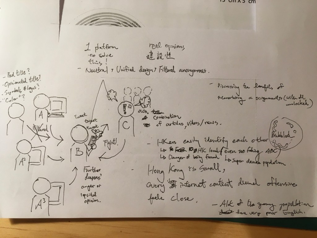
Mod 3 Week 6 Puppet Ms Lai

Puppet Month

I realise that once in a while, fate will just bind me with something and I will go on a craze for, and fully submerge myself in to that particular field for weeks. I wish there is a way of knowing when these “clicks” come, what they are, for when they do happen I get to pick up a new skill and gain new experience…I am curious about many subjects, but its a coming together of a project, the timing and other situations that could bring such topics to light. 

This time it happened to be puppets. Around half a year ago, as me and my fiancee are looking for things to watch for leisure, I thought about The Muppet Show by Jim Hensons’ Muppet Workshop. It was a hilarious I watched with my family that was hosted by Muppets, it was around 92ish, I remember this clearly because my family immigrated and was in Canada at the time. My parents provided me with a great childhood with fun memories of watching The Muppet Show, Fullhouse, Ninja Turtles in the comforts of home while my dad was out working jobs the best he could in a foreign country trying to provide for us. Later on I knew how harsh it was for him and my mom. 

The Muppet Show | Barndomsminnen, Barndom, Minnen
Characters of The Muppet Show & Muppet Movie

Anyhow, the puppet thing further unfolded when I went on HBO and watched a couple episodes of The Elmo Show, it surely reminded me of The Muppet Show but is a Disney (yes, Mickey Mouse purchased the Sesame Street franchise) centered piece and targeted children, it was still brilliant in its’ own way and fun to watch. I didn’t think much about it until (come to think of it I watch too much TV), I went on Netflix and saw “ Ash VS Evil Dead”. I LOVED Army of Darkness, a cult-classic by Sam Raimi and Ivan Raimi, and now its a TV show! You would think i’d pounce and clear 3 seasons in like 1 week? WRONG, I kept it there “on the shelf” for like a couple months, being too busy with personal projects and MA assignments…until I saw this guy:

A Muppet styled Evil Ash/ Ashy Slashy, I had to have it! Even if I didn’t know how good the show is, i’m like really fond of this lil’ guy sitting on my desk, the texture of the hair and the textiles applied is a full on Muppet, the arms pose around with some mechanics hidden in the sleeves and that when you put your hand in, it moves really well…I can’t say enough great things about this prized purchase. 

NECA Ash vs Evil Dead Possessed Ashy Slashy 15 Prop Replica Puppet ...
So well done I actually play with it all the time

 So the puppet seed was planted wayyyy before I conducted the interview with Ms Chung Lick Lai.

Firt I spent more than an hour translating the hour long interview, and was going to step right in and start the puppet skits only to find out that it is not that easy…If I want it to make it sound interesting enough, Ill have to give my Puppet Ms Lai a lil’ character and most of all shorten things up so it’ll be easier on the viewers. So I went and changed things like “to get along with each other” into “they should be buddies” and long explainations that might normally might have taken a minute in to a simple “50/50”.

I wish I had pictures of myself at work, but couldn’t because I was working at home by myself. It was a HOT day and I left the air-con off because it was right next to my computer where I am filming, and the puppet (sock) being over my arm for so long was getting a little soggy….What ended up as a 20 minute video took around 3 hours of take after take, and as time went by, you could hear in the video that my voice was starting to crack also.

I’m actually really happy about how the video turned out and I think as I went along, I picked up how to voice act and made the puppet act more lively than I expected. Next time though, im picking up my whole iMac and moving the operation to the living room where Ill have more room…as of now, I think the sock is a lil’ too close to the camera most of the time while I intended more distance. On the “other hand ; D”, I really had to act my part, I want to look like im conducting an interview, and so a bunch of small interactions were added to my script as I went along in avoiding a boring 30sec here 30 sec there, the jokes and me getting lost with questions actually did take place in the real interview, and that I thought to re-enact the best I could, all those little things should be included.

Hope yall enjoy it!

ANDY WAS HERE

Mod3 Week 4

Darkest Force is:

A company focused on logo work, graphic solutions and video editing. We are looking at younger business owners who would like to tie their operations with the flare of pop-culture and sub-culture, to aid “the scene” in hopes of changing the outlook of Hong Kong’s landscape.

Services:

1:

There is a lack understanding of how well done graphic design could benefit the variety of businesses here in HK, for example : local eateries, apparel, education, services, electronics, IT services, packaged product etc. In the years which Art Director Andy YH Lau has been in the graphic design biz, there is s realization that the general public thinks that design is no different than lil’ art and design projects done in grade school. So forms of material to educate the public is of importance.

Physical Outputs :

-The Hong Kong Handout (monthly printed material on a specific arts, design, cultural, local crafts topic).

-Online platform in educating and promoting design.

-Small team in producing blogs and videos on the topic of design.

2:

Before the actual design work is commenced, our team of advisors are here to provide pitches to owners looking to spice up their business. The usual conversation before reaching a contract to begin designing is a relatively long process:

-we find it to be best when our clients are involved, to have them understand their part of commitment and involvement

-to have clients fully understand how the process is like, what and when are initial ideas, development, the end product is to be expected.

-Most of all, the client is knowledgeable about what the end product will be, how it is to be used once finished, and that to assure that he or she will continue to receive support for a period of time once the design is delivered.

Projects in themselves are also able to serve point 1, in educating clients and to help them see the results and difference a well designed business or service could provide. This might

take longer than the average firm or studio, but we fully recognize the long-term importance of changing the impression of design towards the general public one at a time.

Physical Outputs:

Branding, logos, illustrations, packaging, info graphics, creative solutions.

Market Outlook and Potential:

The general marketing seen here in Hong Kong is experiencing a change in to a different era, it is witnessed that the content and pitch of commercials and ads are being handled by younger talent.  Which signifies that the creative industry is:

1: Studio, firm owners are leaning more to a younger population.

2: The overall target audience of businesses pointing towards a younger population.

To appeal to this upcoming wave of more youthful and energetic content, branding and business operation, our firm shall stay at the very front in updating on what is trendy, the latest slangs and happenings in order to provide solutions that could serve the newly founded or elder businesses that would like to be rebranded.

Case Study 1:

The case of 3.9 by the Honey Collective is about to launch on July 4th, 2 young entrepreneurs that used to work in creative agencies that did not require too much guidance, they are exactly the clients we very much like to handle: young, open minded and full of potential.

Brief

3.9 was founded by 2 gentlemen who have pounced at the opportunity of an upcoming trend in CBD products (a biproduct of cannibas). Their idea is to infuse this supplement in to honey which works well with a variety of things such as : water, tea, cocktails, toast, bbq.

They were specific in what they wanted, and instantly agreed on a combo of greys and dark greys in creating a slightly scientific/hip logo and honey jar label. The thing that they lacked though was on pricing and the fact that they had to stick labels to jars by hand.

Solution

-Originally wanting to price the product at $220 HKD, $ 250 was suggested by us so that they would have a $30 buffer to pull discounts and promotions.

-The label has most of its content laid out horizontally, a strip of taglines and an actual colored line was added vertically in aid of their labeling work.

Case Study 2 (in progress):

Leung So Kee Umbrella Factory is a historical umbrella shop in Hong Kong which has frozen in time for decades. The business owner was an elderly gentleman without much interest in branding to begin with, but after viewing our proposal along with some suggested material, Mr. Leung has agreed to green light and to rebrand their business to appeal to a younger audience.

Pricing:

We have different business proposal plans for different clients, and usually depending on the decision to provide more counseling or not is the main difference to the pricing.

Pricing also varies depending on the request of different clients.

Case Study 1 : $5000 HKD for logo work, labels X 2 (only slight differences) and flyer.

Case Study 2 : $5000 HKD logo work, packaging, receipts and order forms.

with an additional $3000 HKD consultant fee + follow up for a month.  

Darkest Force Roster

Design team – 1 Creative Director, 2 Graphic Designers, 1 Motion Graphic Artist

Consultant team – 2 Advisors + Proposal Pushers

Freelance – 1 Website Builder, 1 Copy Writer, 1 Accountant

Dark Matter Works (latest update)

After having registered Darkest Force with Hong Kong’s Business Registry, I started thinking that maybe Darkest Force as a name is not gonna work so well for it’s lack of seriousness and that the relations with design is too low.

After much consideration, I chose the name Dark Matter Works for dark matter’s similarity to graphic design, influencing a flow and pull in an “undetectable” way. So now, Dark Matter Works is a design firm under the Darkest Force brand.

These are the sketches I did in coming up with a new logo, compared to the development of Darkest Force’s logo MANY years ago, I still want the sci-fi element to it, yet this time I do want it to appear more professional and have it appear more trust worthy.

The final output is based on the typeface design above, having liked it but never having been a huge fan of “writing everything out obvious”, I decided to try and extract the first letters to build with, ending up with a logo I think fitting for my attitude, direction and what I want Dark Matter Works to represent.

The logo is a result of a plan to make a printer friendly business plan.In this document everything is mostly black and white in considerations of the COVID-19 pandemic. I came up with that idea having sat at home for months in total during the first and second out break here in Hong Kong, with a crappy printer at home, there isn’t much viewing quality documents, and I thought to myself that it might be the same for many of us.

This might be a one time plan, but the logo is the result I am looking for. The whole black and white considering crap printers could be a pretty sweet background story for the birth of this logo I suppose.

ANDY WAS HERE

Mod 2 Weeks 11 & 12

For the remaining weeks of our module, we are to tackle a problem raised by our classmates in week 10, so I selected a piece of writing by Kris based on the issue of loneliness during COVID-19.

I stayed in for 2 months, barely having gone out at all and lived on a lot of Food Panda. At first it felt kinda great, but after about a week or so it really made me miss my friends, normal life and the kids at the college, whom are having a hell of a time trying to catch up with online lessons, and some even fell out not being able to cope with the stress of having to stay home and not getting the physical support theyd’ normally receive at school ; if it bothers the teacher enough, can’t imagine the kids.

So my solution is to come up with a way to allow people to meet and talk, that seems to have been done a long time ago yes? But, the problem with the existing social apps (here in HK), is that they tend to attract a lot of people just looking for a date. I know because I met some one on Scout before, and that the reputation for these apps in Cantonese is “find a boy/girl app”, in other words they are now labeled as dating apps.

My fiancee out of bordom and interest in the Middle Eastern culture decided to go on Tinder one day just to make friends, she started talking to these guy who first gladly spoke to her about cultural differences and would show my fiancee around streets of Iran with his camera. I hate to say I told you so, but it was around the 3rd day, this gentleman started to say sexually offending comments and expressed a whole lota’ desperation that didn’t go well with me. No more Tinder.

People in HK and I do suspect other countries also, get embarrassed when asked about dating apps, never have I met a friend that would openly admit the use of dating apps. Now that it’s the time for me to make my own, I really want to fix this problem, and be able to play the advantages of the internet, to make socialising on social networks safe, in order to do that I started generating some rules.

My app was named Topic, it is to focus on simple conversation and casting out the need for profile pictures, instead all that juicy personal contact info, real identity and out look is something locked away, and is treateed as a celebration at a point when people are REALLY connecting with each other.

The way it works is that any one can host a topic, details are provided as in what aspects within a topic is of interest, along with a response rate of the host and little details if one decides to provide. Once 2 are engaged in conversation, the two can only enter Pen Pal Mode, which messages exchanged can only be recieved over a day’s time, good ol’ fashioned writing back and forth with sincerity. So to unlock that “friendship” in the end, one would have to recieve 3 unlocks (which are also 24 hours apart) in order to let another person in to your life, you can then chat in real time, exchange details and you can even go on a date if you wish later on. BUT, the focus is on meeting with rules, without it, it will just turn in to a mating fest. with odd people leaving odd messages.

The app is user-centered in making the user feel completely safe and in control, and to re-establish a real friendly app which people could be in isolation but still be able to engage in contructive conversation with any one in the world

ANDY WAS HERE

WEEK 12

The video took a commercial approach to the app. There is mentioning of Covid-19 in order to tackle the main task in hand, but I do believe that this concept is capable of evolving even when times locked up at home are over.

The footage is exactly taken on one sunny day when i woke up on a week end, my fiancee was out doing stuff and I really felt alone. It’s funny that I actually jumped on this without a plan really, and have spent days just randomly filming shots to see what I can come up with; but then the shots that worked out for me were filmed with me just sitting in my room. In search of a metaphorical symbol to express the feeling of being trapped, I went to seek help from my pet turtle!

I usually tackle editing by first selecting a sound track, the first isolation part was easy, and I took the instrumental parts of Falling by Julee Cruise to go along with my dragging, depressing, empty shots. Then when it came to the animating the app, I looked in to music by my band Ni.Ne.Mo and all other creations in my Garageband, but with me, my music is usually pretty depressing and loud. So I took some time and made a soundtrack based on a drum pattern with an electric sounding synth pattern to make everything sound more technological, and counting was done to fit all motions going on. A fun fact is that the logo pop I recorded myself doing a pop sound with my mouth.

Again, I concluded that music really makes the video propelle. I gave After Effects my best efforts in a really limited time, but when the timed music was brought in thats when everything really started to click together.

My video is focuses on the many benefits of this app and making it look easy and simple to use, most of all, the emphesis is on the user having total control, safety and also in taking the time to know somebody, which I think we are all lacking in this day and age.

check out the video here:

Make Real Pals!

ANDY WAS HERE

Mod2 Week 10

For this week we had to chose a social issue to write on, and Hong Kong with it’s political turmoil is not short on issues waiting to be solved.

Having done my daily check-ins on Facebook, I started to think about all these articles that came up. I am a believer of randomly following groups and people in getting more information, having stopped posting much on FB a long time ago, it has became a source of news for me.

In HK’s political status at the moment, the general Yellow and Blue posts contradict in wording and even style when I come to think of it, comment sections are being filled with fights and opinions thrown at each other from live feeds of protests, a simple news article to the most harmless “cute kitten” picutres; people have made every platform possible a place to express their concerns and to rip at who ever is not on their side. Out of all this, a lot of online bullying emerged, and any one is up for punishment which could lead to tragic results.

I started with a simple sketch to brainstorm and to trace what the average user is going through online: The single user tends to phase out articles and opinions that are not of their own beliefs ; or are those own beliefs to begin with? What I found out from this practice is that behind every angry blogger are all these others’ that helped fuel him/her, worst of all, Hong Kong people although having always been criticised for our lack of cultural rootage, it is actually super easy for us to be living in our own “bubble of perceptions”. First of all : HKers are not as open minded as they would like to be, just by reading what is typed by another, any foreigners outside of HK are easily identified, for example: the use of Traditional Chinese and Simplified Chinese, the tone and vocab of choice and profile checks. In this era of anti-Chinese gov., the citizens of HK are very on edge. Now, once you have said something to tick someone off, it is actually very much a war, with the fight having been initiated by 2 bloggers, very often some reflective fights could be seen signifying a whole crowd of opinion.

More details are explained in the article itself, however the main point in raising this subject is that I think that despite the big divide of for or against HK X China, ultimately we’ll still have to learn to get a long with each other, and to do that, I think awareness or the willingness to understand the background story of one another is of importance, and to fix that problem steps need to be taken.

I want this piece to first lure attention, thats why I went to my cartooning ways and referenced an old style of cartooning, clean simple characters with exggerated expressions in communicating action. Green was chosen in signifying the mix of Yellow and Blue, in hopes to express the neutral stance that this article is taking. The web of users are scattered in the fashion based on my sketches, but I have left out all the arrows and such thinking they will be too much of a distraction from a clean, easy on the eye layout.

ANDY WAS HERE

Mod2 Week8 The HK Handout

Ill start by saying I think I have spent way more time than I was supposed to on this assignment, but that new knowledge gained and the result came out satisfactory, even with potential of this becoming a lasting project.

First as a graphic designer, I stressed a whole lot on the cover. With my writing based on Hong Kong mascots, I started off wanting my book to appear friendly,

It went on for a bit, but something did not feel right…I don’t want to conclude this just by sticking arms and legs on the cover, and just going the “kawaii” route. So I went back to my title of “Behind the Mask”, and came up with a new illustration.

It started to ring better, and that I have taken cue from a 5 year mascot actor and personal friend “do not unmask while in mascot costume” and swung it out of the park. I started thinking that it is exactly what I am doing with my writing, and that in order for people to learn more about the path and details of mascots in HK, there is no avoiding of unmasking. I hope that readers will learn to appreciate the mascot culture by bringing more focus to the topic.

The orange in the background was chosen out of a very common impression between Hong Kong citizens and Government services : The orange is the recognizable color of the Public Health and Safety Department, for many years this color is commonly seen on street trash bins, and the color holds significance to HK.

At first, I wanted it to be a “coffee table book”, a big bulky book meant to be flipped through for leisure sake. It was met with quick feedback from my instructors, and aside from some minor altering to the writting suggested, there was another thing that froze me : composition was not based on a grid.

Ive always prouded myself in being a “cartoon man”, thats’ what I wanted to be and I take the opportunity to just cartoon my way outta projects as much as possible. Now that I am faced with editorial design and I will be honest: I am clueless.

I recieved an extenetion to my course due to family matters, and that I have received ample time to figure this out. I have tried using a grid before, but then everything turned out just didn’t seem right. After the many failed attempts of laying out a grid in AI, I finally landed on a solution that I am not super proud of ; but which I have learnt a great deal from doing:

I took an existing grid and started to use it, and that things finally started to make sense to me. The last time I ever used one was during college, and who knows what kinda wonders helped me pass that paticular assignment, but I did not get it up until now. I cheat with the grid here and there in order to maintain balance to all images and text on it, slowly as I got more pages done I finally saw the neat and order to my pages.

I was told at some point to change my title font from Rockwell to something else, that Sarif fonts might look a bit dated, but after much selection I still landed back on Rockwell. I want a museum quality to my book as if someone is at an exhibition on HK mascots and I find the font to hold a certain sense of wackiness which plays well with my cartoon related subject, it plays along with the reason why I have arranged everything with a sense of space in mind ; more negative whites in providing more attention to the subject on hand. So I have achieved an arrangement that is fun with an exhibit quality to it.

So, progress continued on until I reached mid-way and I froze AGAIN. Having ignored the fact that my piece of writing is only 3000 words long, it only just occured to me that I won’t have enough pages to compile a whole book!

Then 3rd module started and I am stuck. What life has taught me after I passed my 30s though is that : answers tend to pop-up when we move ahead and keep an eye out, so what happened was that during module 3 week 1, I stated a “mission” to help HK citizens see the value in good design. After that was said and done, I was out for a walk one night and then my query was answered after what must’ve been a week. To tackle the problem with HK peeps’ groundedness, the material must be short and most of all must be free of charge! It was an exact fit. The Hong Kong Handout is to be a monthly short read to take up readers a sweet 15-30 minutes to finish, informative on specific subjects and easy to obtain a copy, I do not want to create an app subsciption and to eliminate the distractions that nrighbouring apps and ding dongs might cause; just the reader and their booklet. The logo of HK Handout is a quick idea based on slot machines (3 Hs aligned), signifying the randomness of topics while you might just “hit the jackpot” and benefit by learning something interesting with every issue.

For each issue to be a different topic, id like to invite other friends in the creative industry to carry on writing for the other issues, there will be different cover designs and a selection of a main color. After all that is decided, Id like to further more my own issue and make it more interesting to look at, and a quick turn around and changing shapes landed me with a classic 90s optical illution very commonly seen on Mickey Mouse tshirts. Bring this “back view” optical illusion is a decision made to create a pop culture nestalgia.

For the very last pages, a preview of the next issues’ topic and also a page to credit the creator of the specific issue. This is to help (well my business) and the businesses of other guest writers, to get the word out there of what kinds of services which the person or company can provide, another effort to push the design industry here in HKC.

So let’s see (when im finally don’t have to work on 2 modules at once) if I could start translating these booklets in to Chinese and be handing them out for real! I am really happy to see this finished and is extremely pleased that I have finally picked up how to use a grid effectively.

ANDY WAS HERE

Mod2 Week5

This week we are tasked with article writing, and my chosen subject is to give my thoughts on speeches.

With the Hong Kong riots going on, it’s the talk of the city on how speeches are are delivered and how the participants perceive the message, a recent in one of HK Chief Executive Carrie Lams’ boradcasted speeches was suspected to be made with face planting softwares.

through out the broadcast, Lams’ body did not move and her facial expressions seemed stiff

No one gets to find of if it was true or not, but then it sure got people thinking about public speeches.

I wanted to relate the topic of speech to communist propaganda, and went on to illustrate this:

The results were a lil’ cheesy and was not satisfactory. I wanted to focus on the listener and bring out a sense of doubt with a big big question mark. With the advice of my instructors, I think I should be more direct in making the message clearer with my illustration and title, and so I made this:

I tried to match my font selection better with the use of San-Sarifs and to apply Bolds to assign a better overall heirarchy. I make up titles based on a ring really, I was really inspired by a Stan Lee documentary I have seen some where, he was emphesising for names to RING, “Man Spider….no, SPIDERMAN, Goblin….no, GREEN GOBLIN!.”. Its making your lips bounce up and down and ryhming that could make titles/ names unforgettable. Beware and Boo Boo makes your lips move, and when I put Mouth to end the title, Boo Boo Mouth kind of sounds like a character. Naturally, there is a big bouncy lip in the background crossed out, simple and direct!

ANDY WAS HERE

Mod2 Week4

This week we are to generate an info graphic of our own, so lets start by describing the college I work at.

I actually earned my Higher Diploma at the same college (hmm..smart for me not to name), I was desoerate to go back to school for a bad case of depression has landed me back in Hong Kong from Canada empty handed of a degree. My parents are financially stable, and that it is actually sort of a shame to me that I have to end up in what is refered to as a “dead end college” (the shame adds to the fact that im an Asian in HK), but I pulled through the interview while I was still in my depression, cured myself from my depression with a couple months and am now very grateful to be doing my MAs. So I do have this college to thank as it accepted me during my time of need.

Working in it now gives me a whole new perspective in to the rooted problems of Hong Kong : Is it really the kids’ fault when they don’t do well with their studies? There are so many families in poverty here, and that a lot of marriage problems, gambling problems and neglecting of children happens, then the most “well known” result of that is for these kids to fall off the wagon at some point before or during their teens, I’ve had friends that claimed they’ve done drugs, join the triad and just drowning in credit card debt. Just how many are there? How many fail to find stability in our schooling system and potentially have to take on life pretty much on their own?

I refered to the Education Bureaus’ website for some statistics and was stunned by my discovery.

How students scored in their DSEs in the year 2017, 5** being the best scoring batch : “the good eggs”.
Total number of students taking their DSEs
calculations based on day schools and the common subject of Chinese

The DSEs are a stress filled, major exam determining paths of students in secondary 6 : You do well you have a shot of doing well in life here in HK; you do bad, you’re pretty much left with a life that is not as sucessful. Students pour their efforts in to these exams and when it comes to the month for results, suicide rates are higher than usual.

In my effort to do math and to shrink things to perspective, I decided to only focus on one major subject and decided to take the Chinese Language, and within my math: there are around a 100 DSE takers out of 437 day schools, I end up with percentages in which I could round up to about : 20% students smoothly move on to Secondary 7th (scoring 5+ or higher) and 80% are pretty much left with limited choices or even closer to none at all leading on to further education. The 80% are the students i’ve been working with at my college ; beat down, dis-couraged and rejected by the schooling system.

My first effort in conveying this data came in the form of housing : my original idea was to have the viewer scroll from left to right in finding out that all the lights left on in these apartment complexes are kids that are loosing sleep over their DSEs. Maybe a lil too abstract and would require explaination. So I illustrated something else.

Thus, my diagram of A Hundred Kids.

This time, there is explaining to do for viewers not familiar with Hong Kong culture. I based the 80% of DSE takers that didn’t do well to classroom punishment; the image of 80 kids being punished while the 20 seated signify class as normal (a smooth educational pathway). At first, I wanted to punish the kids like this:

But after a lil’ research, I did not find cone wearing and sitting at the detention corner a form of classroom punishment here in Hong Kong, so I decided to do this Hong Kong style, a way of punishment that still rings with me and my parent’s generation: to balance a chair on top of your head standing. I want this to appeal to a Hong Kong crowd, and that I based the illustration style off of 70s Hong Kong black and white comics.

I didn’t want to spoil the impact of the illustration and decided to leave the text out. Compared to Moon Landing by Accept and Proceed, I think mine is more comical and is relatable to Hong Kong citizens, a good reminder of the flaws of our education system and a reminder of the many unfortunate teens left with options, young, lost and confused.

ANDY WAS HERE

Mod2 Week3

I never really wrapped my mind around the purpose of big data until this week’s workshop challenege.

Having looked at the 5 to choose from, I went on to work on analysing Moon Landings by Accept and Proceed.

from accept https://www.acceptandproceed.com/project/moonlandings

The poster is a limited edition print depicting how much land has been explored on the moon by human. After I read through the short little description on their website, I still don’t really get the gist of it right until I started imagining it be hung in my own living room. Lets’ take my friends Josh and Tedman for example, they might come up, we start chatting bout some stuff and then one of em’ would point and say, “hey, that looks sweet!”, and then Ill have to be the one to explain whats’ it about, and the detailed lil’ pieces of information that require you to look closely, sounding super smart.

What this module has taught me to do is to think in a user point of view, and that has led me to start appreciating Accept and Proceeds’ work. There are just these things in life that might not really bother you, but when you do grasp a few fun facts or be able to put some massive event in to size and scale, you feel just a tad more intelligent, reconnecting to something that might be of past or happening right on top of your heads far far away.

Aside from imagining how sweet it is to be able to show off something expensive if I were to own this poster, I started identifying with the kind of people that would buy something like this, and all these scenarios were enabled to play out to make me wonder, “hmm…how much does this poster cost?”.

(I found out the price, and I think I will spend time putting aside some money first)

ANDY WAS HERE

Mod2 Week 9

The Idea of User Centered Design (UCD) is a very effective method in making designers get off their butts and really have a feel for the subect they are edesigning for.

In a smalle extract by David Benyon, author of : Design Interactive Systems, he comments on the 4 pay offs of UCD.

1: Design process involving the user is more likely to meet satisfaction before the product is launched.

2: Reduce user errors to ensure safety of product while reducing costs for warranty or repairs.

3: Desinger and user develop a better understanding and will be able to make design more ethical.

4: To focus products on user could help designers better understand cultural devirsities.

In other words, I think that UCD is a great practice to have designers meet a better job satisfaction for one: being able to leave their seats na dreally talk too people, and two: for a designer to really emerge themselves in to a given task.

Here in Hong Kong, I don’t think I have ever seen good UCD being carried out… the most ive experienced seem more manditory, and were carried out because “someone told us to do so”. In fact, the further we are in to this course, the more I realise how important it is to hit the right questions, to set up scenarios for the client to answer to and most of all in becoming more aware of trends that are happening in my society. Very often, trends and latest happenings are pushing users to lean towards one thing or another, for example: Covid-19 has grounded many to be working at home, and while some restaurants were taking a beating, food delivery services has met with emence popularity for people keen on keeping social distancing, and even now that all seems to have been returning back to normal, Food Panda and Deliver Roo are both still doing really well.

Leading on to my example. I ordered almost every single day during my 2 month period working from home, Food Panda really got me there with their selection and how turned-off I was in leaving home for the super market and the fact that my apartment is still a mess after my move. The interesting thing though is the other side of the delivery box, the people that find a good part-time job in delivering for Food Panda.

It was recent when a friend and his wife who worked as a repair’s man and an air stewardess have left their jobs (or maybe lost their jobs), and when I visited them at their studio/ flat, I was amazed to see a Food Panda uniform laying on a table, ” Yep, we started doing delivery and they pay well! Just 2,3 hours I have earned $250!” ($25 pounds). They then excitedly started showing me their app , “for us who are very in to fitness, this is like the perfect job to keep an income.”. Then it started occurring to me that this is something totally new: not only the ones receiving the food got an app that is designed to give you discounts, recommend you restaurants and make it all as user-friendly and as convenient as possible; but then the ones doing the delivery is also well considered for and this is a big chain of organised service.

Then one fine evening my fiancees’ cousin dropped by, he works as a freelance driver of some sorts and drives his clients’ children to school. As we sat in our living room making a Food Panda order, the topic came up and right on my lap to input on my findings, “There is a ranking system with drivers,” says Ho Man, “the ones that are rank one have a wide range of around 7 sets of shifts to choose from and other benefits; compared to the lowest rank with only 1 shift a day assigned. It all depends on timelyness and customer ranking.”.

There are little details such as how the deliverymen/ women get paid, flexibility provided for those who might want to do delivers in another district, protocols of how complains are handled etc. Before all this, restaurants did their own delivery, only limited to homes and offices that are nearby for one of the staff or waiters to make the delivery by foot. Now Food Panda has not only taken apart this whole restaurant to customer relationship, they have even created a whole new job opportunities and has included these freelance employees as an essential part of their app design and system.

Rohid Chadda, co-founder and MD of Food Panda has this to say about hiring employees (https://rohitchadda.com/tag/interview/):

“Young entrepreneurs often rely on their gut while making business decisions and while intuition can sometimes be an indicator of something being afoot, it certainly isn’t an appropriate criterion to rely on when hiring employees. Don’t let yourself get wrapped up in just the ‘culture fit’ – often, a candidate’s ability to click with you has no bearing on the professional skills he/she brings to the table. Instead of going ahead with casual interviews to gauge someone’s vibe, create structured interviews and evaluate each candidate on merit. Ultimately, this will ensure you build a strong team to grow your business.”.

Heres’ more by Rohid regarding Food Panda (https://www.businesstoday.in/):

” I would break it up into placing the order, and then processing the order. Placing the order doesn’t take time. How much time the restaurant takes to prepare and deliver the order depends on the restaurant. If the order doesn’t get delivered on time, he can either go to the restaurant or come back to us. We believe that the customer is a Foodpanda customer. So we make sure the restaurant delivers on time. Based on performance, we keep filtering the bad restaurants that are not honouring the delivery times. (Foodpanda has now started its own delivery service in Hyderabad, Delhi, Mumbai, Pune and Bangalore)…..It is the customer-centric approach. We selected the right sort of restaurants and made sure we weeded out the bad ones. It is the focus on customer experience that helped us grow very quickly.”.

These insights have solidified my speculation of the delivery staff having been apart of Food Panda’s considerations. Through learning more about Mr. Chadda, there could be a hand-full of UCD methods that could be identified :

1: Focus groups

2: Usability tesing

3: Questionnaires and Interviews

4: Customer journey maps

foodpanda APP 訂餐教學:註冊下單、取消退款、免運優惠碼、現金回饋
I would suspect they didn’t reach their sucess in one go

The method Id like to focus on would be Customer journey maps. There is no direct evidence leading to certain application of the method to Food Panda, yet the order process goes : Choose a restaurant, filling out the order forms, payment, restaurant gets the order starts to prepare, while a delivery man is to pick up the order, once the food is picked up a GPS map shows the location of the delivery man/ woman and communication by texting is made available on both sides to ensure smooth delivery to one’s doorstep. Which is clearly a well thought out process with the visuals to go along with. Other extras include : Recieving a coupon code to encourage usage, and customer service in handling incidents such as wrong orders, spillage or having delivered to the wrong destination, which is usually resolved by a full refund.

Foodpanda designs, themes, templates and downloadable graphic ...

Such an intricate process could only mean one thing : trial and error. I have strong reasons to believe that Food Panda has gone through long development processes. With Rohid Chadda himself quoting the term “user-centered” many times, I do believe that the popular app was developed by applying lots of UCD methods and processes.

ANDY WAS HERE

Mod 3 Week 3 Sneakers & Tshirts

This week we are to look in to examples of work that might run in to legal problems.

At a very young age, I did actually had a couple run in tos with Nike (their small lawfirms that hound over the opportunity to catch any one unaware and be able to profit off of).

I was never a huge spender on Nike products, but I have always admired this house of top NBA players and provider of cool kicks and I have always wanted to be able to join the team in one way or the other. Back in the 2000s, there was this trend of artist/ illustrators customising sneakers and I was very in to it in joining the fun, hopefully wanting to gain some attention from the big N.

So yay…these go wayyyy back

I drew on these plain pair of Dunk Lows and was really pleased with it, and after having had a chat with a sneaker shop I hang out at, I was granted some space on the shelf to see if any one wanted to buy these! Not exactly a Nike experience, but at the age 15ish? It was exciting to have some recognition by these elder cool looking sneaker shop owners, and yo we agreed on a price of $1500 HKD(around $150 GBP), not bad for a kid no?

I went by there everyday, and there were people asking about it, even a local magazine reporter wanted to include it in their sneaker section! BUT, that was when the whole downfall started : they could not report or include any non-official products in to their book. Oh well, may be i’ll make some money, but that was my first time having started to realise that there are precautions that people make, and that “taking matter to my own hands” could make some one unhappy.

Then one day after school I swung by the shop to find out my creation was taken off the shelf. What happened as I was told was, some folks from a law firm stopped by, asked a bunch of questions and ordered all customised shoes off the shelf. From that day on the whole street art/ sneaker scene ended, but I could still remember how nice it was to have had a range of illustrators and designers having their work in the window and during that time, I felt like I was apart of that era.

Seperate Incident

Hong Kong is different from China, infamous for fake goods and counterfiets due to a very seperate patent/ copyright system from the rest of the world. Here in Hong Kong, I believe that counterfiet goods just don’t appeal to the public and products like that just don’t make much money. One thing in Hong Kong’s culture though is an issue worth mentioning though is our humour (ill try and explain this another time), which really makes “highjacking designs” very popular; to get creative and show humour in poking fun at famous brands, a very common practice among local fashion brands. I have always been warned that this is a risk to take.

Here is one of the designs I made for a t-shirt brand i’m running with a few others named Bak Tee Jai:

It’s a play on the brand Kenzo, with the graphic and the wordings all switched up, the concept came from the phrase “Hit Tiger Tonight” (direct translation), a popular slang/ joke in Cantonese meaning “to do it with my wife tonight”, anddddd I tied tiger and the famous Kenzo tee together, hence the tiger being “hit” and replaced the words Paris with something else….my friends laughed pretty hard!

We are still debating if we would like to release this print, but the word from multiple local brand owners is just that “just do it” as long as they don’t find out.

Within a module trying to earn a MA in Graphic Design, I have doubters of mentioning this example myself. But ive came to think that maybe this is a good opportunity to find out if this happens in the rest of the world often? How danger is this move if we are to release this print? Do any non-Cantonese speakers find this funny? Would be nice to get some feedback !

ANDY WAS HERE