Mod3 week1 & week2

Week 1

This course is fun in a very special way. Over the past 2 modules there were questions that left me brain frozen asking myself : Who am I? What am I doing? Why am I doing all this? Dang but when that’s finally out of the way, I feel like a new man!

This week is the same in answering the key question of WHAT SERVICES AM I PROVIDING? It got me thinking about the days before I started working and teaching in Hong Kong College of Technology, I did branding, illustrations, storyboards, made movie props edit movies, logos, characters, and maybe more until I see it…I LIKE (or would love to) : create a comic, sculpt more, make animation and is trying to squeeze time and learn ZBrush and do character design, make an action figure…. The words which came from one of our week’s guest lecturers rang ” You have to output what you want to be doing…no one would give you a project if there are only bits and pieces of everything in your portfolio…” At least that how I remember it.

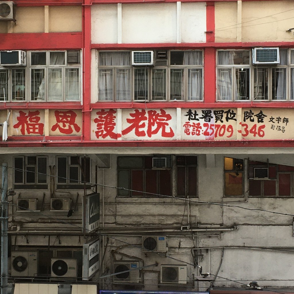
So the big question came and I wanted to write “Mascot Doctor”, which is what I always wanted to do, to give Hong Kong mascots a make over, but to come and think of it, this is not sustainable at all. Thats when I started thinking about my wish to solve the “cultural desertification” in Hong Kong. In a nut shell : The population here are too focused on making money and rely on the reputation of foreign known brands for quality ensurance.

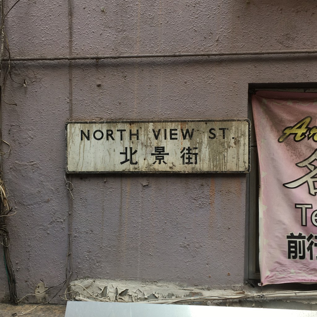
In fact, specially in this political turmoil, there is talk about reviving local small production in order to re-enforce our own roots and crafts that are fast dis-appearing, with examples like : Old shoemakers, tailors, plastic home appliances etc. For some reason they have carried on til now, but the out look and branding have never caught on with the ages, talk of a handfull of them coming to an end after 50 to 100 years in operation is constant. With this thought in mind, my goal and my mission snapped in to mind…well not right away, but after a couple hard days turning the question in my head. Also, there are infinite amounts of business owners who just don’t give a damn about design and really effecting the out look of our streets with their shitty billboards and the thing they consider a logo.

Flash businesses that selling cheap goods

A VISION

I am picturing printed material, handed out for free maybe small chunks at the time, in educating more people the difference between good design and no design at all, and most of all the value of it. This could be a good business card, handed out to projects of my liking, which is to revive old businesses and hopefully to decrease the amount of the bad ones out there.

and here’s my desk, tidied up of course!)

Week 2

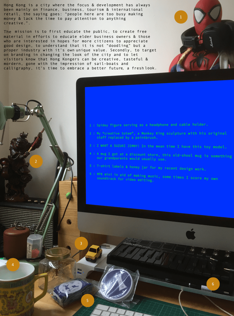
There in week 1, you have just witnessed the secret headquarters of Darkest Force.

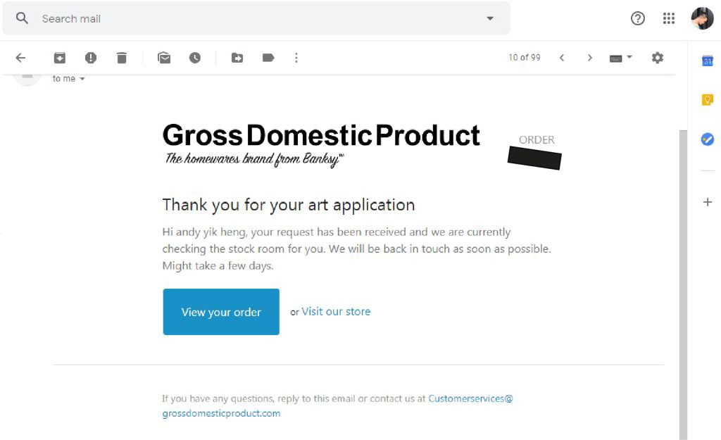
I have slapped the name Darkest Force on my invoices for the past 5,6 years…it did occure to me if maybe I should change it, but the more I use it the more I think it plays well with my character. Ill admit to being kinda cheesy? I love B-movies, and joke around a lot. So yay I am “the dark arts of graphic design” lol.

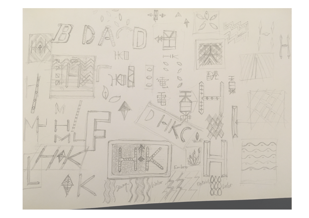
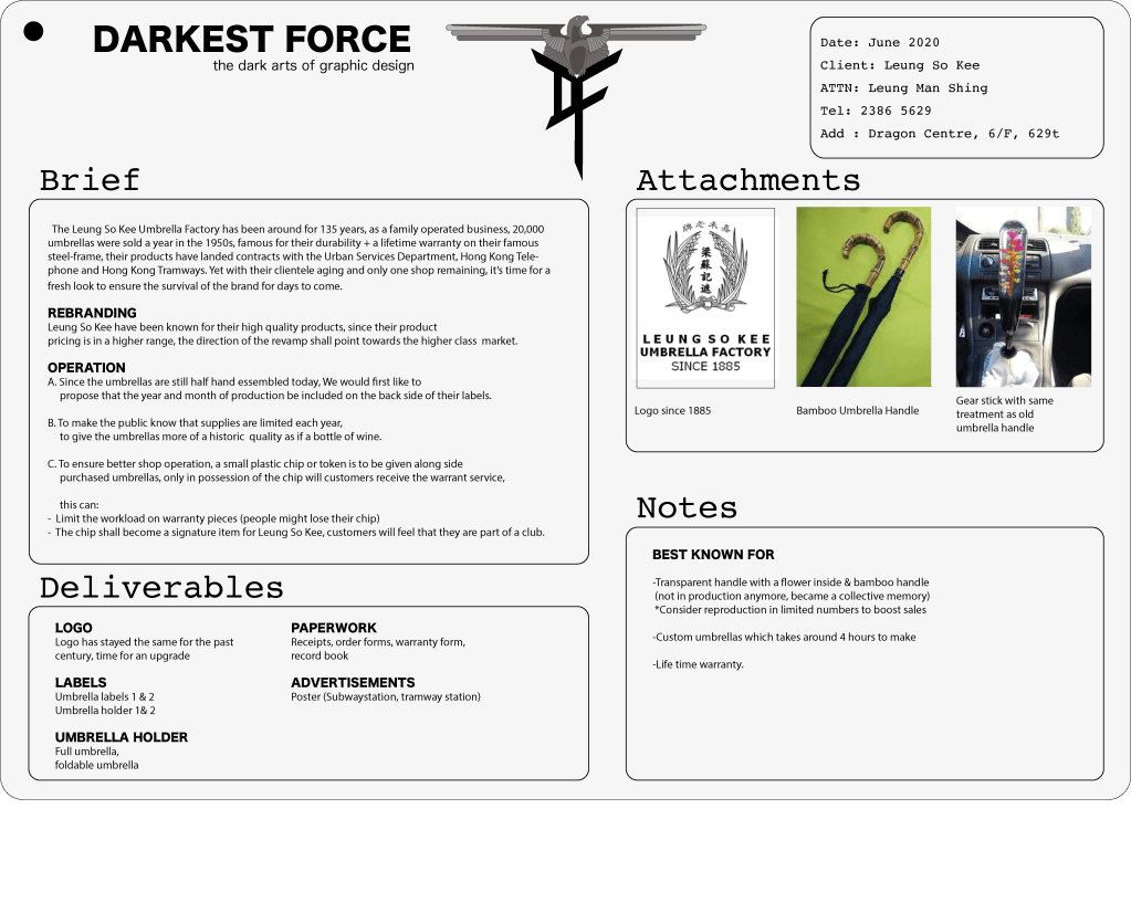
This week we are to set out on drawing up a proposal, something relatable to week 1, something local. It was POURING this week, as a feel a small puddle collecting in my right shoe I turn to look at the umbrella in my hand, hell yes!

I have a thing for nice umbrellas, I know what I like and is able to identify a good one : when you flop it open, you should feel the sturdiness of the frame and a pleasant pop indicating a good working spring and mechanics, and that is good ol’ Leung So Kee, exactly the rebranding project I did when studying Higher Diploma 8 years ago.

so many things are wrong with this omg

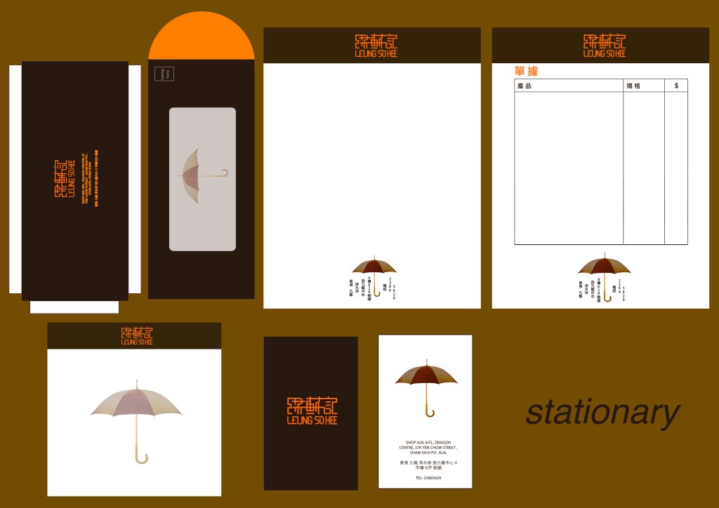
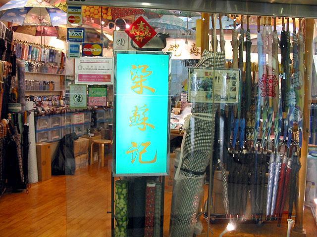
I first knew about Leung So Kee while watching a movie with my family when I was young called The Umbrella Story (人間有情) writen by Raymond To, a fictionalized story about the Leung family which founded the umbrella factory. It was not until my Higher Diploma days when I first walked into their store, got myself an umbrella (loved it, lost it on a taxi, got myself an identical one later), the store has kept a vintage look and probably not in the best of ways, there were just umbrellas cluttered in every corner, with whom must’ve been the 3rd generation family since founder Leung So (梁蘇), sitting around on little chairs working their way on umbrellas. Leung So Kee’s slogan “Life time Warranty” (on umbrella frames).

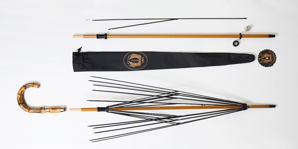
On one of my visits, an old man, must’ve been in his 80s presented an umbrella to one of the shop keepers with shakey hands “can you fix this?”, this 30 year old shop keep replies “WA! This umbrella is probably older than I am, they stopped making the parts for it!”. I turn to see the discontinued bamboo handle umbrella, dang I want one.

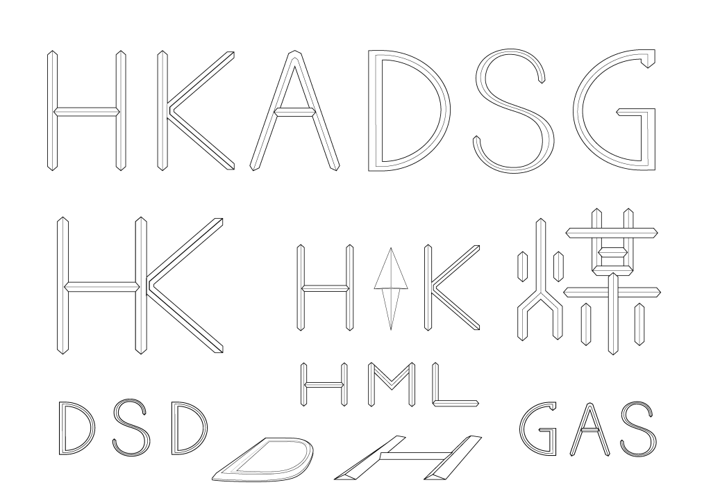
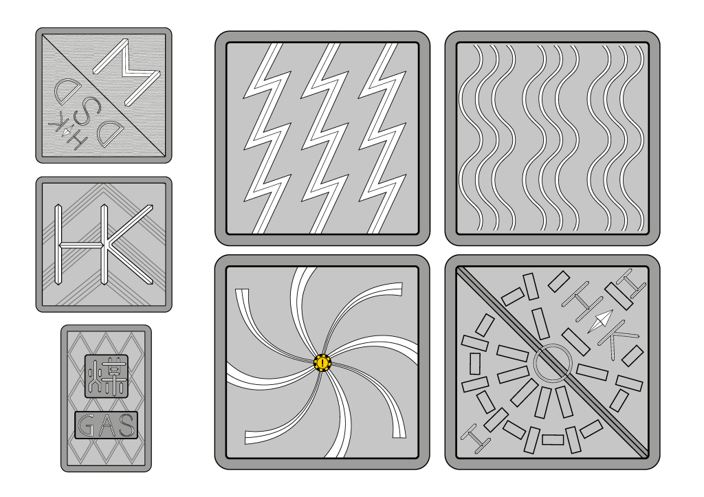
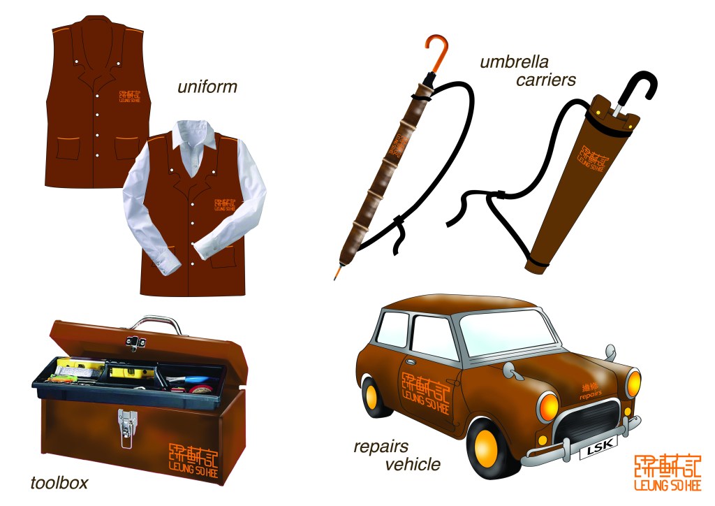
So! The proposal I have mustered up have this week took a lil’ brainstorming, and I suppose these could be a good start to a rebranding of Leung So Kee. My goal is to up lift their entire branding, look and feel, and no for realistic reasons I am not going to include the mini-cooper this time.

It looks like…we might be sent off to complete these items for real later on? BRING IT ON!

ANDY WAS HERE

Mod 2 Week 7 : Mascot Hunt

I got lucky I suppose. The COVID-19 situation esculated globally and the library is shut down as of now.

But last week, I went on a walk for books for my article writing (WITH A MASK ON, AND NOT TOUCHING MA FACE!), and on the way I wanted to document how many mascots I might run in to. The walk started from leaving my home in North Point to make it to the Central Library in Tin Hau, which took around 35 minutes.

Having stayed home for too long, the usual location/ shop archive in my head wasn’t functioning too well. So it was about 10 minutes in to my walk I remembered that I would passby one of the biggest 2nd hand book shop in my area named Sam Kee Book Co.(Kee basically mean shop, and is an old Cantanese saying. The shop is roughly translated as Sam’s).

Sam Kee located in an old 90s underground mall
One of the main attractions of this bookshop is that around 20 cats are being kept there at a time in wait for adoption.

There were a few titles that caught my attention, a 3 volume by acclaimed HK local professor and ex-government advisor Chan Wun which documented the cultural development of Hong Kong, got one of em’ for a $100 HKD which was well worth it. Another was written by a professor from Taiwan about civil service which I did not pick up at the time and has lost some sleep over it the past week. So once it’s better to be able to go out for leisure im going to make sure I pick that one up.

Yet, nothing about Hong Kong mascots.

mascots spotted on my 35 minute walk to the library

YET, the streets are filled with them, in all corners and forms. It is amazing how I could walk pass them every regular day, but when I am on a specific mission they all seem to be fighting for my attention, not only on the streets but on my Facebook account, on TV, a box of cereal from my cupboard, bus ads, tram station, subway station you name it.

Then I came to a realisation that all of these silly faces stands for something, a shop, a company, corporation or even the government. To me, some of them are just lame. Its not hard to tell which mascots are foreign, and that which local mascots were born with a good budget.

In essay writing, I found out that I should be responsible for keeping a nutural tone and it is hard for me to be as direct as I want to be, but typing here is a pure joy and release of honest opionion (although this account is public). A whole bunch of poorly done mascots reflects a problem with the way people view design in Hong Kong, the reality is most likely that : Some guy on top got the idea that including a mascot for their brand or department is a swell idea, then they found out that they don’t have a budget to get a character design (nor do they see the value in good design at all), then the result ended up looking like a K2 child just learnt the basics of Adobe Illustrator and did their best. This happens way too much here, and is one of the many reasons I don’t enjoy the design scene here. That should be another story another time.

to the library!

Another face in my palm moment is when ever I walk near this building. The old Central Library used to be situated in the Central district, was a nice black and white 90s modern architectural building, big panels of glass in letting the day light in and was nicely situated by the Victoria Harbour, then this piece of work came in. Consistantly being voted to be one of the worst looking buildings in Hong Kong, it now serves as Central Library.

Any how, I got to the door and that they were taking precautions of only letting 200 people in for an hour, 4 times a day, also the big archive section is closed, only leaving Children’s reading and 2 levels of Mature reading available out of the 10 usual floors. After flipping around, looking in to indexes with the little time I got, only one book about HK’s cultural development seemed to be useful for me, and I regreted not spending a longer time at Sam’s instead -_-” But as I always say, to find out that nothing is available is finding out about something, at least I got to know how wdiely applied mascots are around the city.

(the end)

So on week 7 I have tried arranging a couple phone interviews, and was waiting on replies. Hopefully I can get those interviews or else I won’t have enough insight. Hope it turns out ok!

ANDY WAS HERE

Mod 2 Week 6 Mr. Au & Mr. Cartoon Man

I met Mr. Au during module 1, and recently the remaining shops around him are clearing out of the State Theater building. Although not seem to be concerned at all (I honestly do worry about his mental well being), it left me wondering why this is happening to one of the major contributors to the general outlook of this city itself!? The topic is intended to extend to other historical sites, how they symbolize (or symbolized) an old way of life and austhetics. With the HK government’s neglect of the importance and value of these local spectacles, what would Hong Kong look like without preservation?

Cartoons and character design have always been a passion of mine as a result of many of the imported shows from Japan, Britan and the US.

I yet to investigate how the whole mascot culture was started, but a good guess would be the wide influence of Japnese culture across Asia. Hong Kong has the bad case “if it works for them it’ll work for us”, and to be frank and not waste my time trying to make this sound better, the government mascots SUCK.

「hong kong mascots」的圖片搜尋結果
retrieved from : https://today.line.me/
the mascot of the HK Fire Department which was widely discussed on the internet.

In a video (in Cantonesehttps://hk.news.appledaily.com/local/daily/article/20160501/19594104) by Apple Daily, an interview was conducted where participants rate and see if they’d recognize current mascots from the Weather Observatory Department, Health Department, Fire Department and so on, most of them where not recognized, and that some of them were even laughed at.

The success of Anyone, the mascot for the Fire Deaprtment was a hot topic in 2019, but I think there is actually a hidden truth behind the popularity of the character in that of it resembles a certain sexual fetish. This is not the first time government promotional material or stunts have landed on mistakes as such, often they hold the impression of thinking they have done a great job now that everyone is talking about it, having a jolly’ol time, not finding out (or not admitting afterwards) about the silly flaws and lack of research in approving a mascot design.

I do hope to steer towards this topic for my essay writing later on, id wish to explore what HK citizens think, are the mascots helping? Are there more forms in public announcements? Why and how are design and austhetics approved within the HK government? There are many great examples of mascots around the word that I personally think could aid the case of Hong Kong’s mascot problem.

ANDY WAS HERE

Mod 2 Week 2 Manhole Cover

As a continuation of last week’s walk about, this week I have decided to focus on the many manhole covers I have collected. Having read up on the handfull of articles available, I discovered that many of these covers were imported from Britan pre-Chinese handover and remained in service til today, no updated versions have been seen or have been released.

The main purpose were to prevent slip as Mr. Lai Chiu Cheurng, a 20 year veteran having worked at the Sewage Department here in Hong Kong. The most commonly seen indications mark : HK for indication of government property to prevent theft and reselling, DC meaning Drainage Contract , HML for Heavy, Medium and Light Duty. (content taken from interview on devb.gov.hk)

I then set off in a minimalist approach to slightly update the font and also to better the purpose of anti-slip. I was thinking of designing in grooves, and later on having extended to using simple graphics to replace certain utilities such as sewage, water supply and electricity.

My results are fonts that are formed by iron casted ridges for improved tracktion. Some old designs were kept while updates were made to others.

This assignment was met with some commentsfrom my instructors and is not completed yet, please stay tuned for updates!

ANDY WAS HERE

Mod 2 Week 1 A Walk Around the Block

I started off the little adventure with my lovely fiancee around the North Point area, a place where all glimps of history is still exist like the 50s State Theater, 60s Wa Fung Mall, 70s Sun Beam Theater etc., but aside from these individual historic specticals the rest of it has caught up with development (not as much as areas like Wan Chai or Causeway Bay), there are not much a local guy like me could really identify with. Our general locations basically remain the same, but shops change with frequent examples of when certain 30 year old restautrants close due to sky rocketing rent, along with the business rich pieces of history gets checked off the list without means of supporting them or plans of passing on of knowledge or skill after these “legendary” owners are gone.

I promised myself not to stray off as much as I did during module 1, so back to our walk.

I compiled a list for my walk, and it was a result of a brainstorming for sources of local typography. The symbol you see is a 5 stroke chinese syllable we use to keep count. This way of documentation enables me to identify which is the most dominant form of typography in my area. The results were Direction and Services, such as manhole covers, instructions and warnings by utility departments and cable companies.

Yet Hong Kong’s street scape is a huge mix of much much more, and the following are some examples

Street sign from the pre 97 British colonial days.
Service instructions, some also date back to pre-handover
Imported product logos that are very familiar with HKC, Yakult for one of the many examples, is a product that has been around for over 50 years.
Calligraphy as logos of restaurants, and the huge variety of individual business owners.
Hand painted calligraphy of the old, some can date back 50 years
Shiney new hyper expensive apartment buildings projects
Government facilities, signage and type not updated since the 80s

I went up on padestrian bridges, down walk on the pavement and I would describe Hong Kong as a litter of typography, and it is in that chaos Hong Kong is voted as one of the most cyberpunk cities, an interesting way of saying old vs new I suppose.

For more details, feel free to download the below PDF for your viewing. More thoughts and notes are included, enjoy!

ANDY WAS HERE

Week 12 Future (everybody and I)

As a Buddhist, I have really stopped thinking about the future (too much). Like the many big plans I’ve had in the past: something happens, I get upset and then there’s a total change of course for the good or the bad. Personally to think about the future is to have my own set of expectations, and when I have that perfect image of how that’s going to be, I don’t think I have ever met face to face with my exact expectations. (or am I not appreciative enough?lol)

From my general observation though, I think the world’s creative and innovation has been pushed to a bottle-neck position. Is it me having grown up? There HAS TO BE a huge part due to the smartphone that nothing excites me no more. Oh violence? Seen that. Oh rape? Murder? It happens everyday. Oh new tech.? Amazing, the iPhone is adding their 5th camera lens…I’m sorry maybe I should feel a bit more impulsive when you know…things happen? But honestly I don’t.

It’s not that I don’t think about the lives being claimed, our earth getting polluted and climate change, the amazing work and science that goes behind the Beyond Burger…maybe once in a while I’ll go: “I wish I’d thought of that!”, but as a designer, I’m just really dull towards the general happenings and news.

There was a time when I thought it was a problem. So I tried finding my muse and realise that I love my family and my friends, I love my city and I WANT A DOG DANGIT! Slowly, I realise my feelings towards these things being reflected in my personal work; the collection of jokes with my friends are now made into a t-shirt project andddddddd….I STILL WANT A DOG! A PUPPY!

So for my sake, I think I’m kind of detached in a good way. I still pay attention to what’s happening around the industry, buy sneakers and being the fan boy I am with no persuasion needed, aside from that once in a while there’s something interesting, like: Joe’s re-tracing of his grandpa’s story, Breaking News 2.0 by Patrick Thomas. Yet again, to be honest, these are not things that make me squeal…but the point is, I think the most interesting things that could happen in coming times are: life stories, nature and how people or designers are applying the bottle-neck tech. in one’s own context.

For Tinker Hatfield to revisit the Back to the Future II Nike Air Mag’s is nothing 2030, all sorts of devices are getting the nano treatment and we are on the course of getting micro-chips planted in to our brains. But the impact, the back story behind today’s EARL (Electronical Adaptive Reaction Lacing) have sure came a long way, and people are buying in to the nostalgia as Nike has planned to do so.

So in my book,

1: Since “Graphic Design” has long parted ways with the impression of staying on printed 2D plains, I stopped thinking about this subject or my occupation as “graphics”, but would much rather take on the title of “designer”. The reaches of paper and pencil is still limitless and I cannot deny the fact the I might be writing a novel when I eventually might grow bored of doodling. So that’s one of the fun things I have learnt to adapt in the pass couple years, and developed an apetite towards a wider variety of things just make life that much more fun.

2: When the playing fields are all levelled up by the smartphone, I think the uniqueness of one’s experiences or feelings are most vital in future practice. It is made easier for one discipline to work with another in creating something new. That easily said is something relatively hard to do here in Hong Kong for the temper of the folk living and working here; but being sparked by this course, I am starting to get more active in helping here and there, and interesting things are starting to happen.

I wish I could squeal again, but I guess as a designer at this age that rush can no longer be expected to be coming from others; but I think I’m at the age and the capability of putting something out, seeing the physical object come in the mail and make me squeal like the excited kid over a Christmas present I once did.

ANDY was here

Week 11 Wait…how did it happen?

Living in an international city, there are these brands I grew up with that are just there, like you were born with an elder sister or brother, your parent’s dog or that relative you’ve been seeing since…you can’t even remember; they are just there. I can’t remember my first Happy Meal, the first time I had a Coke…Compared to other things like the first time my small unc. (youngest uncle on my mother’s side) pulled out a Laser Disc and showed me OG Ultraman, my first pair of Reeboks or the first time I touched a basketball. But there are these other ones which my attachment to them is plain awkward, it’s almost like it was planted in my DNA.

I couldn’t return to my parents house for the exact photograph, but I remember that one picture taken in 1990. I was 3 and the picture had my mom, dad and elder sister in it at Hong Kong’s signature theme park: Ocean Park, seated in front of a water fountain with smiling faces. Further in the background are kiosks which surround the plaza we where in, and I can still remember 29 years later: A big, red umbrella with the white swirling letters, beaming for attention still in a 29 year old photograph.

I have been fascinated by logos since I was around 12. Back when the NBA was still infused with a certain hip-hop flavour and did not contain as much censorship against images like bombs or weapons, the colours combination of each team logo stood against one another with opposing intent, as a kid that could not follow the 90 something games every year I still was absorbed in to their branding and the imagery, how it was applied to their jerseys and spawning products from sneakers to fridge magnets.

So I guess that’s where my passion for character design came from (thx ninja turtles and NBA!). It was later on when I grew older though, my thoughts went to more of the brand logos that need no introduction in my life. As told previously, I don’t remember not having to go discover them; they just happen to be there all along, including: McDonalds, MTR (Hong Kong subway) and Coca Cola. I guess I started seeing simplicity and how well it is practiced with these big time brands, and the power and the mesmerising affect they have on the world fascinates me.

But I see it now. As message senders that have been spreading their influence for over 5 decades, they must’ve gotten pretty freakin’ good at doing so, even on a global scale; the red umbrella stuck to my mind much more than any other detail in that photograph for a reason. So proves the might of mass marketing.

For a period of time, I did not believe in the effects of mass marketing. One of my first realisations on my path to becoming a designer is when I worked a summer internship and found out products are not worth as much as they are sold most of the time, before that I couldn’t link a pair of Air Jordans to an assembly line, mass orders of fabrics and a bunch of low paid workers in China, so I became pretty careful with what I buy in my early teens because I weighed the value of everything, I thought many people must have the same view and advertising is just….there. I was proven so wrong with the emergence of Facebook.

Before the internet gotten big with the smartphone, TV ads had all sorts of ways in sending out messages for different brands and products, the better ones usually got shown a lot: The bigger the brand was the “better” the commercial the more run-time they got. So thinking back I guess that was fair right? A good product with awesome commercials and magazine articles to inform me bout it’s time to head to the mall. Now though (in Hong Kong), dry humoured YouTubers, floppy $5K (around 500 pounds) budget commercials…..eh yuck! But it proves a point: spend the “right” money, LOTs of exposure, get the right person or group (boy band), people will pay. Hong Kong businesses have generally stopped trying to look like they got any taste, as long as people pay. It’s just that kind of a place.

Driving my thoughts back, I think looking at the long lasting examples of brand establishment is really important as a designer in Hong Kong. I ain’t sure what the thousands of small business owners are thinking; but when I own a brand of my own I darn wanna make it last longer than I live!

So was Coca Cola’s deep set roots in Hong Kong a total plot? I personally do not think so, they just happened to be in the right place at the right time, who would’ve thought practicing a set of management not common here in Hong Kong in the 60s could lead to a positive word of mouth and having accomplished it’s influence over a city for many years to come. I chose this example for week 11 for I think this scale of influence is impossible to replicate in this time and age.

A great product or service is indeed a must, but for a logo to stick in people’s hearts it probably takes more than money and the sheer number of influence, there is the human feeling factor which cannot be calculated which could impact any design the most. The thing is all that could be designed is done to establish a good product, give it the packaging it deserves and sell it as the amazing spectacle that it is, but the ultimate goal is to have the receivers get and to buy in to what ever that is sent out.

So I think Coca Cola has done way more than us here in Hong Kong a couple of sodas; they (intentionally or not) have rooted in to our lives, continue to make the right moves and have successfully captured our hearts to grab the red can instead of the blue.

ps: I purchased my first 4 blue cans in like over a decade JUST for the Gundam collab…so that’s how well the red cans have worked on me.

ANDY was here

Week 10 Tomorrow’s Party Medium

This week we are to compose a challenge reflecting our views on typography by selecting a poem and take in typographic considerations.

It’s a coincidence in which I have been working on a tshirt graphic on and off for a couple of weeks, MAN is it hard…there is always something that looks off and ever time I work on it is basically a 70% rework, a line here the space there…and I am still not done.

Here it is so far, a Cantonese crossing English play on a HK political theme

But anyway…This weeks challenge started by selecting a poem. Most poems I know are in Chinese…and I don’t really know much English poems. Being a great chance to go look at some though, I thought bout Roald Dahl and remembering him having slipped in small poetry in BFG and Charlie and the Chocolate Factory, but what had me go against that idea is that I want to do something less cartoon. So then I set my sights on Lou Reed. I’ve been a big The Velvet Underground fan, and always found Lou’s lyrics captivating. Eventually finding out he had a run as a poet in 1970 after he left as lead vocal of The Velvet Underground, but having read a couple I found them a lil’ scary with heavy hints of drugs and fetish, too hardcore.

So I went back to his lyrics as a vocal artist. Lou Reed has been considered one of the leaders of Glam Rock and Punk, and honestly most of his songs are still heavy in content. Lots of the content were hidden with extremely smart word play. For example the song Perfect Day off of Lou’s first solo album produced by David Bowie : Transformer, on the surface it’s about Lou having a day out with his ex-wife Bettye Kronstad, but having looked up different perspectives people have on the song, a once heroine addict declares that the lyrics totally expresses the feeling of addiction, how the drug could feel like a girlfriend in times of despair and how one could develop a relationship with it and feel fine for the day(please don’t do drugs), the song being feature in Trainspotting also further solidifying the perspective. How artists slip these kinda hidden messages in to these songs are scary and amazing at the same time.

I ended up doing All Tomorrow’s Parties from Lou’s Velvet days. Relatively tame, written about how a girl being addicted to partying. An experience i’ve had back in high school, keeping up with “costumes” for the next party, the one after that, and all future parties. All of these songs are unique perspectives of a certain period of time, a look in to the different ways of life, mentalities and observations.

My font design is aimed at portraying glam, not to over do the glam though to keep a high class, psychotic feeling of unrest; the toxic joy of addiction.

To me creating a type is establishing rules, and usually more rules would be considered and applied especially during the design of the first couple of letters. Sketching is COMPLETELY different than drawing them out in AI; what works on paper usually needs modifying once put in to software. Since only the fist line “In what costume shall the poor girl wear, in all tomorrow’s parties?” requires designing, I started with picking out all the letters needed for this sentence (as shown above) and this ables me to spell the word out later on. The design concept is what I call a semi-serif; I want a tiny tiny amount of decorative but not so much that would make the font look aged. So an element I stressed a lot on is the little curve or “kick” on the ascenders and the descenders. The little yellow boxes are in place to keep the angle of all endings aligned, enabling me to subtract after i’ve done expanding; the method is something I realised I needed to do while I was working along these letters. As in creating any font, a lot of elements get rather recycled, copying reflecting and pasting to compose letters with similarity, for example: the m is a child of the w, flipped upside down and making modifications.

I ended up with a back ground graphic of something resembling a room born from the thought that all parties are held in rooms, and then the colour from lit outer rims descending in to what appears an endless dark suggesting the idea of “all tomorrow’s parties”, the next after the next after the next.

I would consider this end product as a first edition of Tomorrow’s Party Medium, the name I gave my font. As Adrianne has said in the lecture there is ALWAYS something to fix, and I guess that goes with all the typography work I have done so far.

ANDY was here

Week 9 The Shouting Signs

Hong Kong is a very stressful place to live in, that being the first thought that popped to mind when asked to describe this place. There are many aspects to it: From the high rent and long working hours, ignorant expectations from employers and clients, bad education with a high population on a small patch of land…and the list can go on. 

In a graphic design perspective, Hong Kong does not have a rich cultural history. Having focused on finance, trade and business for as long as I can remember, the funny thing is what barely resembling physical cultural items that could represent Hong Kong would be Cantonese style fast food: Pineapple Bun (butter crust on top of a bun), egg tart, milk tea, stylised version left from our Colonial days, a handful of local cartoon characters that still get reused since they were created in the 70s, 80s, cantonese pop and films that have way passed their glory days, and seriously that is it. Everything else is imported, all trends of now are imported. Most local artists and designers alike work a day job to support their passion; the ones fortunate enough to make it a full time job do not make enough and are pissed off at the non-existant cultural scene, a government which talks about boosting culture and innovation but is clueless with execution and trying way too hard to maintain censorship over general content and creativity, to shape “a positive vibe”. It’s embarrassing. 

A recent move to a new place has landed me and my fiancee in meeting a crazy ol’ guy while shopping for a decorative lightbox. For the past 30 years, Mr. Au Yeung live and work in a small shop inside a mall that is about to be demolished, we happened to be talking to the forefather of Hong Kong billboard calligraphy writing, crowning a style known in Chinese as Real Type. He offered us a lesson on calligraphy which ended up lasting for a fun, but tiring 4 hours (cause the whole time we were standing up, writing with ink and brush on sheets of newspaper), and having gained the basic ability to tell “his style” apart from others, our eyes were opened stepping back out into the busy streets, and was in awe of how many pieces of signs Mr. Au Yeung has hanging in Hong Kong. Yet modern development has rather have him forgotten, replacing his traditional font and handcraft light box making techniques with hideous computer fonts and laser-cutters. But Mr. Au Yeung’s story is for another week, another time. 

Master Au working over his acrylic cutter making our sign

Having set my sights on the many billboards and signs, I walked the streets one day after work with my camera (phone) in hand. I wanted to be as spontaneous as Sam Winston put it, I have my subject and it all depends on how I am to approach with an empty open mind. Photos won’t do it, I am not pleased with phone camera photos and made the decision of wanting to capture the movement of the streets also but I had no stabiliser. 

So heck with it, I started purposefully letting the camera wobble up and down as to take in my motion of walking, allowing pedestrians, lamp posts and double decker buses to brush by, and after I had around 15 pieces of  ten second footages on my phone I think I was done filming. Then one extra shot, since I am capturing my walk a cheesy shot of my shoes might be handy. 

I went home with all these and thought hard about how to present them and did regret not snapping photos for a bit, making a poster would be a lot quicker…Aiming to have fun though, I gave myself a lil’ sigh after the final idea was realised, and the inevitable is about to be carried out which I was trying to avoid on a Wednesday night having to go to work the next day: Editing and putting the clips together, give the signs voice overs (since they are in Chinese) and that would also leave me wanting to make a soundtrack to the video (never been a fan of using someone else’s music), I finished at around 3am and called in sick the next morning 😀

At first was the learning curve to re-learn Premier, not having touched the software for some time really makes me feel dumb. Eventually having to put the clips together, then the bloody option of doing direct voice overs was not working…so I turned on Garageband (which I am familiar with), first pressing record before playing the video immediately on a separate window, transfer and  syncing the soundtrack in place after I was done. The good thing about Garageband though are the effects and sound adjustments ill be able to make. Most clips took around 4-5 takes to get right, working late night getting me all tongue tied. Having to get in to character is one of the things I needed to adjust to also, the personality of the voices were thought out by picturing what kind of a shop-owner or staff would be sitting behind the counter of such shops, or the tone of a construction worker, the traffic light that is installed in place of a traffic cop (and my inspiration for a electric cop came from the voice of Robocop). Another mention is my attempt to make a satisfying click of shoes against pavement, I actually recorded myself drumming my fingers against my desk in the pace of my walk, and that slightly enhanced the steps which I felt is much needed. The soundtrack I tried to finish quickly by key board drumming in Garageband and took inspiration from Antonio Sanchez’s Birdman original soundtrack, ending up with a jazzy drum fiddle.

The clip came out pretty satisfying! I’ve always wanted to do voice acting but never really had the chance to until now, it’s a good thing that I sing for my band and is familiar with my voice going through a microphone. First time handing in a video instead of Illustrating is actually a much needed refreshment to my mundane life. Woop woop!

ANDY was here

Week 7 A Mug Worth of Issues

This week we are to write a 300 word piece based on an object. Like any of the past 6 weeks of Falmouth Flex, my brain instantly went on scan mode.

I don’t make the habit of “keying” the project with the lecture materials, I instinctively would go for something that I’d feel right about first. I moved out with my fiancee and is too busy to go back to my parent’s to my Cabinet of Curiosities I left behind, I did visualize what I left in there: edition beer bottles and soda cans, packaging, action figures Western and Japanese, a limited edition Bruce Lee Zippo lighter given to me on my 18th bday, rocks…but I don’t feel like those are relevant enough.

So again checking on my status on getting this mug…in order to purchase an item on shop.grossdomesticproduct.com one has to submit a short answer to the question “What is Art?”, and get approved to be a genuine art collector before they’d send another email with the bill. I chose the mug because it’s the only thing that’s not too expensive, only later on finding out that Banksy got kids to draw his work on to these mugs. I’ve been anxiously waiting on a reply for around 2 weeks now. In search for an item to write about, my mind clicked when I checked my email again for the 20th time.

The only description given for this mug was that it was created based on the comments “my kid could do that!”. Banksy has always been known to highlight social or even global issues and phenomena, and has obviously made a name for himself doing so.

So when my gut pointed me to write about this mug, the realization of this act of Banksy and the issue of child labor has only then entered my head then, “THIS IS BLOODY BRILLIANT!” as I shared my new found discovery with my fiancee…whilst making me want this mug even more 0_0″ (check email again).

To join the link for my writing, I went to my bookshelf to flip through my copy of Banksy : Wall and Piece, thinking to myself “HA! I have his book to quote from”, but only to find out that the Slave Labor mural is not featured in this book…and the book doesn’t have much writing in it anyway. So left with no options on my shelf, I could only result to the internet.

I found it amazing that a mug I want and a 300 piece writing to have had me go through around 8 articles. But on my mission to end at exactly 300 words, I had to turn a lot of what I learnt from these websites in to my own writing, and also be really careful of balancing the content evenly. Having to link the mug’s rather un-explained intent with child labor issues, I knew I had to take up some paragraphs to talk about Slave Labor mural to make my point.

Another interesting thing is that the intent of Banksy making his protest against the use of sweatshop’s on Jubilee and Olympic items and such was interpreted by an unknown origin, people has only made this assumption due to the timing of this piece having appeared in 2012, year of the Diamond Jubilee and the London Olympics. The reason why it was on the side of a Poundland shop was “probably” due to a report in 2010, a supplier of the shop was found working a 7 year old Indian boy named Ravi 100 hours a week, paying him only 7ps an hour. (info retrieved here: https://www.dailymail.co.uk/news/article-2144677/Banksy-Diamond-Jubilee-graffiti-sweatshop-boy-appears-overnight-Poundland-wall.html )

So that’s my workshop challenge for the week. I wish I had more other sources to turn to, but in the process having experienced the full circle of info hunting to complete this relatively short 300 word piece, also this shrunken 1 week process gave me a scope of how one answer could lead to another question and how sudden discoveries could pop-up and drive the project or even my own thinking to another level of realization.

I’m going to go check my email again.

ANDY was here