I stress real easily, and that goes for this first project also. I wish I had more time I guess? But being the first week of Falmouth Flexible, as the course goes on I’ll know when to check for assignments, do my reading and all that jazz. So if there’s another assignment for 2nd week, I would know to manage my time better.
Anyway it’s been a while since I based a mind-map on myself, and that it was actually nice to get updated and lay my brain out a lil’, and that looking at how i’m Buddhist while believing in aliens might seem weird to others?

In the mean time I went into my massive REF. folder and picked out images that caught my attention the most; since the weathers’ been brilliant lately and things are going pretty smooth, I guess the happy references got me this time.

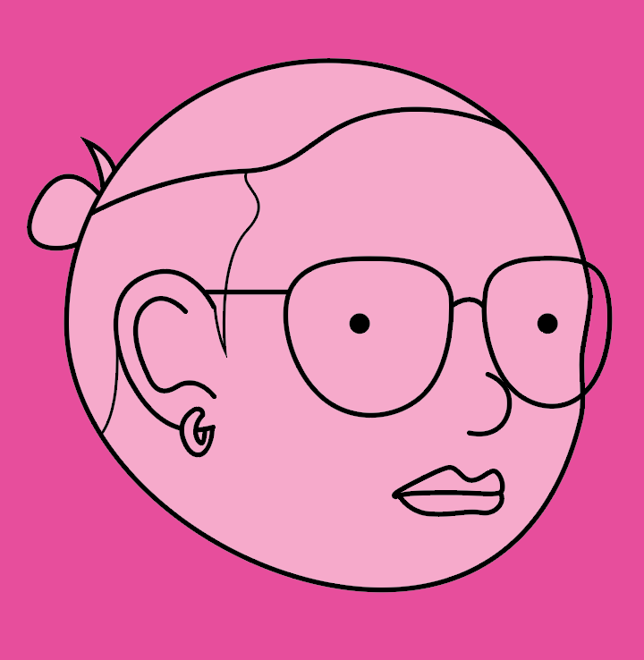
Once the mind-map was completed and the direction was set, I was originally going to only cartoon my head then stop, and go sketch layouts on paper to plan everything better, but 2 things happened.
1: I fell into my illustrating addiction, started to have fun and went “heck, lets go AI everything.”, had lots of fun doing it.
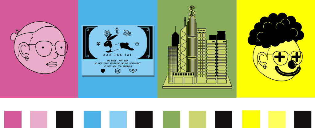
I had the thought of bright neon colors very early on. The popping colors came to mind when I looked at the Ideas Wall; and I knew I wanted to catch eyeballs and to stand-out, that I think goes hand in hand with my mood.
Pink: Pretty much representing my mood lately, I was actually very sick just a year back and is just glad to be on my feet again.
Blue: This section is dealing with the “business side” of things, originally I thought bout leaving this section white (due to the t-shirt projects’ name), but completing the neon palette made more sense to me.
Green: I was done and sitting there looking at yellow buildings and a green clown, and then it snapped into my mind “how stupid can I be!?”. It’s funny how sometimes the most basic of representations could be ignored or forgotten, and what says “money driven city” better than green?
Yellow: Obviously, I realized my role as a graphic designer is to entertain, then yellow is the obvious choice when a happy color is called for.
2: Time is running out and I have to be at work tomorrow. Thats why tackling this quickly in a way i’m familiar with made a lot of sense, a major aspect in being a good graphic designer (and probably due to working at a school) is to be punctual. So yeeep, got things done and i’m pretty happy with it.
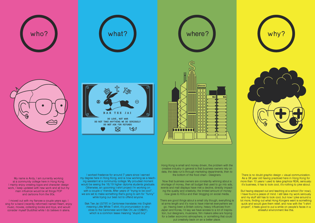
There are a few things to reflect on. At first I was really trying to avoid too much writing, but once the icons where complete I started steering towards a more info-graphic kind of treatment. In the sections what? and where? the more I think about it, the more I’d like to properly explain myself, then I came to settle with being comfortable with there being a bunch of writing.
For later projects though I do want to take my time and display my ability to layout/ coming up with the best solution, but this time I will leave it as it is.
ANDY was here
